Affiliate links on Android Authority may earn us a commission. Learn more.
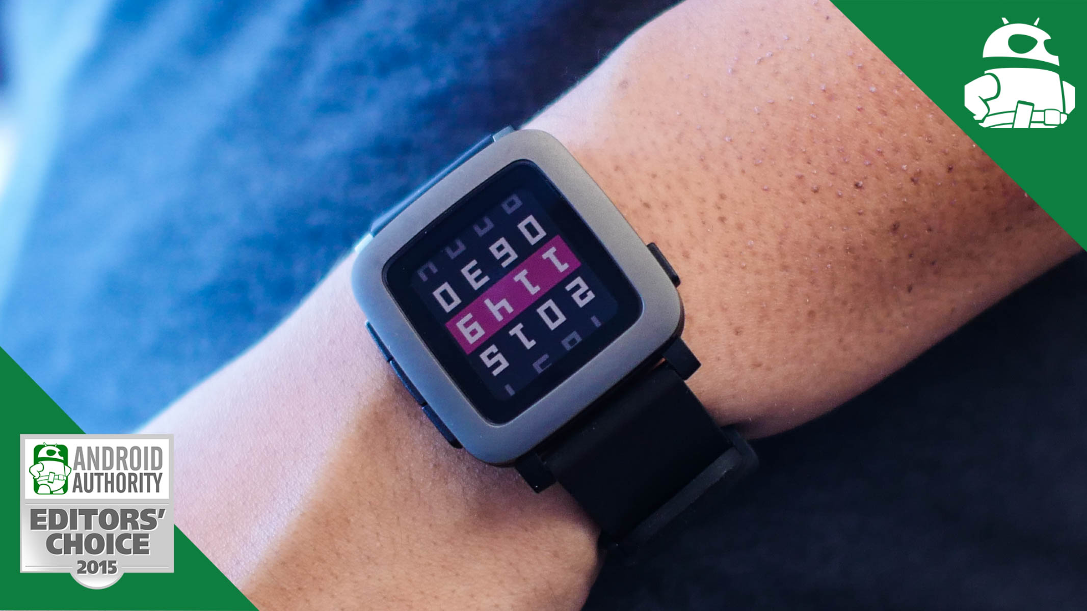
Pebble Time review
Published onJuly 1, 2015
Pebble Time
What we like
What we don't like
Our scores
Pebble Time

Design
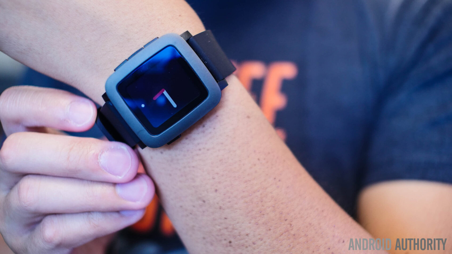
The most important feature of the Pebble Time is the update to the design, and though this is the original edition that is made of hard plastic materials, a Steel version with the same general aesthetic will soon be on its way to Kickstarter backers as well. In a stark contrast from the taller overall design of the original Pebble, the face of the Pebble Time is more symmetrical and looks quite a bit like a very tiny old-school TV on the wrist. Contributing to the rather wide body of the watch is a significant bezel around the display, that adds further distance from the edges of the screen to the edges of the watch itself.
Read – Best Android Watches
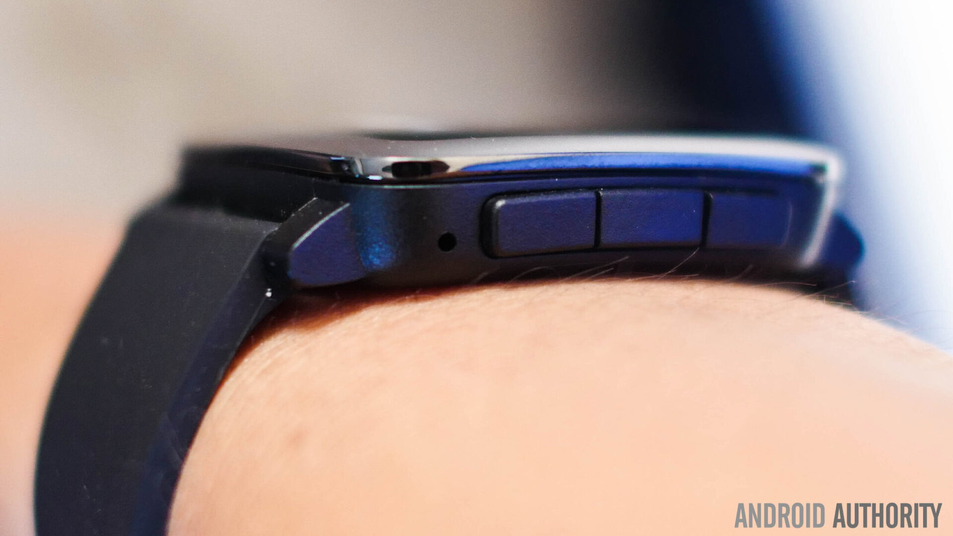
The sides of the body house the button layout, with the selection button flanked by the up and down navigation keys on the right, with a back button towards the top on the left side. A water resistant microphone is just below the buttons on the right, that can be used for any voice input. The buttons start off squishy, but end with a strong click at the end, and feel pretty sturdy all around. The availability and usage of the buttons is one of the main differences between Pebble devices and the other smartwatches out there, with Pebble still favoring this implementation over complete touchscreen control.
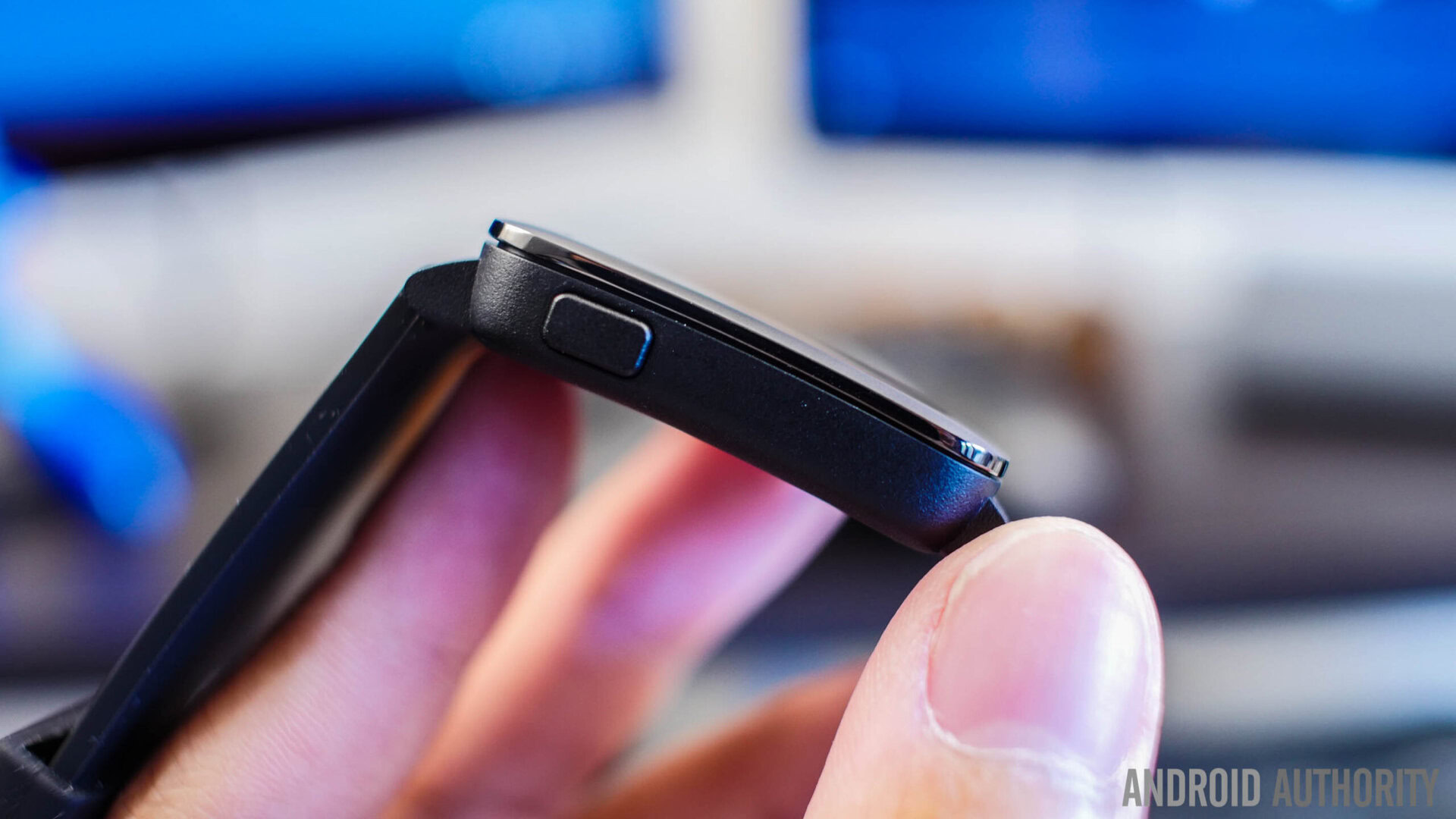
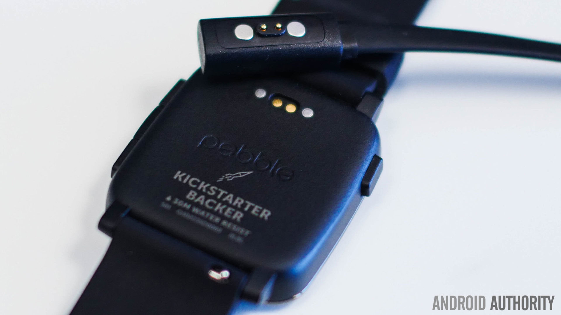
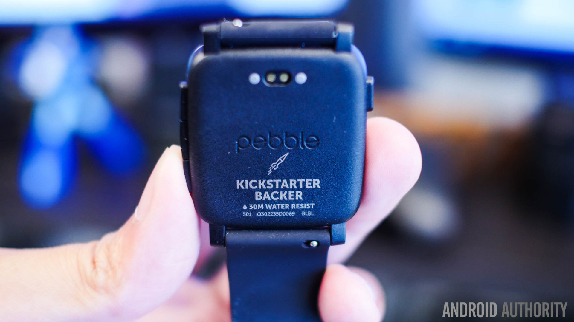
For those who like to customize their watch, the usual 22 mm prongs are available at the top and bottom, which should allow users to replace the included strap with any of their own choice. That said, the fact that they tend to stick out quite a bit makes it difficult to find a replacement watch strap that doesn’t end up looking a bit weird. Cuts in the strap will tend to stick out, and don’t fill the blank space between the body and the watch enough to look stylish. The back of the Pebble Time houses the charging and expansion port, through which we will hopefully see smartstraps become a reality. Underneath the port is a clear indication that this particular version is a Kickstarter edition of the watch, with a big “Kickstarter Backer” label as a reminder that I was an early adopter.
Design has been one of the most polarizing aspects of the Pebble Time, and it is somewhat obvious as to why. While this watch is quite the departure from what the original Pebble looked like, it is also quite far from a traditional timepiece, something that other smartwatch makers have been at least attempting to achieve. Despite the usage of the word watch, it is perfectly alright for some smartwatches to feature a unique aesthetic, which the Pebble Time does, and what it does well is present the screen with enough room around it to express itself, in a simple and elegant way.
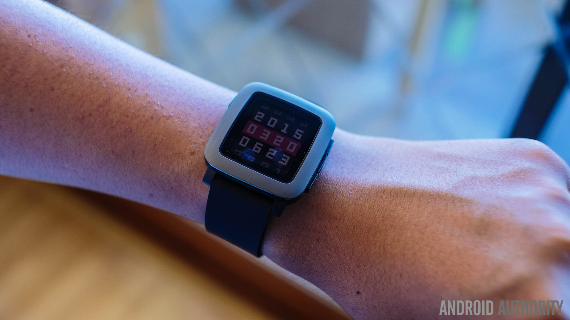
With just enough space for the buttons to be of a comfortable size, the Pebble Time isn’t particularly thick, and is quite light on the wrist as well. It is so light, in fact, that you might actually forget you are wearing the device throughout the day. The search for a better watch strap might prove to be a bit of a nuisance, but the original band available helps keep it inconspicuous at first glance, though the device itself will lead to some curiosity on the double take.
Display
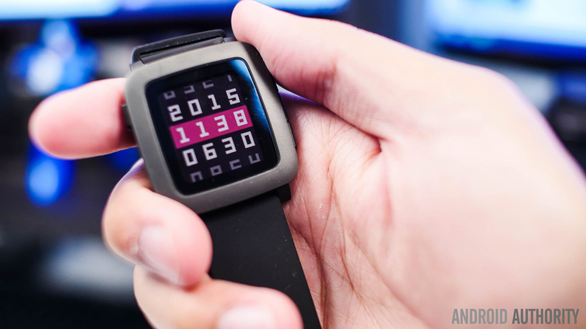
The Pebble Time brings with it an upgrade to the e-paper display, which now provides color, resulting in a new level of character being added to the applications in the Pebble ecosystem. The colors are really muted however, but this isn’t unexpected, given the nature of this display. Though the colors allow for an easy distinction among different elements, you certainly won’t be amazed by this enhancement the way you might by the color displays featured on Android Wear devices and other competitors.
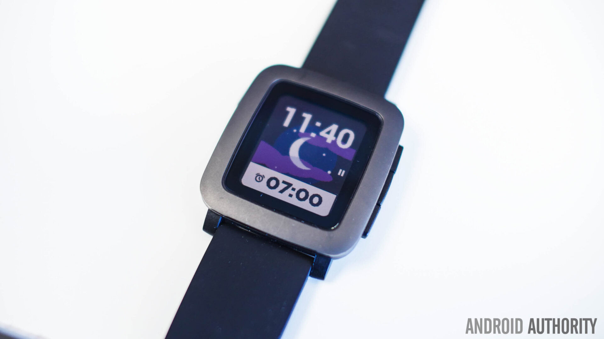
What the Pebble Time does bring forward from its predecessor is with regards to visibility, with a mostly positive effect. In broad daylight, it is really easy to see what is on the screen, and in well-lit scenarios it is a treat to have this always-on display when compared to some of the competition — which have displays that must first be triggered on before they will display. Where the display falls short though is in lower light situations, with the backlight not having been engineered to its best potential.
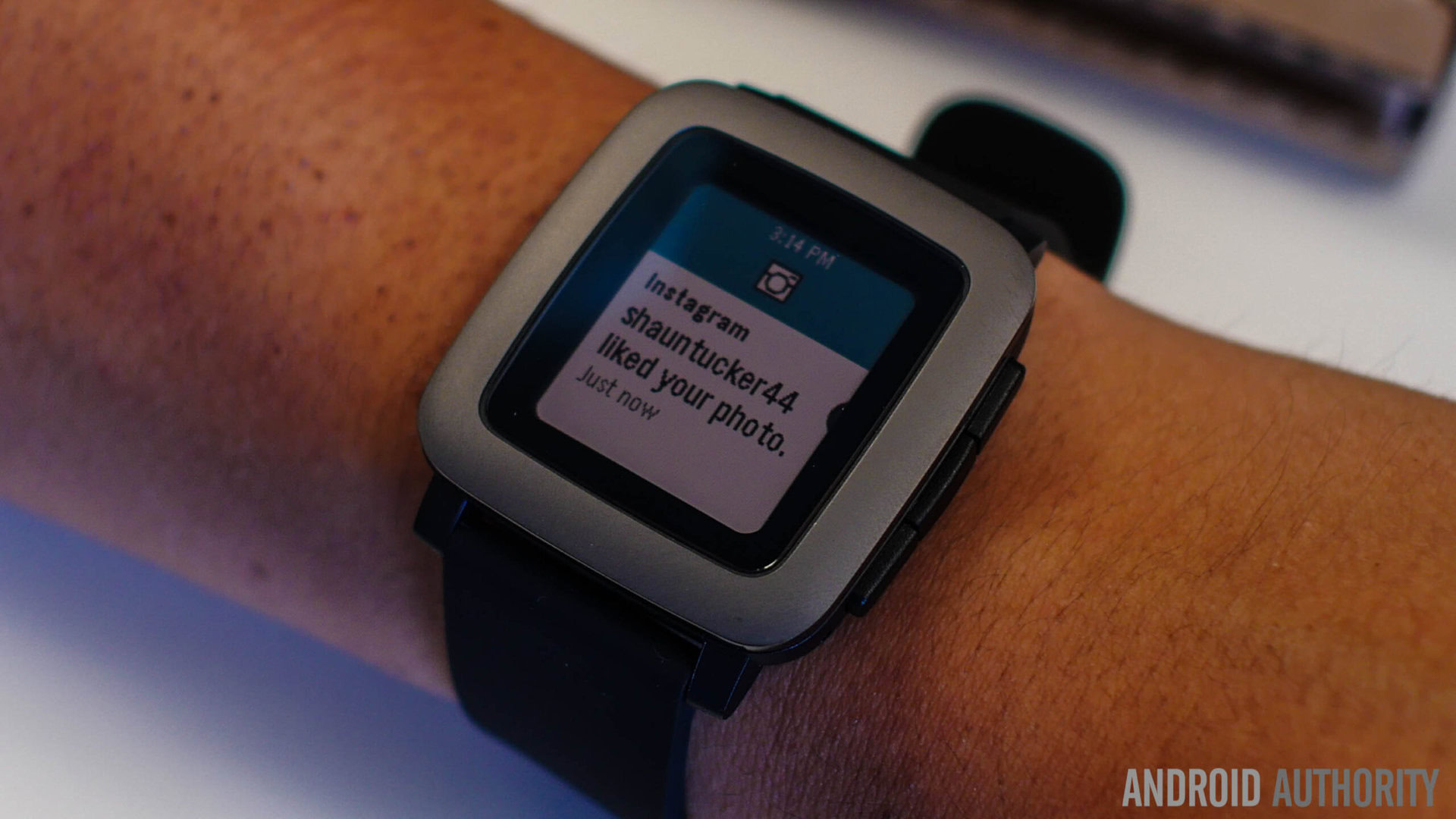
Though bright enough for easy viewing, a hard flick of the wrist is needed to trigger it, and apart from the fact that the movement is quite jarring, it doesn’t work 100 percent of the time. When it does work, the backlight stays on for only a short amount of time, which can become very frustrating. While there is a third-party app available in the store that helps remedy this issue, it is a shame that this kind of functionality isn’t better implemented out of the box. Hopefully, a substantial firmware update in the future will help make the backlight better.
Performance
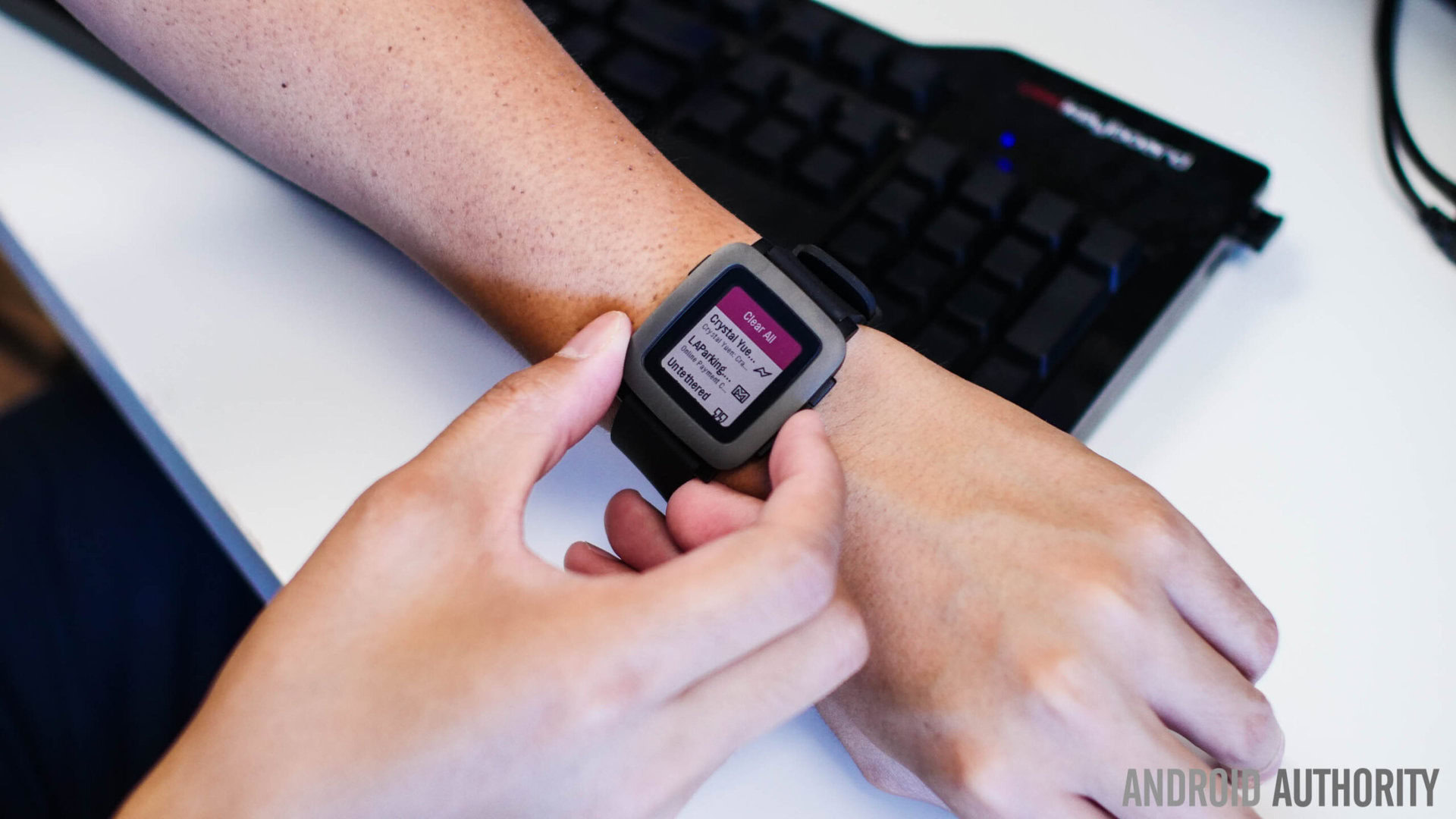
When it comes to performance, the Pebble Time performs as well as its predecessor, which is a very good thing, even if speed and snappiness aren’t too difficult to come by when applications are given a simple, but effective, platform to work on. Under the hood, an updated ARM Cortex processor is accompanied by a larger amount of storage, allowing for a bump in the number of apps you can have installed from 8 to as many as 50 this time around. Getting through a large app list may prove too annoying though, but that is about all that will slow down Pebble Time users.
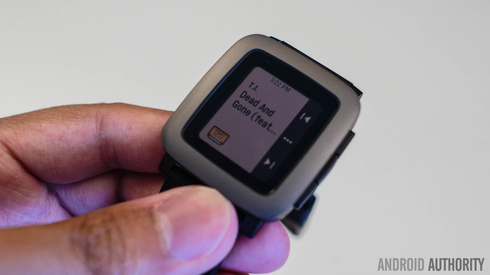
Animations when transitioning between screens don’t take too long to finish, but does keep tasks from feeling instantaneous like before. This short loading time is easy to forgive though, as these animations to add some character to the overall experience. The only real slowdown is with the new Pebble Time application for Android, which still takes some time to load lists of apps and watch faces. Once you find what you are looking for however, adding it to the watch requires a very short transfer time.
Hardware
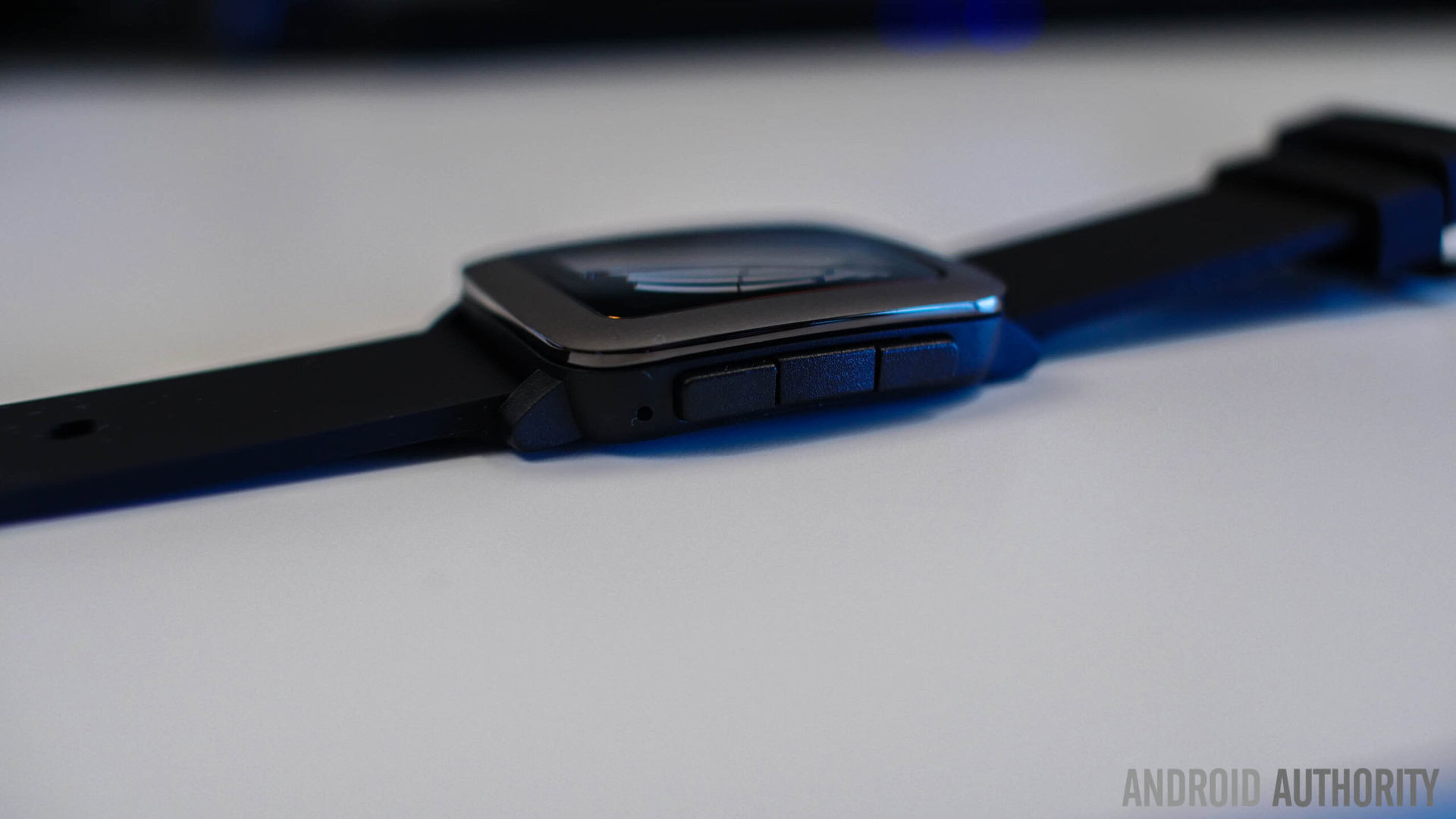
On the hardware side of things, some new additions help add to the overall experience and usability, bringing it up to the mark with what you’d expect from a current generation smartwatch. To start with, the Pebble Time comes with resistance to dust and water and a Gorilla Glass 3 panel to protect the display and help keep it scratch-free.
The big enhancement in its capabilities is in voice. The microphone nestled below the right buttons does require Android Wear to be installed though, allowing the Pebble Time to take advantage of Wear’s API for voice input. While it can’t be triggered at any point to perform a search on Google, it does provide the useful opportunity to respond to messages using your voice, which works about just as well as it would on any Android Wear device.
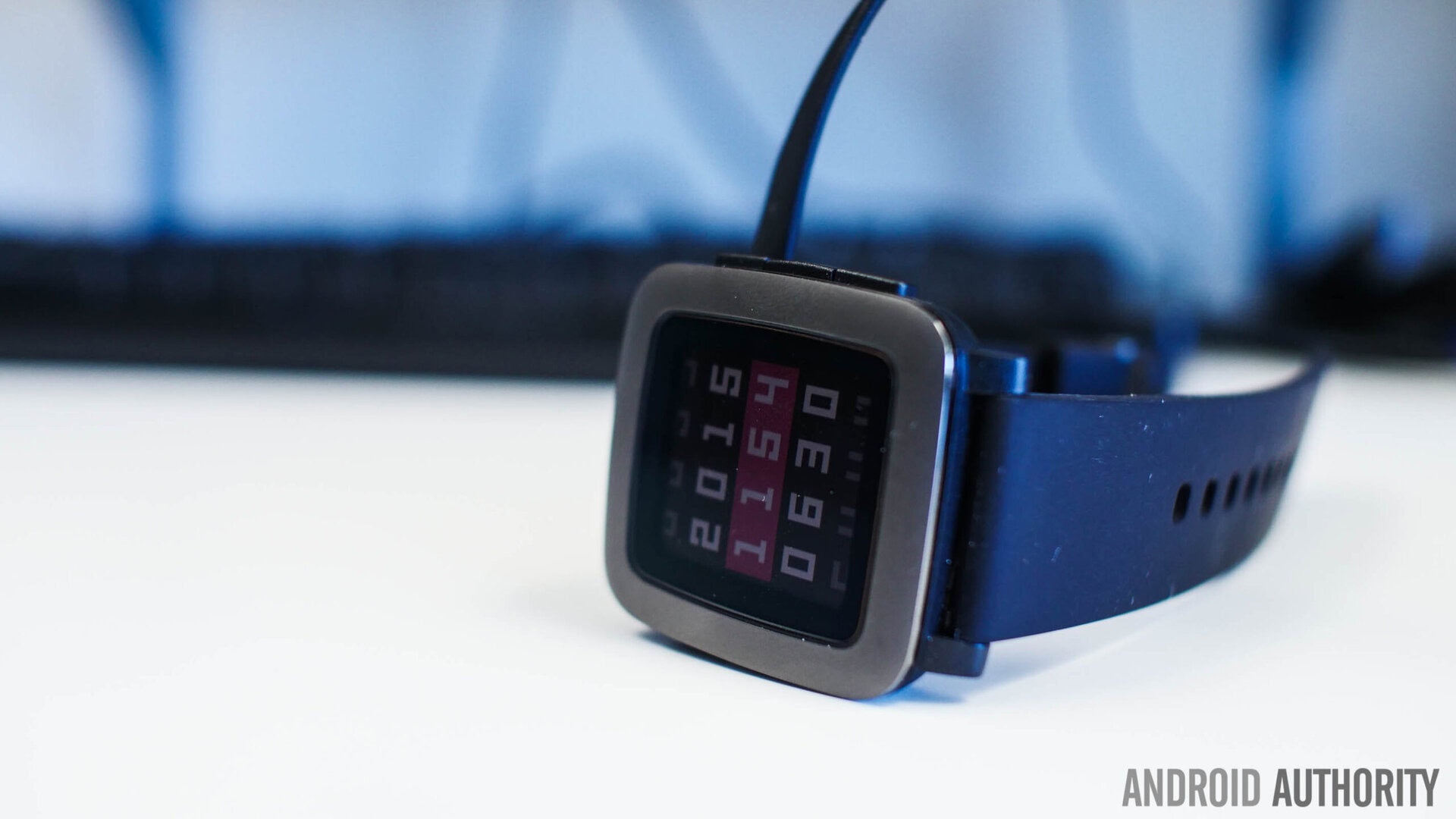
Another highlight of the original Pebble was battery life, and it’s great to see that feature carry over to the Pebble Time as well. Not a lot of devices that claim to offer incredible battery life live up to that claim, but that is certainly not the case here. The Pebble Time can comfortably last close a full week of usage, which includes a lot of vibrations and backlight usage throughout the day. The cherry on top is the fact that the charging time is also short, and just an hour of having the device tethered to the magnetic cable is enough to get the device back to a full charge. The fact that it doesn’t need to be removed and placed on a dock every night is great, and even when it does need to be, it wouldn’t have to be off the wrist for very long.
Software
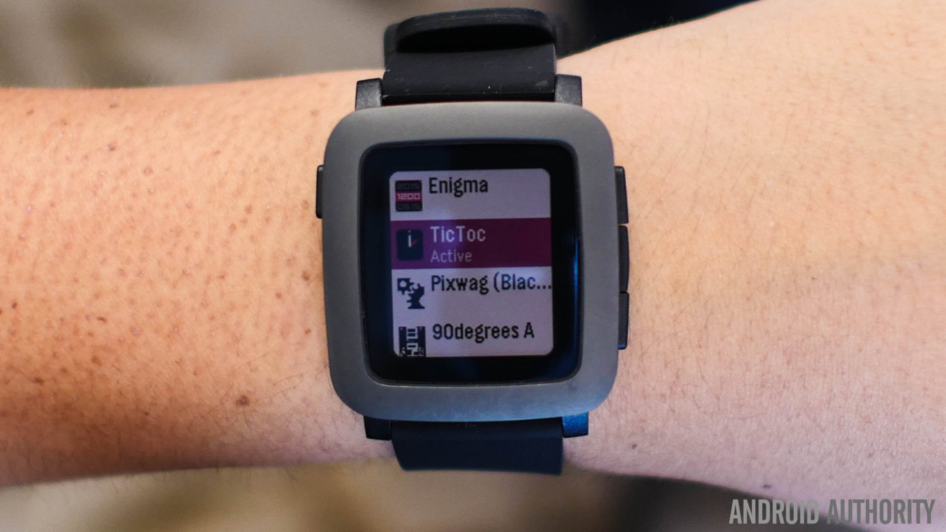
When it comes to the software side of things, the underlying foundation of the Pebble Time is exactly the same as the original. All the applications installed using the Android app are transferred over to the watch, with now up to 50 apps allowed to be installed, compared to the 8 with its predecessor.
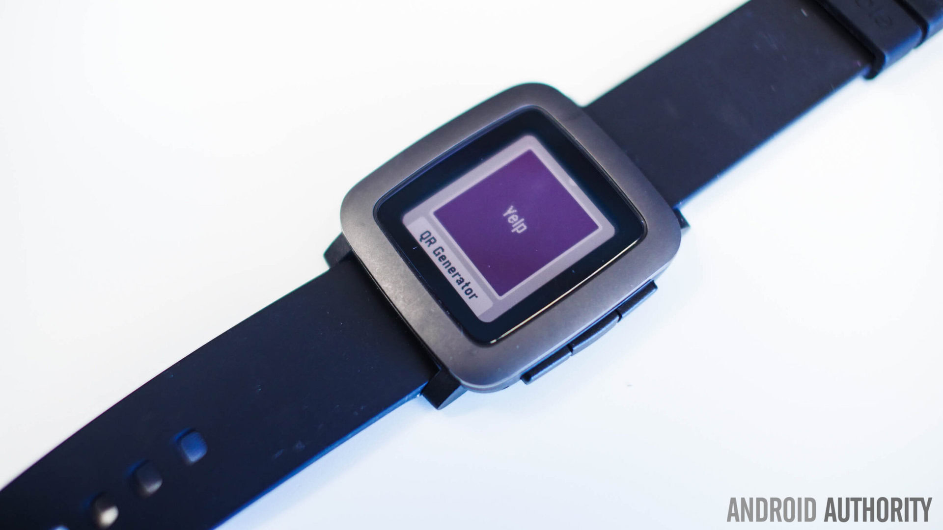
Not all the applications have been updated for the color screen or for the new Timeline feature, but all of them can still be installed and used, and will simply be presented in their original monochrome iterations. Of course, notifications remain a key part of this platform, as any notification you get on your phone from any and all applications appear in previews on the watch, making it very easy to decide whether you actually need to reach for your phone. Notification handling is definitely the main point of a smartwatch, and is one of those features that you must feel for yourself to really the huge advantage it offers.
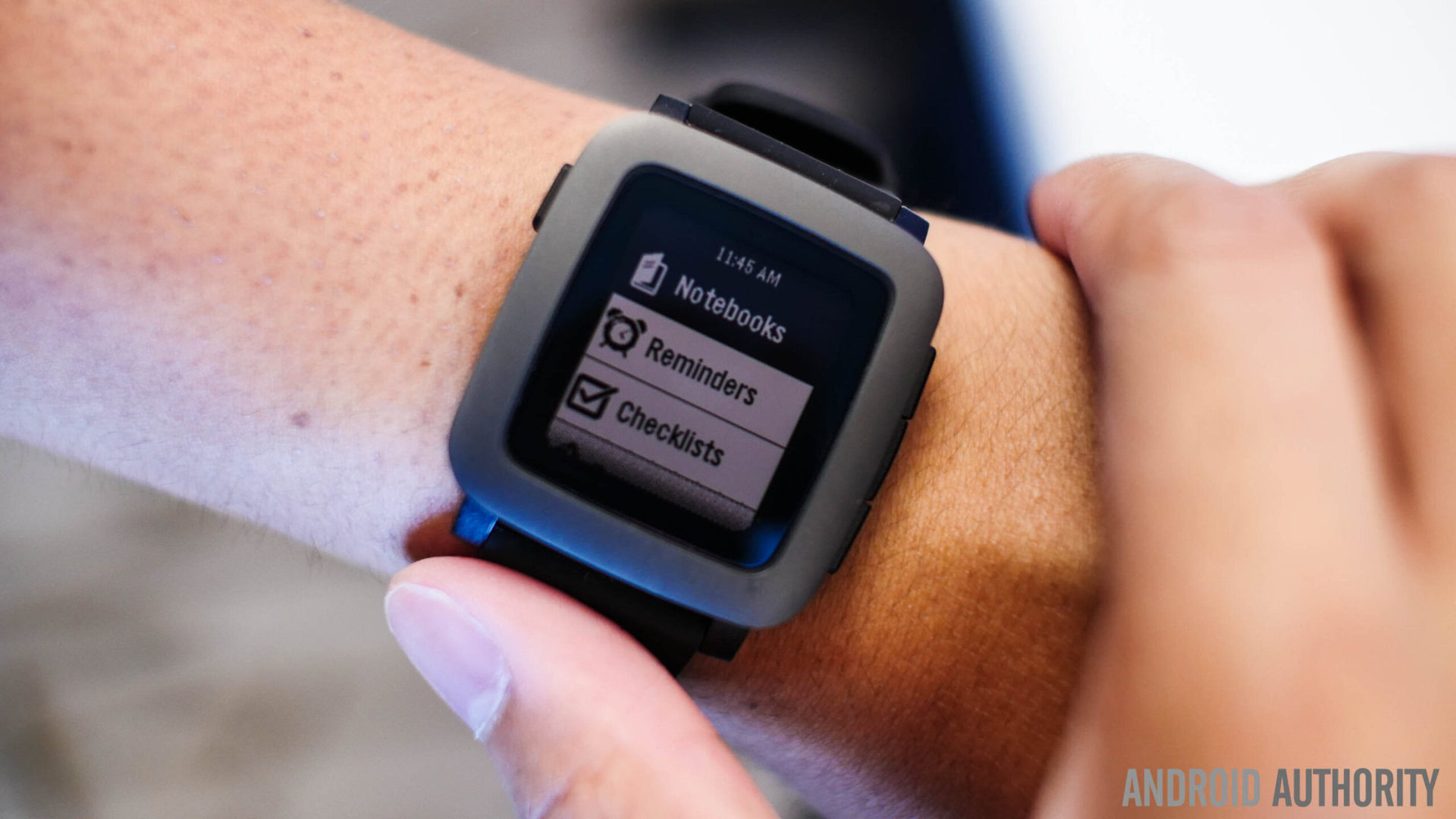
The biggest addition to the way the Pebble Time software feels is the Timeline, which is an agenda-based UI that can be triggered by going up or down from the main watch face. You can see what is coming up on your schedule, see what you might have missed recently, and also whether you’re approaching sunrise or sunset. The overall functionality is being expanded all the time as well, and there is already an app that can create a custom Timeline entry for a simple reminder. This is a fantastic feature for anyone that is wholly dependent on their calendar, and as mentioned, this will only continue to get better with more apps adding information like sports scores and travel times.
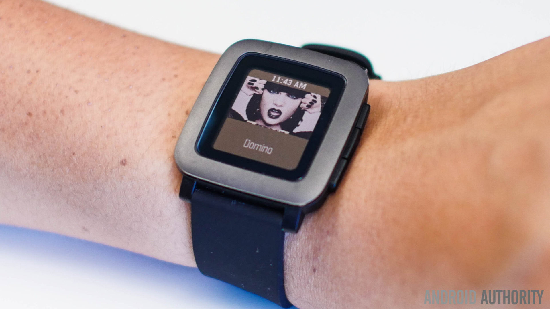
What makes the new Pebble firmware standout is its character, and that is exactly what colors and new animations bring. Initially, the extra time needed to even show these quirky animations felt like time lost, but it really doesn’t matter once you get used to them. Once the task is triggered via a button press, you are likely not going to stick around to watch them all happen anyway. If you do, however, you’ll see a charming and quirky animation that will bring a smile to your face, like a star that tells you that you’re all set, or an ostrich digging its head into the ground when notifications are muted.
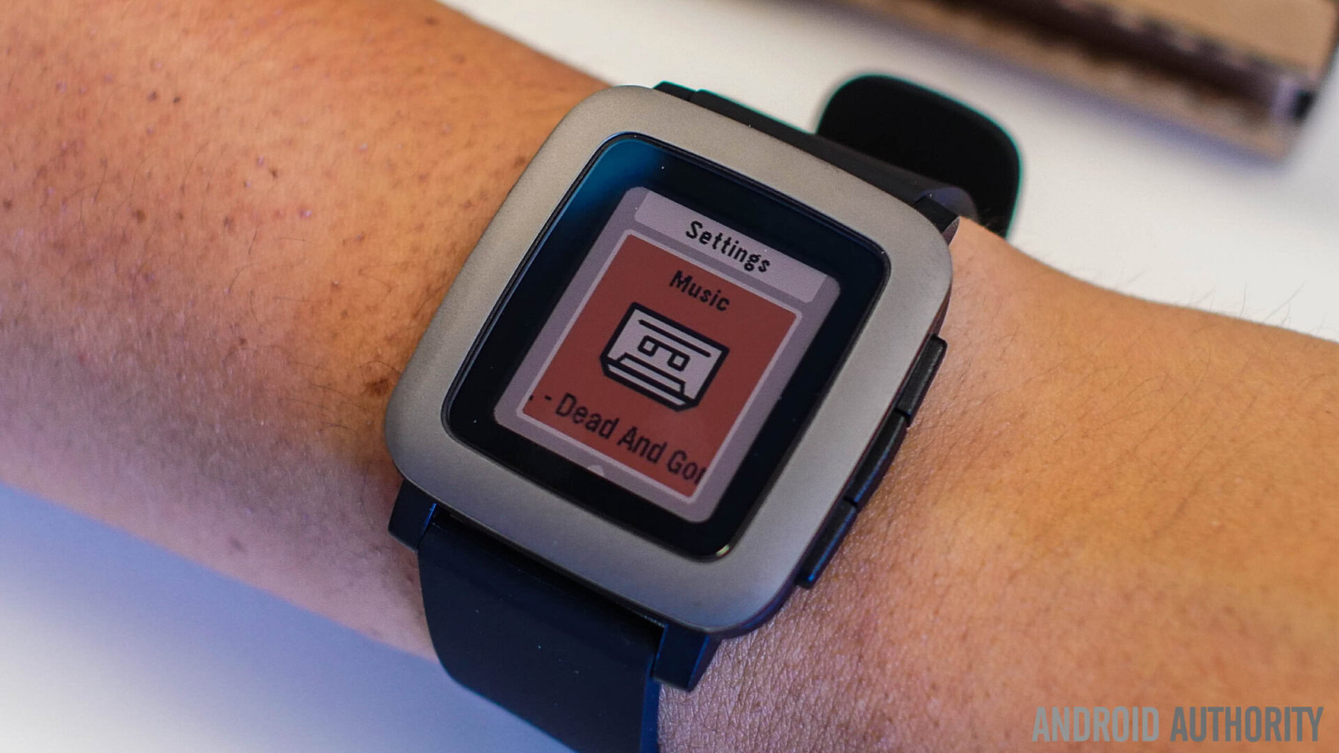
Apple’s watch OS features an elegant but ultimately predictable look and feel, and Google’s OS offers a somewhat sterile information based system, but what the Pebble Time brings to the table is a different kind of take, and one that isn’t afraid to look a little goofy while still getting the job done admirably. It speaks to what kind of community the Pebble team knows it has, and makes the Pebble Time a platform for the company to be clear on what makes it different from the rest, which is the way it expresses itself. All in all, the software might get a couple new abilities and some color, but what gives the Pebble such a loyal following is how unique it is, inside and out.
Gallery
Pricing and Final Thoughts
Though I pledged $179 on the Kickstarter, the Pebble Time is available for pre-order and will come to Best Buy stores by the end of July with a price tag of $199.
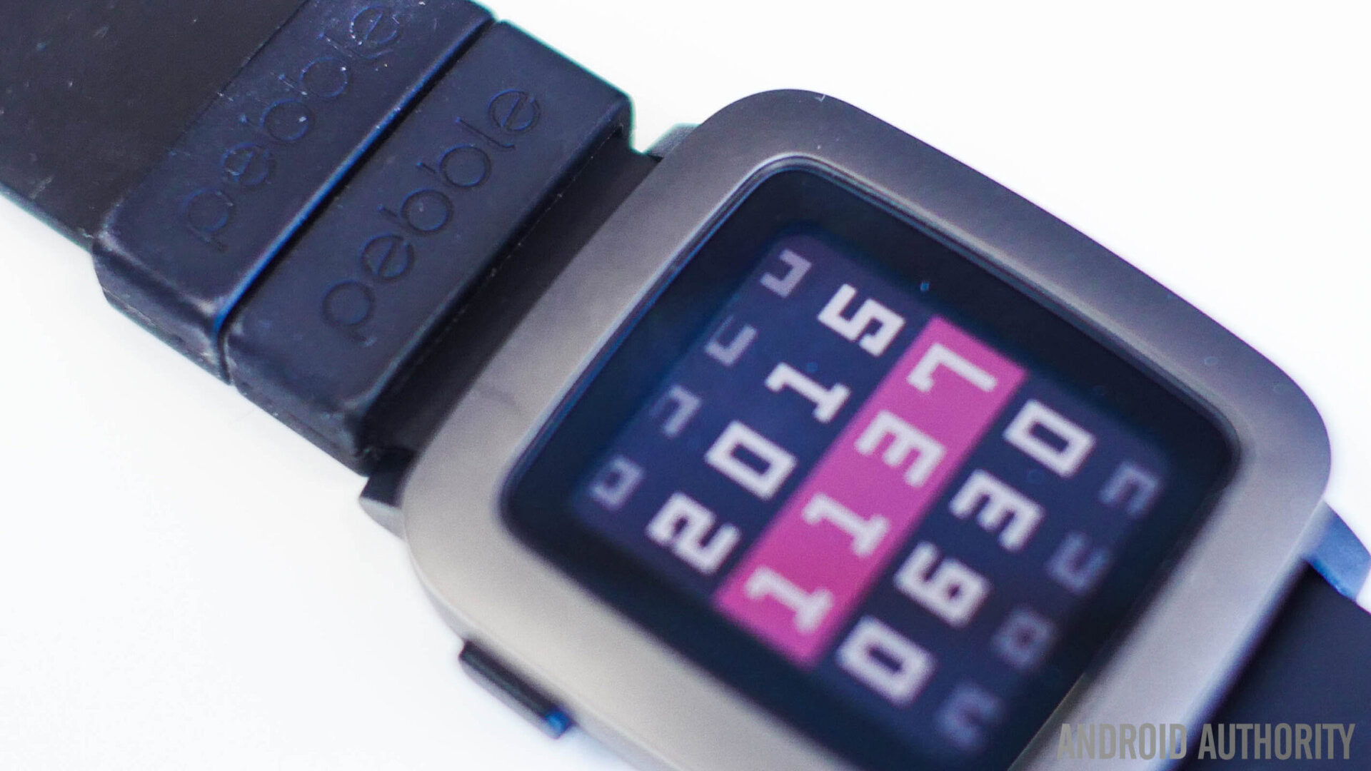
So there you have it for this in-depth look at the Pebble Time! $199 might seem like a lot, considering there are some high quality Android Wear watches coming down in cost. Even the original Pebble watches are easy to find in retail stores for $99, which sounds like quite a steal these days for a full featured smartwatch. That said, for anyone that already supported Pebble before, the pledge price, and perhaps even this retail price, makes perfect sense, because the Pebble ecosystem makes more sense to them than the competition, and I think I fall in that category.
[related_videos title=”Great smartwatch videos! ” align=”center” type=”custom” videos=”591854,543668,608623″]
