Affiliate links on Android Authority may earn us a commission. Learn more.
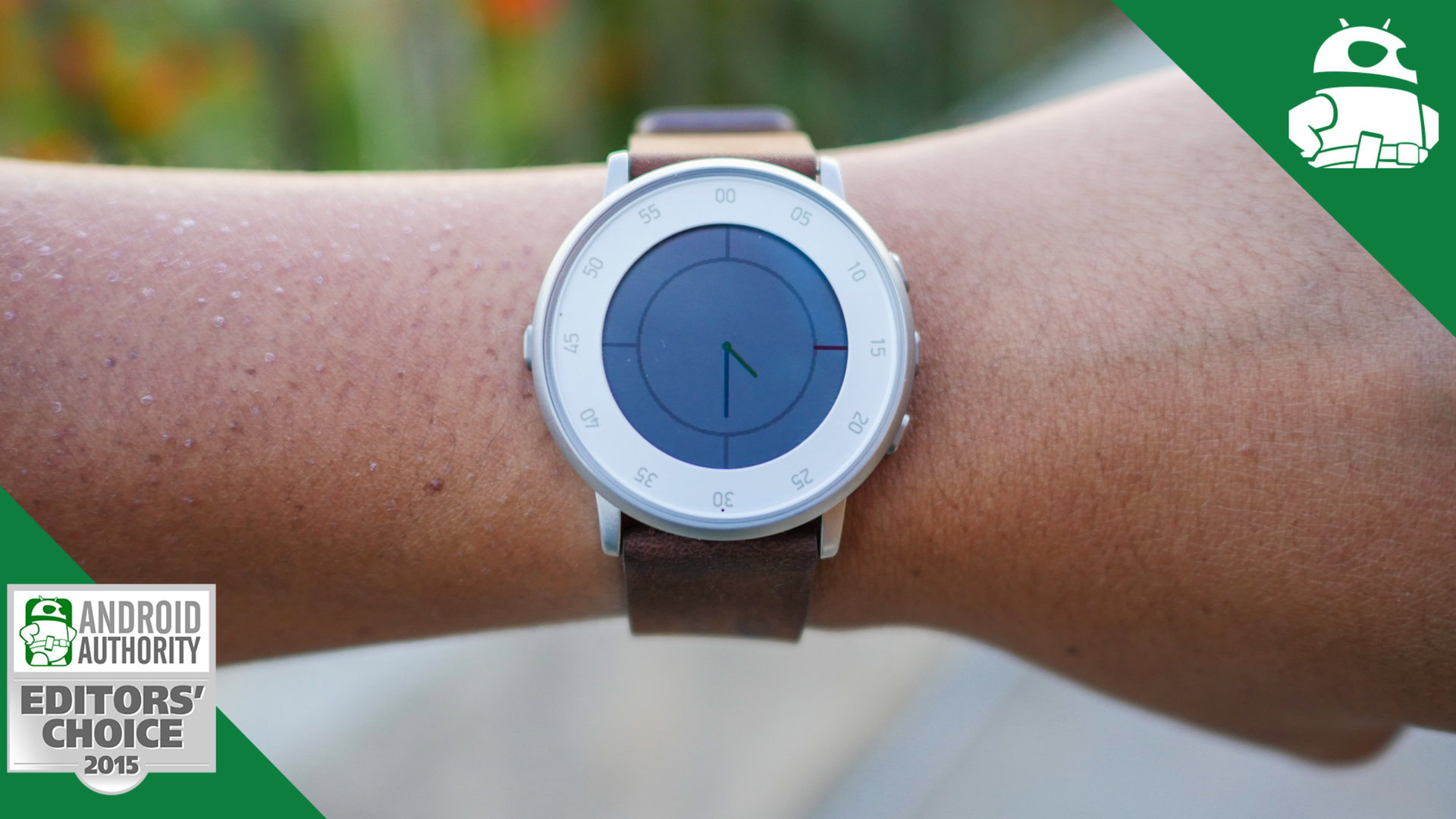
Pebble Time Round review
Published onNovember 25, 2015
Pebble Time Round
What we like
What we don't like
Our scores
Pebble Time Round
Something we all want from our smartwatches is to have them look as close to an actual watch as possible. Of course, some of the latest Android Wear releases can certainly be considered fashionable, and more importantly, indistinguishable from regular timepieces. However, the biggest hurdle faced by these devices is their size, something that can easily be seen, and always felt, with most current generation smartwatches being thick enough to pale in comparison to the sleek analog watches that are available.
Pebble hopes to address this issue with the latest addition to the popular Time series, along with this device also being their first foray into the circular watch face game. How does this new smartwatch fare amidst increasing competition? We find out, in this in-depth review of the Pebble Time Round!
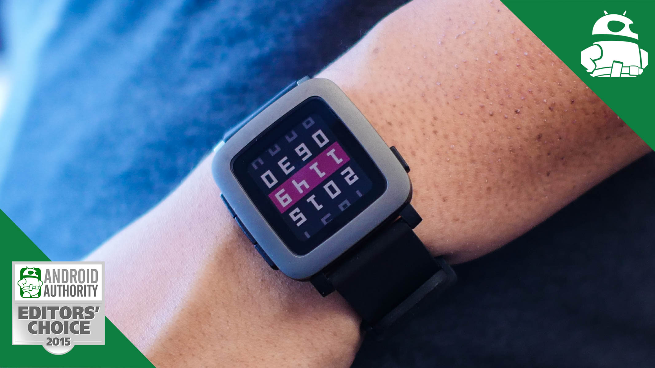
Design
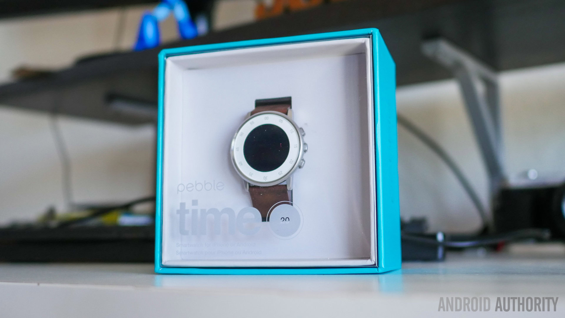
The big story with the Pebble Time Round is its circular display, which is a first for the wearable maker. As technology has improved over the past few years, circular smartwatches have been growing in popularity, and Pebble is now trying to bring their Time series into the growing group of round smartwatches released this year. With that said, there is a lot more to the design aspect of this device than its circular watch face.
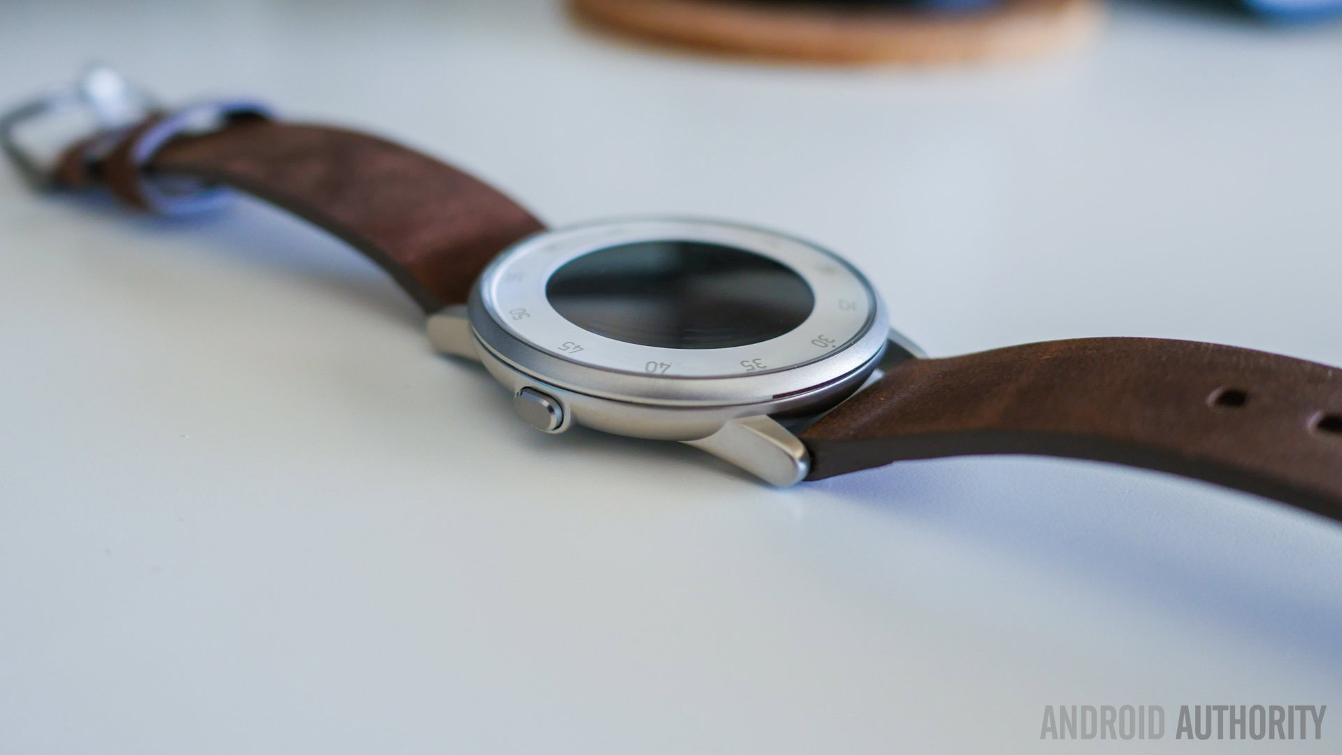
The metal-constructed round body is made splash resistant rather than completely water resistant, and is something that will take some getting used to. It does make sense, though, given Pebble’s larger focus on this being more of a traditional timepiece and less of a tech wearable. To that end, lugs on the top and bottom are also available to accommodate either 20mm or thinner 14mm watch bands.

Another aspect you will notice right off the bat is just how thin the Pebble Time Round is, and when compared to just about any other smartwatch out there, the Round comes out looking much sleeker. This also makes it far more accessible for anyone with smaller wrists. Of course, the body is thick enough to make room for the up, down, select, and back navigation buttons, as that still remains the primary mode of input, given the lack of a touchscreen display. The buttons do make for a somewhat weird back, where the charging port is also found towards the top. That isn’t something anyone will see when the device is on your wrist, though. The buttons feel solid and offer good tactile feedback, which is great, since these buttons will be used a lot.
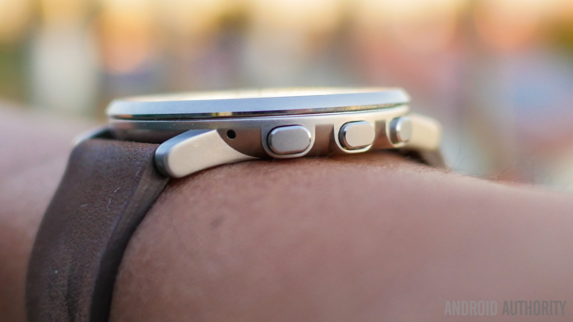
The Pebble Time Round is the lightest smartwatch we've used to date
Pebble’s commitment to making an incredibly fashionable smartwatch continues with their choice of bands, which include leather and metal options – both of which nicely complement the silver, black, and rose gold bodies. The leather band seen in this review feels really nice on the wrist, and doesn’t take away from what is quite literally the lightest smartwatch we’ve used to date. You actually won’t realize that you are wearing the Pebble Time Round most of the time, up until you have to take it off to charge.
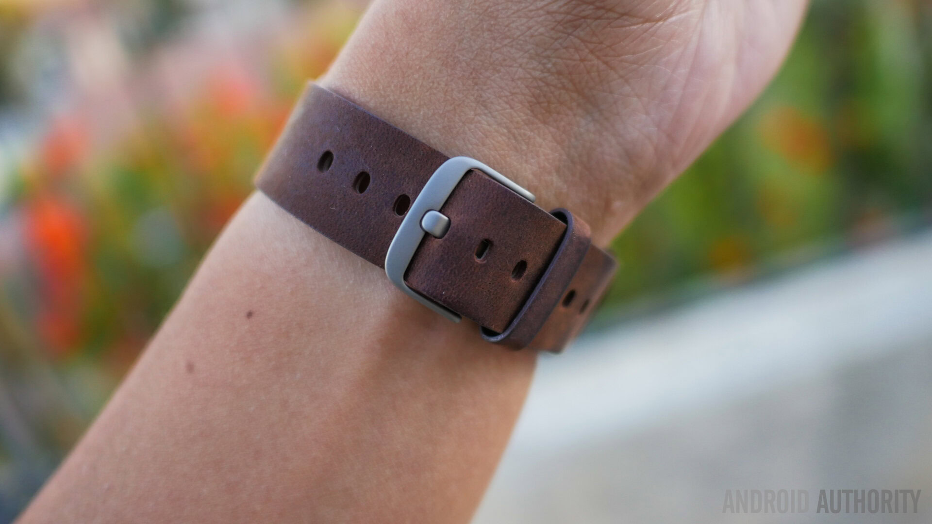
The Pebble Time Round is simply one of the best looking smartwatches available now, not because of what it packs in, but rather because it prioritizes minimalism. Granted, there are a few features that had to go by the wayside in order to make this thin body work. But if you’re looking for a smartwatch that is as easy on the eyes as it is easy to wear, the Pebble Time Round is definitely worthy of your attention.
Display
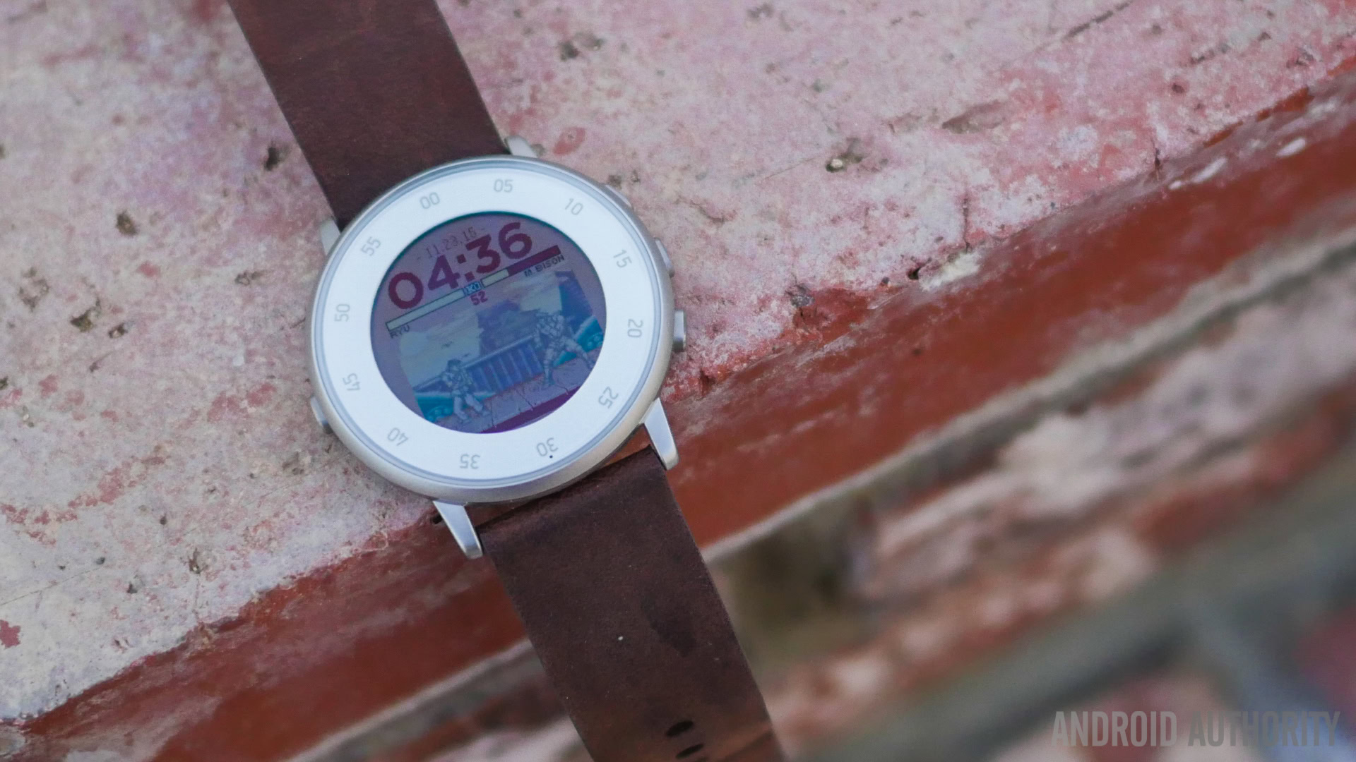
The switch to a round display means a new way of fitting information on the color-capable e-paper display, but Pebble has managed to handle the round design beautifully. Speaking of the display itself, e-paper means that the watch is easy to view in bright conditions, with a back light available when in poorly-lit situations. In broad daylight, however, the Round has the same issue as the original Pebble Time, and it can get tough to really see the elements on the display. The back light can also be a bit strong in low-light conditions, but the intensity can be lowered in the Settings menu.
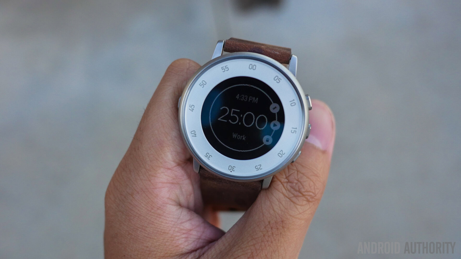
The only real issue we had with the display is triggering the back light
The only real issue we had with the display is triggering the back light easily, which sometimes required the wrist movement to be overly aggressive to make it happen. The 2.5D Gorilla Glass panel also gives the display a nice sheen, but a bit of a peeve we have is with the bezel. The issue isn’t just with how thick the bezel is, but also with regards to how it is used.
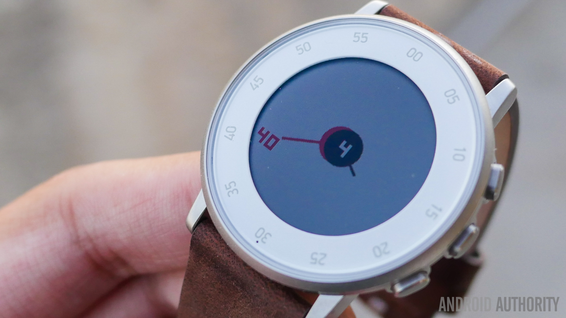
The silver version of the watch, as seen in this review, comes with minute markings all around the bezel, and as such, some may prefer the black edition, that comes with either hour designations or nothing at all. This meant that I was torn between getting a digital watch face, or using an analog one to properly utilize those minute markings. Luckily, the Pebble Store does have plenty of good looking options to choose from. Of course, the bezel can also be covered with a skin of some sort if it is a big deal for you, but even if it isn’t, it is definitely something that you will notice.
Performance
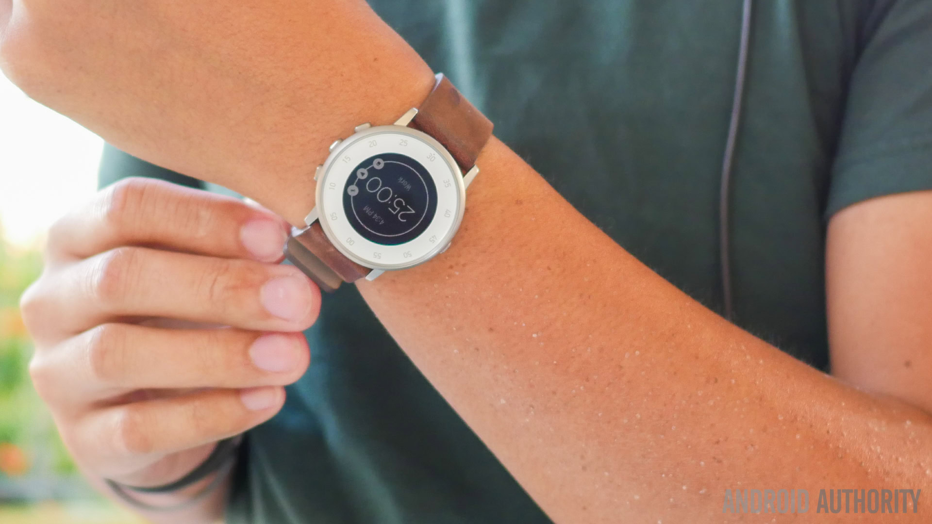
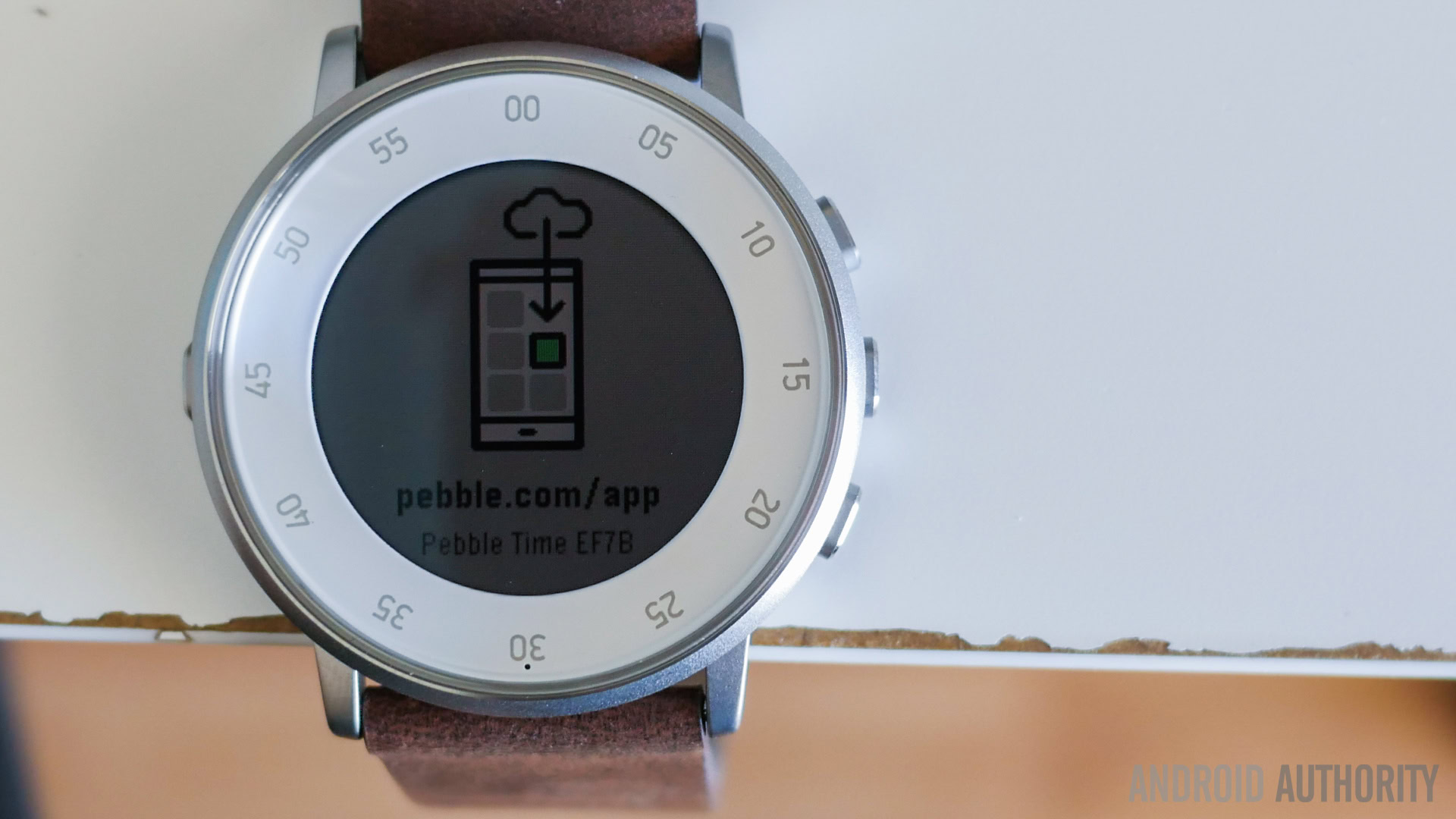
Similar to what we got with the Pebble Time, performance on the Time Round is snappy and smooth. We hardly experienced any issues with apps. Apps and watch faces are installed from the accompanying smartphone application, and doing so is a pretty easy experience. After that, the apps are either standalone on the watch, or require a companion application on the phone.
In either instance, we’ve had a good time using apps like the Pomodoro Timer, or even a sleep tracking app, without any issues. In an upgrade from the first-generation Pebble devices, the various Time editions can also save what the current app is doing, even if it gets covered up with an incoming notification. The Time operating system is able to perform most tasks without any issues, and provides a smooth overall experience.
Hardware
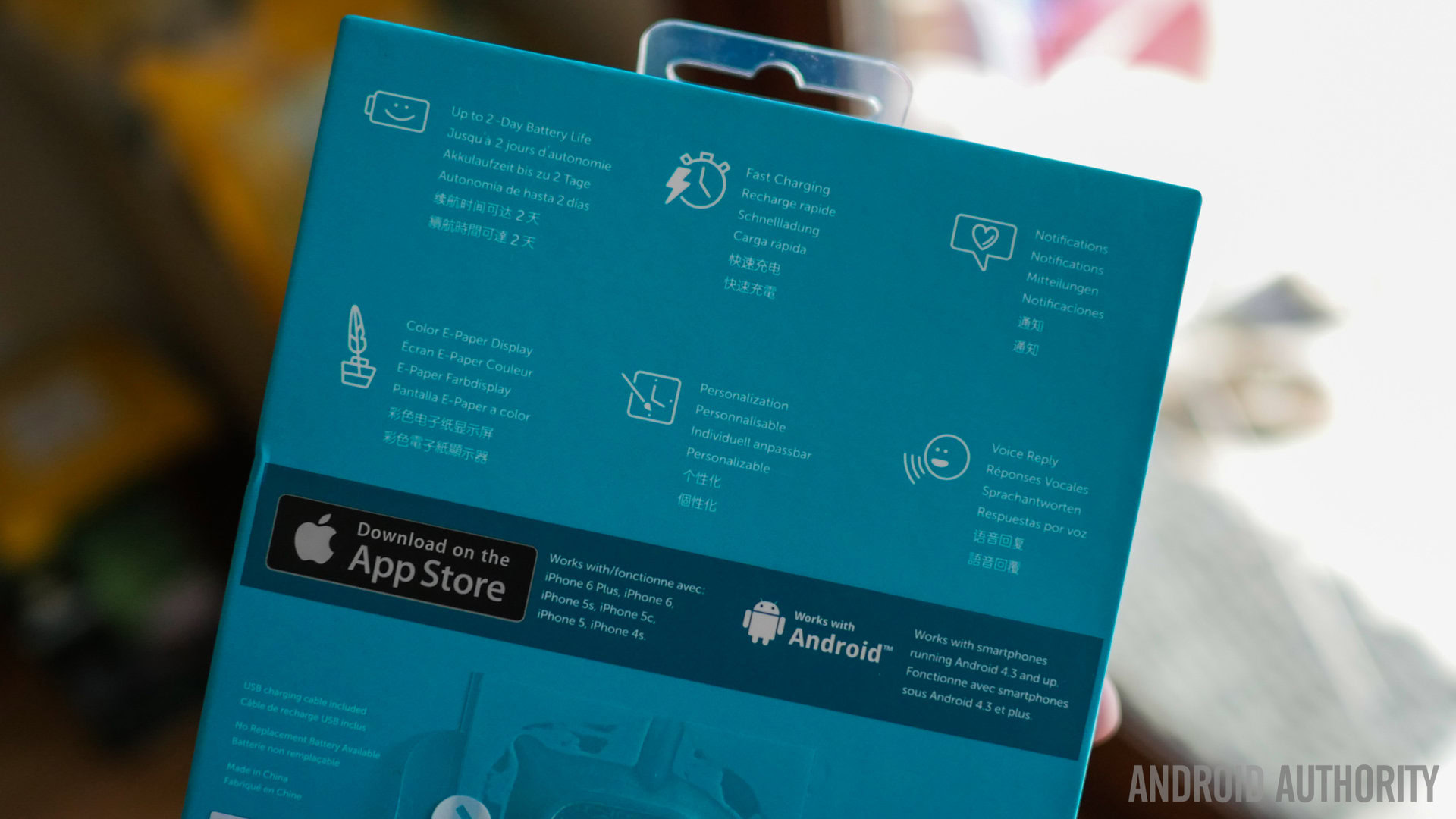
Hardware on the Pebble Time Round is actually rather simplistic, and with this essentially being a smartwatch that requires pairing to a smartphone, Wi-Fi and mobile network connectivity aren’t a focus. For that matter, there are no extras like a heart rate monitor either, but there will supposedly be smart straps available in the future that will add this function.
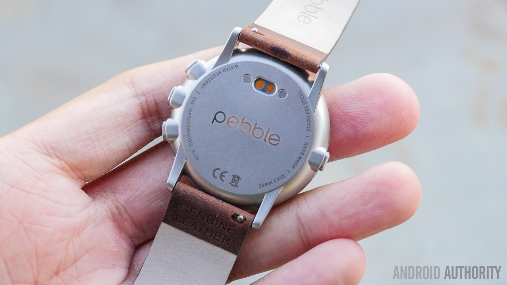
Voice input is quite good on the Pebble Time Round
What you do get is the standard Bluetooth connection, with a microphone underneath the buttons on the right side for voice input. Voice input is quite good on the Pebble Time Round, and only in the loudest of environments is it difficult to perform proper dictation. For most purposes, such as replying to messages, we didn’t have much trouble with it. When the watch needs to alert the user about anything, it uses the vibration. While effective, the smaller body does mean that the vibration is a little weaker than we’d ultimately like it to be.
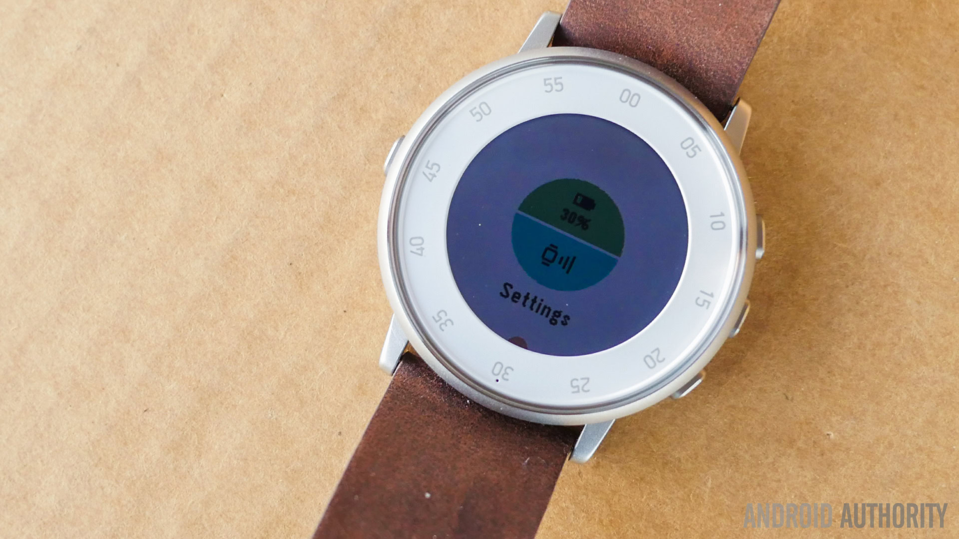
Battery life on the Pebble Time Round is a big deal, and unfortunately not in a good way, with it being the first smartwatch by the company to not boast exceptionally long battery life. While the Time and the original Pebbles last for a week, or even more, the Time Round is only able to squeeze out around 2 days. This does make sense though, given how thin the device is, and is a compromise that just had to be made for the sake of aesthetics. Of course, two days isn’t terrible given its competition, and you can get more with lower usage if you only focus on notifications. Still, battery life is disappointing given what was possible with its predecessors. Charging the Pebble Time Round is incredibly fast however, with only about 20 to 30 minutes required to get back a full charge from 0 percent.
Software
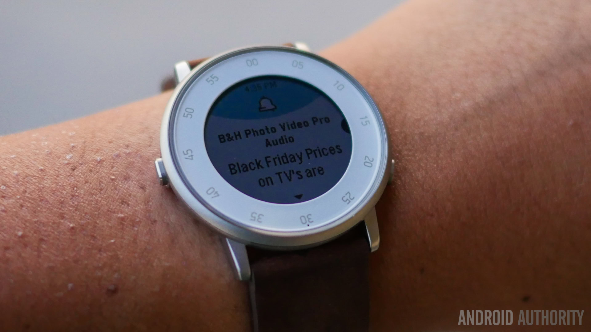
On the software side of things, we have the round version of the Pebble Time OS, and the transition to this new shape has been smooth, for the most part. What we do love about the Time OS is its nice transitions and sometimes cute animations, that make for a fun experience that is still very functional.
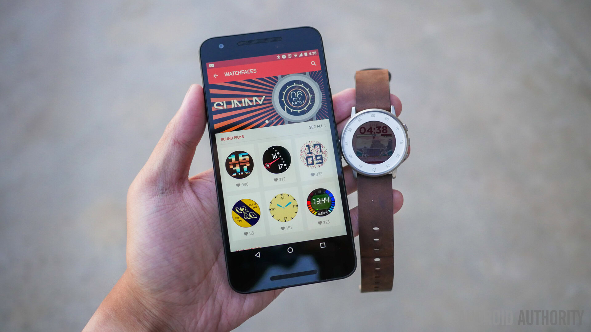
Going through the app list requires hitting the up and down buttons a lot, and this is the same input method within any and all applications as well. Even the animations that are just for the Time Round are nice eye candy, like an iris animation when going backward in the interface. The Timeline is the main addition here, where you can go up or down from the watch face to see future events, reminders, and other useful information. If you aren’t much of a calendar user already, this might not strike you as a must-have function, but after installing one of the few apps in the store than can convert voice input into reminders, the Timeline can prove to be a good tool.
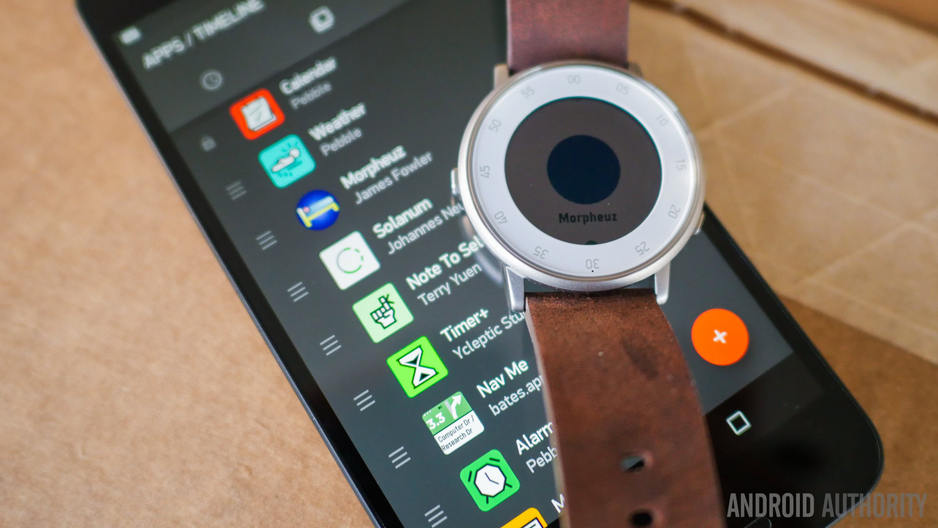
Notable developers still haven't brought their apps to the Round
To that end, applications are the crux of the Pebble experience, providing a layer on top of what is primarily a good notification center. That said, with the transition to a round body, applications had to be changed in order to utilize the space better, and that conversion is not yet complete. For example, Yelp and Evernote have yet to make their applications available for the Round, which is a little disappointing, but will hopefully be rectified soon. Certain apps do make the Round their home however, like Solanum, a Pomodoro style app, and Note to Self, which takes voice input and uses key phrases to insert what is said into the Timeline.
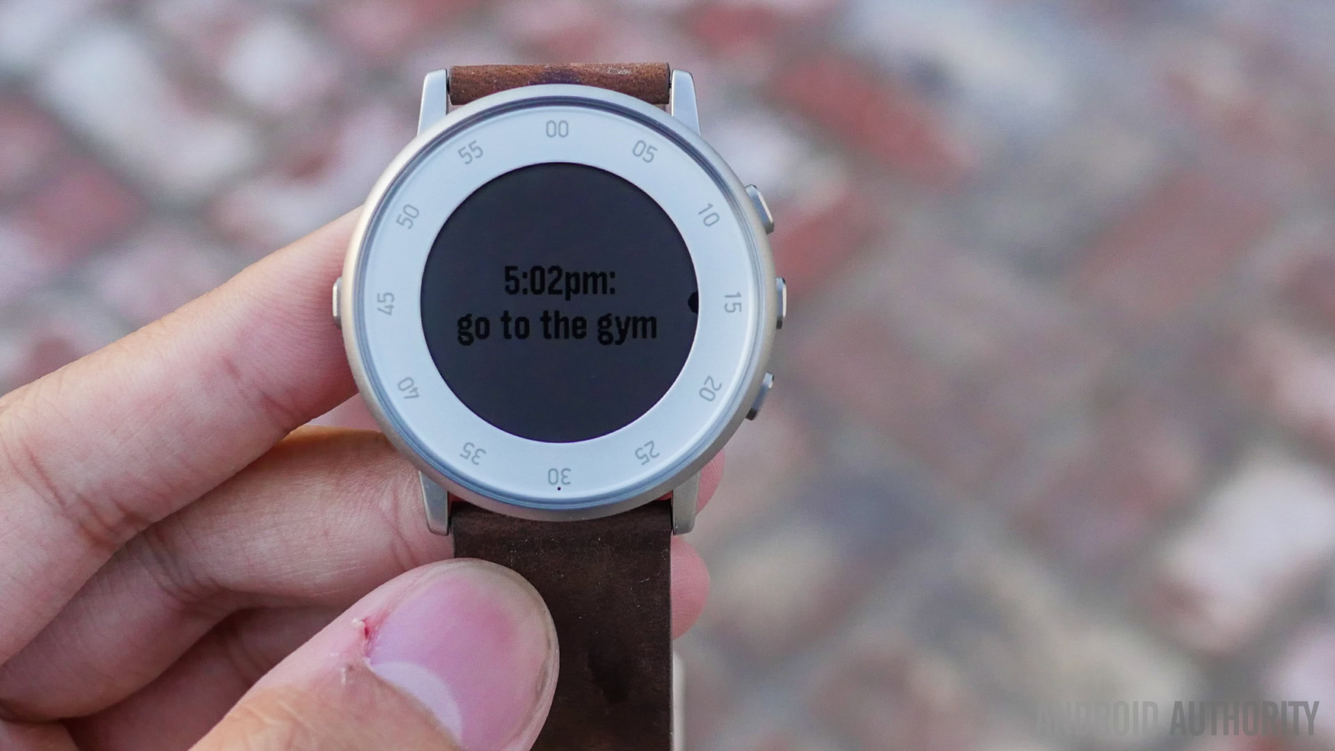
It is easy to find uses for the Pebble Time software, even past the main the function as a method to see notifications from your phone. If you have never used a smartwatch as a way to keep your phone in your pocket, you should definitely try it. Customization is still alive and well in the Pebble ecosystem, and with an even better looking body to surround it all, a little due diligence can certainly make the Time Round a worthy companion to have on your wrist.
Gallery
Pricing and final thoughts

You can buy a Pebble Time Round with a leather strap directly from Pebble’s website for $249, with the metal band versions going for $50 more. The smartwatch can be found much cheaper on Amazon right now, however.

Where other smartwatches fail is in their feature sets – not because these features aren’t good, but because the design has to suffer to make room for them. The Time Round is the anti-thesis of this trend in smartwatches, and by prioritizing simplicity, it is probably the first device that can be recommended to anybody. If you really do need a heart rate monitor, the ability to make calls from your wrist, or even use the device for mobile connectivity, then this isn’t the device for you. What you do get here is simplicity, elegance, and one of the best looking smartwatches we’ve seen all year.
[related_videos title=”The fierce competition” align=”center” type=”custom” videos=”650695,648705,648417,644990″]