Affiliate links on Android Authority may earn us a commission. Learn more.
Samsung Galaxy S7 edge review
Published onMarch 14, 2016
Samsung Galaxy S7 Edge
What we like
What we don't like
Our scores
Samsung Galaxy S7 Edge
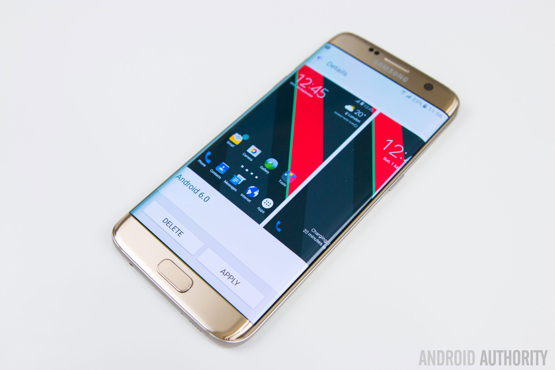
After years of criticism for its stubborn refusal to move past its plastic-clad design language, last year we finally saw a new Samsung emerge with the introduction of the Galaxy S6 and S6 Edge. Trading in the tired plastic rear backing, the new Galaxy S6 family brought us a metallic frame sandwiched between a glass front and back. Though the Galaxy S6 was a stunning device, the star of the show was arguably the S6 Edge, which featured a unique dual curved design that helped it stand apart from other devices on the market.
The Galaxy S6 Edge was the culmination of years of experimentation into flexible and curved displays, with the Galaxy Note Edge and the Galaxy Round coming before it. While neither of these previous attempts managed to garner much attention, the Galaxy S6 Edge burst into the market with a trail of praise following right behind it, not only from the media but from general consumers. In many ways, the Galaxy S6 Edge’s design was nearly perfect, though it wasn’t without flaws and sacrifices, including the lack of a removable battery and microSD slot. Regardless of its minor imperfections, the Galaxy S6 Edge is a hard act to follow.
Don’t miss:
- Samsung Galaxy S7 specs, features, price, release date, and more
- Samsung Galaxy S7: refined, polished, and possibly the best smartphone ever
- Best Galaxy S7 edge cases
- Best Galaxy S7 cases
- LG G5 and Galaxy S7 vs the competition
- Samsung Galaxy S7 and S7 Edge problems and how to fix them
Does the Galaxy S7 Edge make enough changes to the Edge formula to awe us the way its predecessor did? Or did Samsung get so much right with the Galaxy S6 family that there’s nothing left to perfect? That’s exactly what we aim to find out in this full review of the Samsung Galaxy S7 Edge.
Design
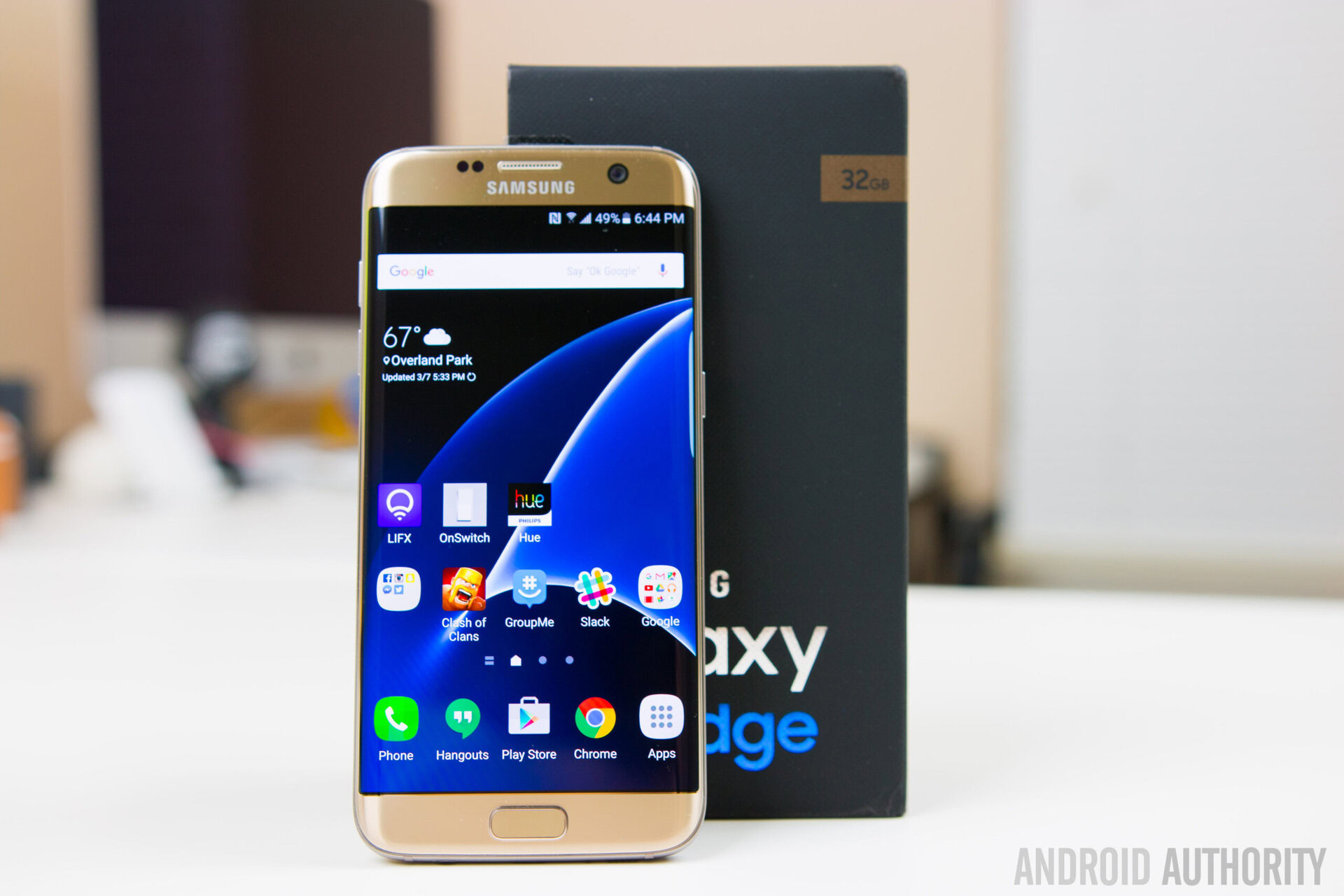
The most immediate difference you’ll notice between the Galaxy S7 Edge and its predecessor is the phone’s size. Bridging the size gap between last year’s Galaxy S6 Edge and the S6 Edge Plus, the Samsung Galaxy S7 Edge offers a 5.5-inch display, making it noticeably larger than the “standard” Galaxy S7. Talking with Lanh, we both agreed that the jump up in real estate was a positive move, giving you more screen real estate for all your gaming and media consumption needs. Sure, the phone takes a small hit when it comes to one-handed usability, but thanks to the way that the Edge curves down, it’s really not as big of a difference as you might think.
Aside from the larger display, the Galaxy S7 Edge looks very similar to its predecessor, though Samsung has managed to sneak in a few adjustments to the design. First, the camera is bump has been noticeably reduced when compared to the S6 Edge. The camera still protrudes a little, but at less than a half millimeter, it’s going to be a lot less bothersome than the camera bump on its predecessor.
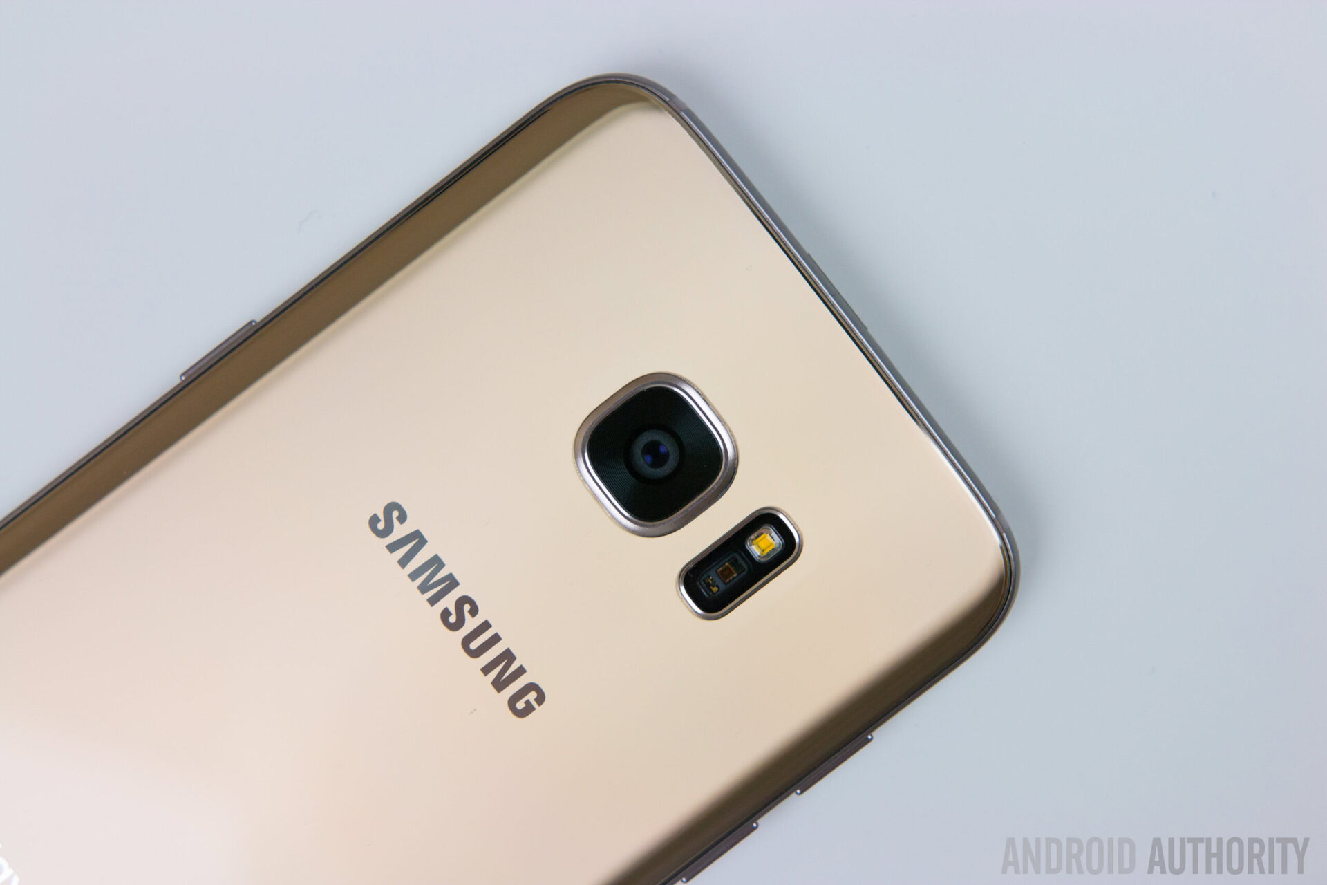
Next, the S7 Edge is marginally thicker than both the S6 Edge and S6 Edge Plus at 7.7mm, vs the Edge Plus at 6.9mm and the Edge at 7mm. That might sound like a bad thing, but the added thickness actually helps with grip. As an added bonus, this thicker profile also means Samsung was able to cram in a larger battery, which will talk more about a bit later in the review. Probably the most helpful design change found on the Galaxy S7 Edge, however, is the curved glass backing that helps alleviate some of the ‘sharpness’ issues some users reported with the original Galaxy S6 Edge.
Between the curved back, slightly thicker design, and the larger screen size, Samsung has managed to create a phone that is extremely comfortable in the hand. As Lanh put it:
Even though it’s bigger, it’s a lot more comfortable. For being a 5.5-inch phone, it’s a lot smaller than many other phone’s with similar screen size.
Lanh went on to mention that he feels this is one of the most comfortable phones he’s ever held, and I have to agree. That said, it is a bit slippery but not to the point that you have to worry about it falling out of your hands. It’s also a fingerprint magnet, though a new coating makes it a little less prone than the S6 family before it. Of course, most of you will end up placing the phone in a case, which will render both the slippery nature of the phone and its fingerprint prone aspects completely moot.
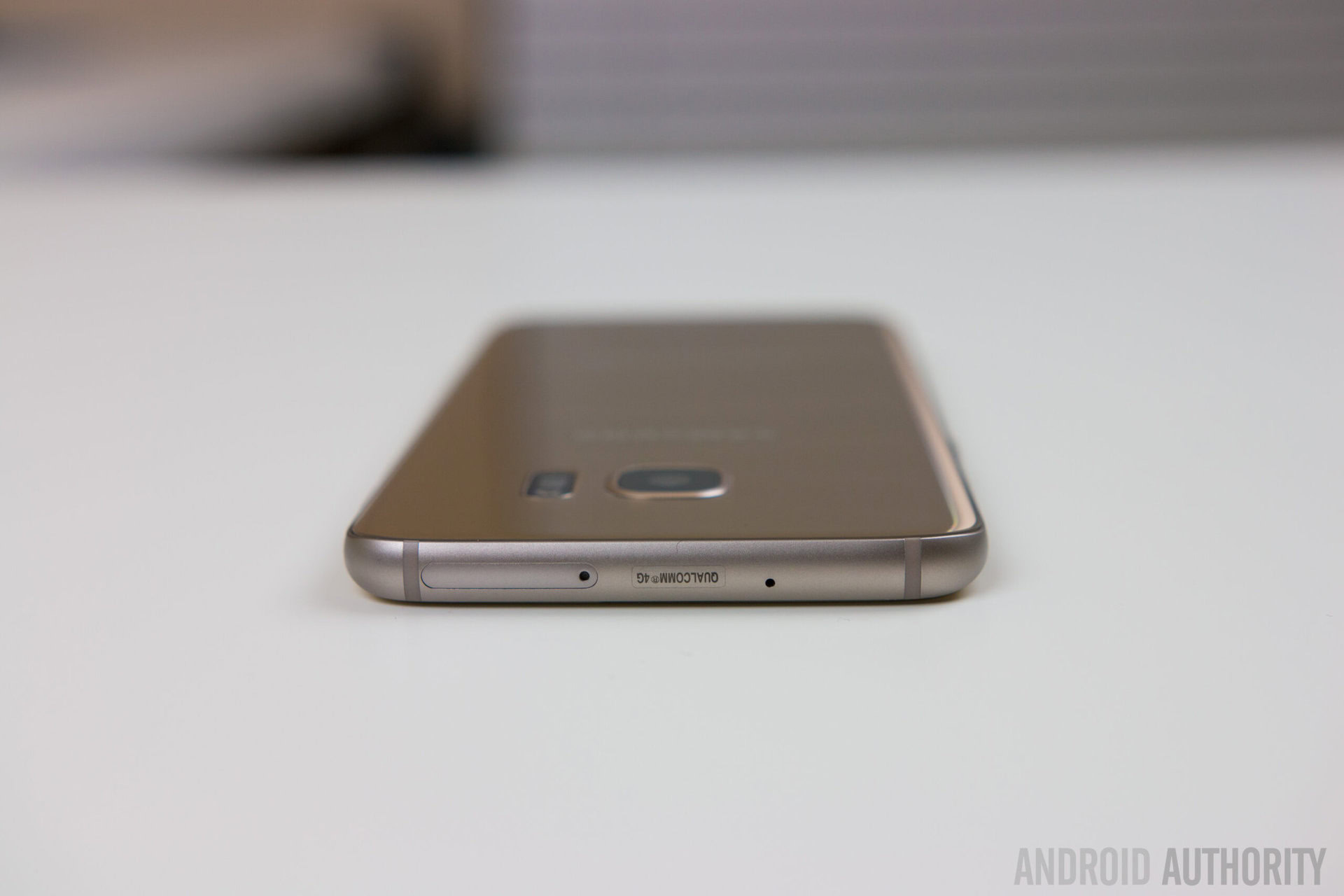
Moving around the rest of the elements of the phone, there’s really nothing out of the ordinary to report. On the front, you’ll find Samsung’s typical home button flanked to the left by a recent apps key, and to the right by the back button. All the typical sensors and front facing camera are found here as well. On the left side of the phone are the volume keys and to the right is the power button. Up top, there’s nothing but the SIM/SD Card slot, which we’ll talk about a little later.
On the bottom, you’ll find the headphone jack to the left, the microUSB slot in the middle, and the single speaker to the right. The microUSB slot is probably the most interesting story here, not because it’s anything special or new, but because Samsung is sticking to its guns with the Galaxy S7 Edge has chosen not to adopt the new USB-C standard.
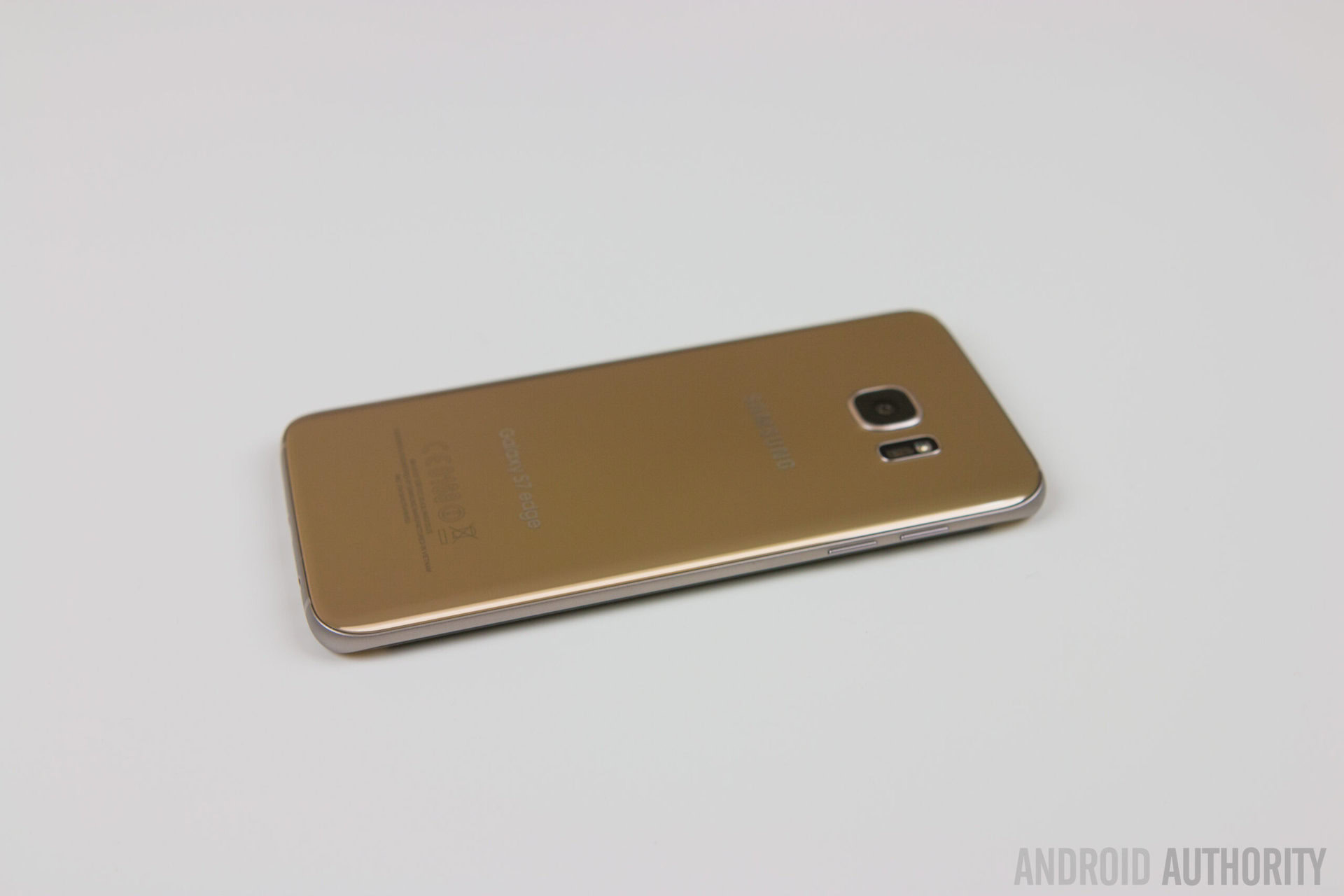
So why is Samsung sticking to microUSB while many of its rivals, including the LG G5 and the Nexus family, make the move? Probably the biggest reason is the Gear VR just hit commercially late last year, rocking a microUSB connection, and so it stands to reason that Samsung wouldn’t want to abandon this model so soon. It’s also very possible Samsung simply wanted to wait until the standard found its way into more accessories. For those with hundreds of microUSB cable laying around, the company’s refusal to jump to USB-Type C probably isn’t seen as much of a problem.
Bottom-line, the Galaxy S7 Edge might not look dramatically different from its predecessor, but little touches like a great feel in the hand, help create what is easily one of the most attractive looking handsets in the mobile world.
Display
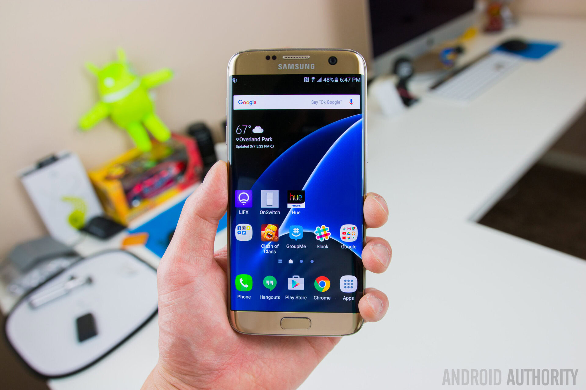
When it comes to display quality, it’s hard to beat Samsung, and thankfully the S7 Edge continues this legacy. While the S7 Edge’s Super AMOLED display remains very similar to the screen found on the S6 Edge, Samsung did bump up the size this time around, going from 5.1-inches to 5.5-inches. While this results in a lower pixel density of 534 ppi vs 577ppi on the Galaxy S6 Edge, the real world difference is negligible and if anything, the larger size means a better experience for watching movies, playing games, and pretty much anything else you might want to do.
For those that prefer a smaller display? You’ll want to check out our Galaxy S7 review.
Everything we love about AMOLED tech is present here in the S7 Edge, including vibrant, saturated colors, great viewing angles, inky dark blacks, and brightness that’s more than good enough even when using the phone outdoors. Comparing it to the AMOLED display on my Nexus 6P, I have to admit that the Edge display looked way better, especially outdoors. That said, the brightness controls (auto adjusting, etc) were a bit more aggressive than the 6P, and required me to manually move the slider a bit more than I normally do, but this was not really anything that bothered me too much.
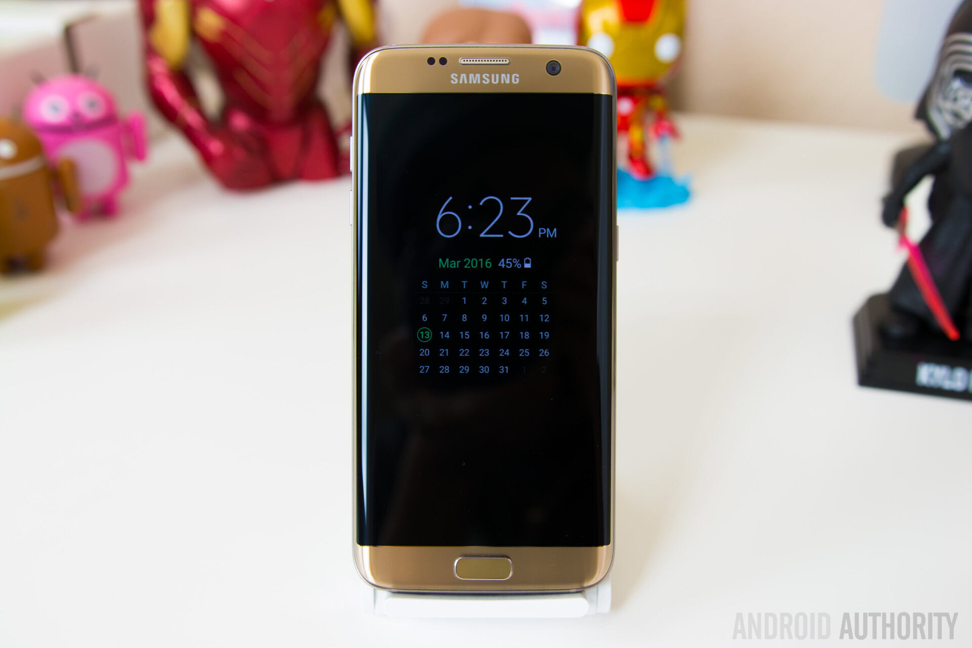
One change found on the Galaxy S7 Edge over the S6 Edge is the new “always on display”. While this is really more of a software feature than anything new with the hardware, we still felt it was worth talking about here. In a nutshell, the always on display gives you glanceable information such as the time, if you have any messages or missed calls, and there’s even options to display a calendar or even a picture/pattern. This is somewhat similar to what you’ll find on Motorola devices and modern Nexus family members, but the difference is that the illumination is constant with the S7 Edge and not just intermittent like with the former devices.
Until Samsung adds more features to it or gives you the ability to peek at notifications, it isn’t really all that useful and honestly feels a little half baked.
In the case of the Nexus, you actually get more information like glanceable notifications in this ambient display mode, whereas Samsung’s always on display is a bit lacking when it comes to detail. In fact, you only get alerts on the display for Samsung specific applications and not 3rd party apps like Facebook and Hangouts. This might change in the future as Samsung opens things up to others, but for now the actual usefulness of the always on display is somewhat up for debate outside of quickly checking the time. Still, I think it’s a great step in the right direction, and an AMOLED display certainly makes a more logical match for this feature than an LCD would (looking at you LG G5).
For those wondering about how the feature affects battery life, I found that on the day I had it disabled, I may have had a few extra percentage points of battery left when I went to bed over what I normally would have had. That’s not the most technical test I realize, but it’s pretty obvious to me that it doesn’t make a big difference and that’s down to just how energy efficient AMOLED displays are, especially when only needing to light a very small portion of the display.
Bottom-line, the display here is a good one and the always on display tech is a nice addition, though it may not be that useful for everyone. The good news is if you don’t think the always on display is something you’ll use, Samsung makes it easy to disable.
Performance & Hardware
In 2015, Samsung kept things pretty simple when it came to the processing package in its flagships, with the Exynos 7420 powering the Galaxy S6 family, as well as the Note 5. This was a break from past convention, which had typically seen Exynos chips in some markets and Qualcomm chips in others, and was likely a reaction to the bad press (and bad performance) associated with the Snapdragon 810. In 2016, Samsung has reverted to its old ways.
In most markets, the S7 Edge is powered by Exynos 8 Octa (8890) – consisting of quad-core 2.6 GHz Mongoose + quad-core 1.6GHz Cortex-A53 – and backed by a Mali-T880 MP12 GPU and 4GB RAM. In the United States and China, however, the Galaxy S7 ships with a Qualcomm Snapdragon 820 – consisting of a dual-core 2.15 GHz Kryo & dual-core 1.6 GHz Kryo – with an Adreno 530 GPU and also 4GB RAM.
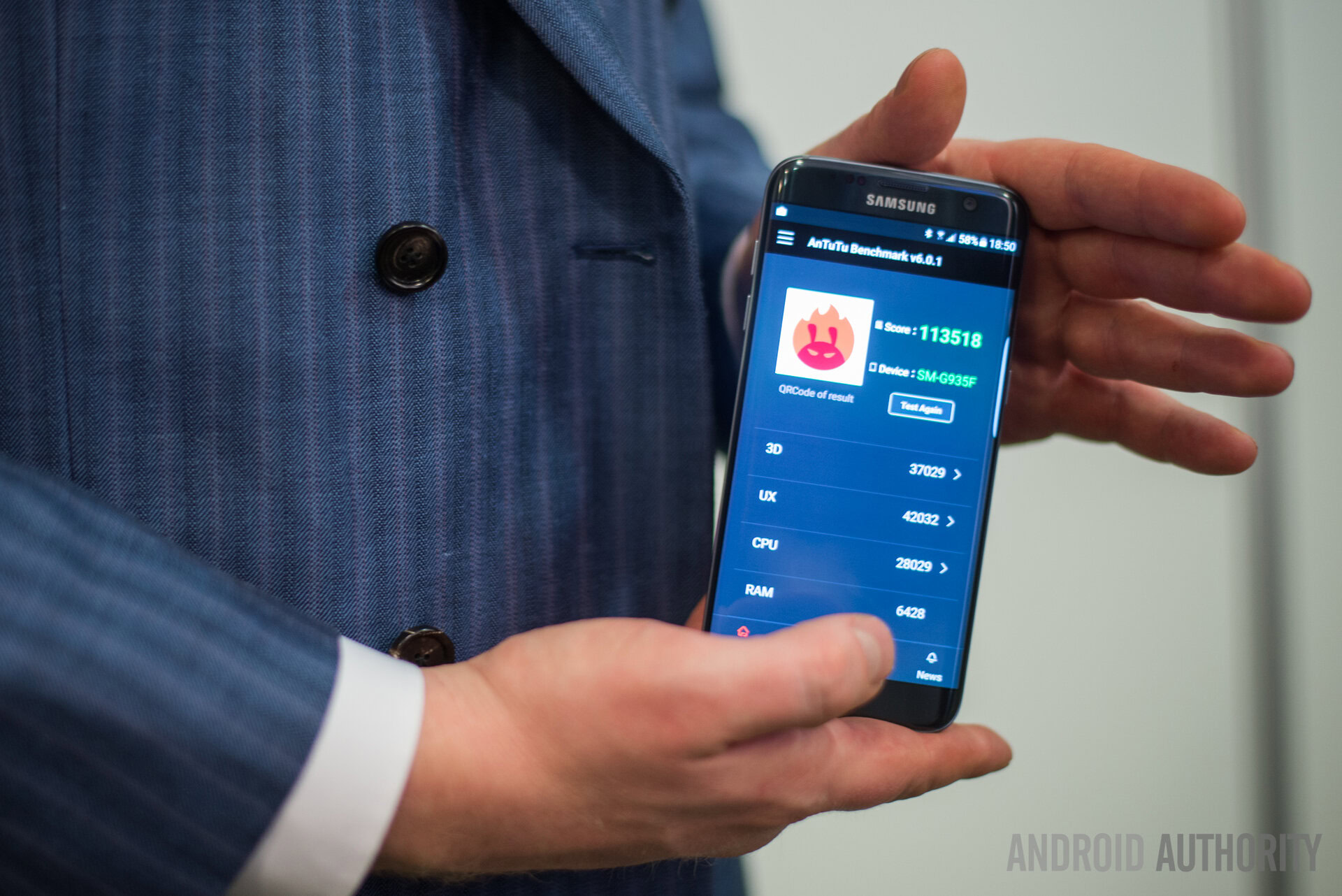
While I had the opportunity to test out an Exynos-powered model, Lanh utilized a Snapdragon 820 variant for the video review. Two different chipsets means you can expect a little bit of discrepancy between the two in terms of performance, at least on paper – and on benchmarks. In order to illustrate that difference, we ran a number of benchmark tests including GeekBench 3, AnTuTu, and 3Dmark.
Starting with GeekBench 3, you can see that the Exynos model scored a 2107 single-core score and a 6397 multi-core score, vs a single-core score of 2210 and multi-core score of 5230 with the Snapdragon 820 model. We can’t say that the multi-core score advantage for the Exynos 8 is too surprising, considering Samsung’s chip has an octa-core configuration while the Snapdragon is a quad-core setup. As for the single-core performance, the Snapdragon 820 has the edge here, even if the difference isn’t by much. Overall, the scores here indicate that the CPU performance between the two should be fairly comparable.
We didn’t want to stop at one test, however, and so we ran AnTuTu next. As you can see, the performance here was pretty spot on as well, with the Exynos model scoring a 127,507 and the Snapdragon 820 variant scoring 127,938.
Between AnTuTu you get a pretty good picture of how the two different CPUs differ, at least ‘by the numbers’. What about graphics performance, though? Great question.
3Dmark reveals that, while CPU performance might not be much different, there’s a much bigger gap in terms of the GPU. The Mali- T880 MP12 GPU scored a respectable 2157, but the Adreno 530 GPU outperformed it by a noticeable margin with a score of 2528. While it’s a bit discouraging to see the Mali struggling a bit compared to the Adreno GPU, it’s important to remember that both of these scores are actually quite exceptional when compared to the late-2015 flagships of the Android world, with the Nexus 6P scoring 1577, the Note 5 scoring 1220 – as points of reference.
The Snapdragon 820 technically shines a bit brighter than the Exynos 8890 in terms of their accompanying GPUs, but in day-to-day use, you’re not going to notice the difference.
If you want to get all caught up in the numbers, yes, the Snapdragon 820 technically shines a bit brighter than the Exynos 8890 in terms of their accompanying GPUs. That said, in day-to-day use, you’re not going to notice a difference. Both phones were extremely snappy, handling everything from general navigation and web browsing to multi-tasking and gaming, without skipping a beat, well aside from some very minor lag in the launcher, though this comes down more to software optimization, which we’ll talk about a bit further down in the review. Final Fantasy IX, Fahrenheit, and numerous other games ran beautifully on my Exynos-powered Galaxy S7 Edge and talking with Lanh, he had an equally wonderful experience.
If you’re wondering about overheating, neither the Snapdragon or Exynos model seems to have any trouble here. Part of this could come down to Samsung’s inclusion of a heat pipe that draws away residual heat. We obviously can’t say for sure that this is what is making all the difference, but will tell you that the phone would get a little warm under intensive use but not to the point of discomfort. In ‘regular’ use, like browsing the web or lighter apps, there was really no noticeable heat for me at all.
Moving past the processing package found in Galaxy S7 Edge, Samsung also has a few other key pieces of hardware worth showcasing:
MicroSD card has made a comeback
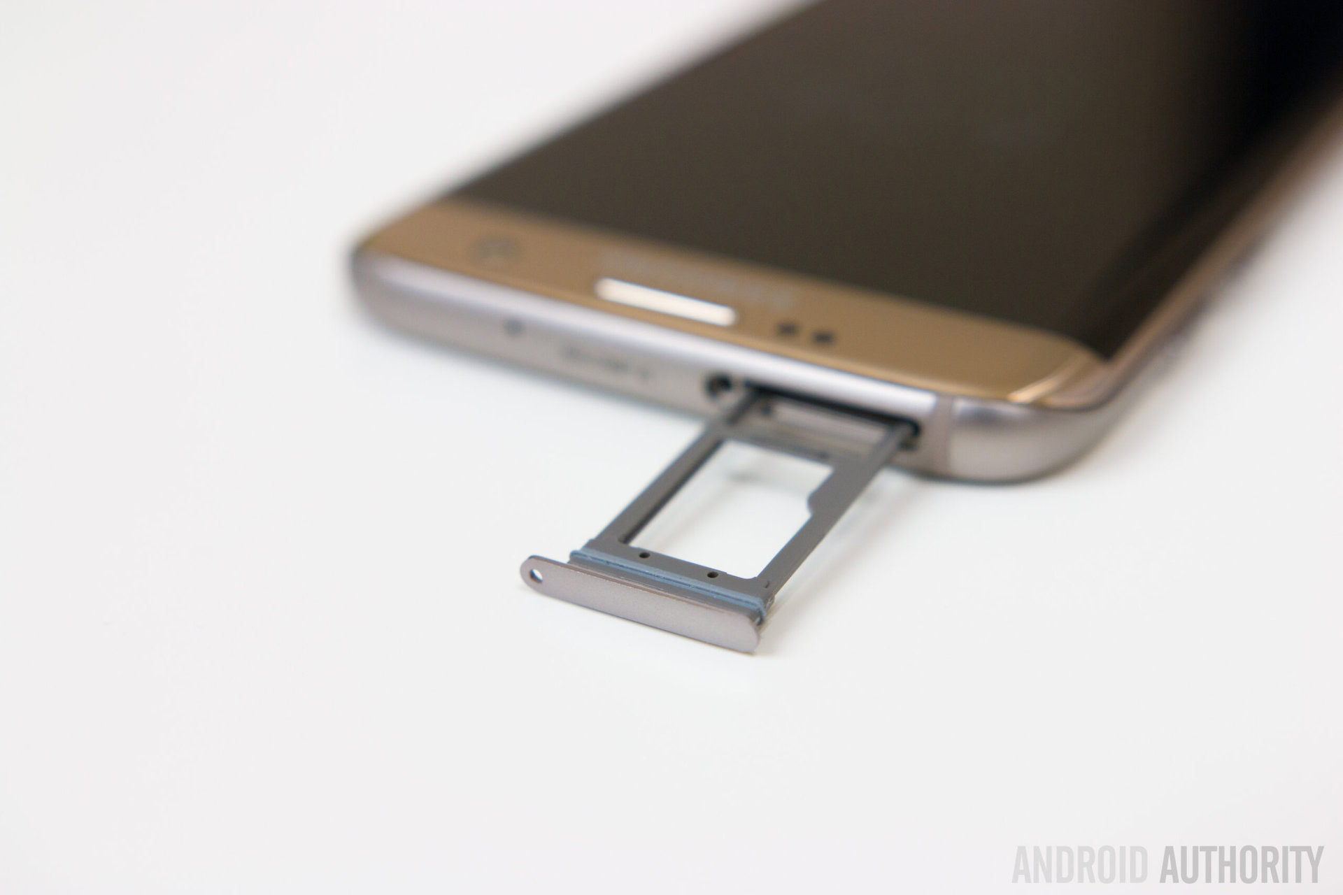
Probably one of the most controversial changes made for the Galaxy S6 and S6 Edge were the removal of microSD and user-replaceable batteries. While the later of these is still absent in the Galaxy S7 Edge, the former has returned! In addition to 32GB of internal storage, which in most markets (including the US and Europe) is the only option, the microSD slot (which is combined with a hot-swappable SIM tray) allows you to expand memory up to 200GB, though the theoretical limit is much higher, that’s just what’s readily available commercially at this stage.
While we would have liked to see a 64GB and even a 128GB variant of the Galaxy S7 Edge, the presence of microSD significantly alleviates this issue. That said, it is important to note that Marshmallow’s adoptable storage isn’t officially available here. For the uninitiated, adoptable storage basically takes your microSD card and your internal storage and combines them into one pool, automatically installing apps and other files wherever the OS sees fit. With this adoptable storage, your memory card is basically ‘locked’ to that device and this is one of the reasons Samsung officially states for leaving out the feature.
While we would have liked to see a 64GB and even a 128GB variant of the Galaxy S7 Edge, the presence of microSD significantly alleviates this issue.
There’s good news though. First, even though adoptable storage isn’t an option, I can confirm that you are able to manually transfer many of the Galaxy S7 Edge’s apps from internal storage over to microSD. That might not be as helpful as having it done automatically, but it’s still nice to know you aren’t just limited to storing music, movies, and other general files on your microSD card. Greater news for those that don’t mind tinkering: Samsung didn’t remove adoptable storage, it merely hid it. Thanks to Modder Paul O’Brien, we now know that it’s possible to re-enable the option of adoptable storage, as long as you’re willing to get a bit down and dirty with ADB. Even better, this option doesn’t require root.
The Galaxy S7 Edge gains water resistance
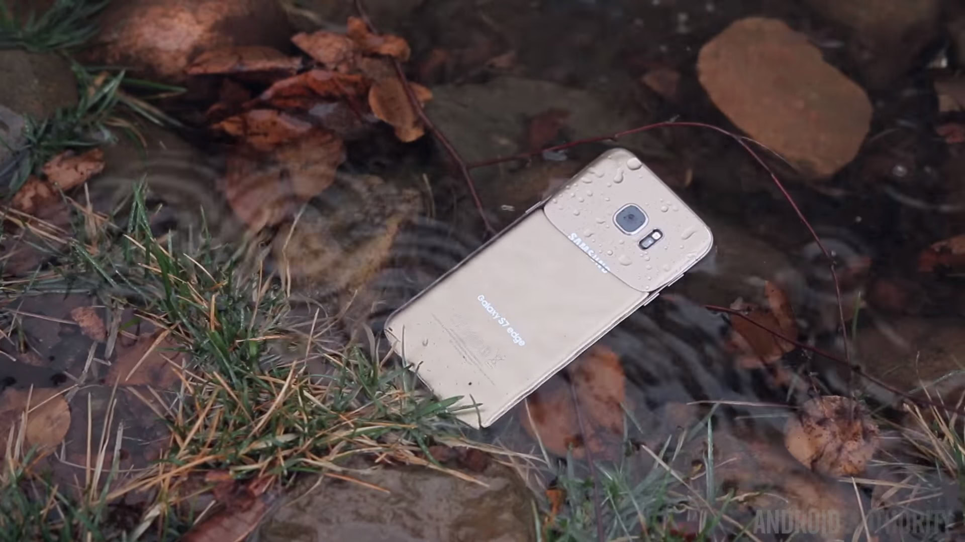
Waterproofing is also making a comeback! The Galaxy S7 Edge offers an IP68 rating, meaning it should be able to handle full submersion in water up to three feet deep for up to 30 minutes. Now, that doesn’t necessarily mean you should take this thing swimming with you or use it as a parlor trick to show off to your friends, but it does mean that if the worst happens, your phone should be able to handle it without any issue.
One word of caution though, the Galaxy S7 Edge’s waterproofing utilizes a gasket on the inside of the phone and part of this gasket essentially ‘comes out’ with the microSD/SIM card holder. So if your SIM tray isn’t firmly inserted, you could be in for a nasty surprise if this thing meets the water.
Fingerprint scanner
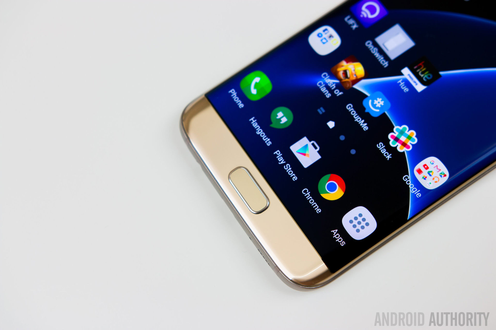
For the most part the scanner here remains the same as we saw from Samsung in 2016. That said, as Lanh mentions in his video review, “the fingerprint sensor feels a lot faster and more accurate over the S6 or even the Note 5 and very rarely did I ever run into the sensor not reading my fingerprint on the first attempt.”
Overall my experience with the scanner was similar, though in the first few days I did have some trouble with it here and there, but haven’t had a problem since. That said, I think it was really more of an end-user issue at the beginning, and the fact I was adjusting to the idea of a front scanner, coming from the Nexus 6P. In reality, front or back positioning doesn’t really make much of a difference and mostly comes down to preference.
Speakers, connectivity, and the rest
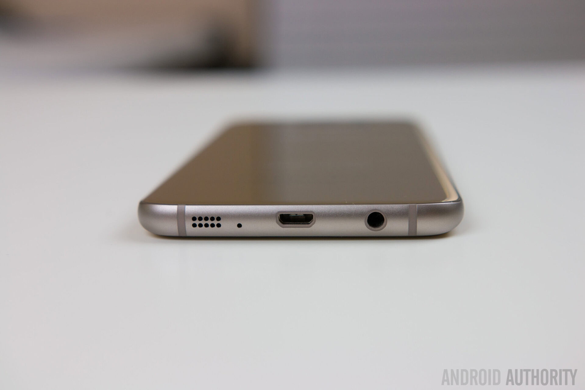
While many folks tend to use headphones or earbuds most of the time when consuming media or listening to music, if you’re the type that uses the built-in speaker, we must warn you it’s far from the best we’ve ever heard.
Part of this might be because we’ve become spoiled by great front-facing speakers from companies like HTC, Motorola, and even the Nexus family. That said, talking with co-workers that have used both the S7 and S7 Edge, at least a few of us felt the speaker experience might actually be a bit worse than we saw from previous generations, even if only marginally so. Bottom-line, the speaker experience is passable, but certainly won’t blow you away. As Lanh put it in his video review:
It’s super tinny at high volumes, and you can most likely thank the waterproofing for that one.
It is worth noting that the Galaxy S7 Edge now features Category 9 LTE, which supports speeds of up to 450Mbps. While Category 9 speeds were also offered in the Note 5 and Edge Plus, the original Galaxy S6 Edge featured Category 6. Of course, few networks support Cat 9 just yet, but it’s nice to see that the Galaxy S7 Edge is at least somewhat future proof in this area.
Another small hardware change has nothing to do with the S7 Edge itself. Instead, there’s a small hardware ‘accessory’ included with the phone that lets you connect the S7 to another Android smartphone via microUSB. The idea here is to make transferring over media and files easier than ever when switching from an existing phone, though you can also use this adapter to connect a hard drive to your phone if you’re so inclined.
As for the rest? Samsung has all the bells and whistles you’d expect from a Samsung device such as NFC, Wi-Fi, Bluetooth, and a heart rate monitor. There’s really no major omissions or additions other than the ones we already covered.
Battery life
Even though the Galaxy S6 Edge was largely well received, there were still a number of users that were less than impressed that the phone ditched its removable battery. Adding insult to injury, the Edge’s 2600 mAh battery performed pretty mildly, making it hard to even make it through a whole day’s use for many users. The situation improved a little with the larger S6 Edge but was far from perfect.
With the Galaxy S7 Edge, does Samsung finally manage to get battery size and life right? In short, absolutely. They crushed it! More specifically, the 3600 mAh battery found in the Galaxy S7 Edge makes it easy enough to get through a full day’s use, and honestly with a bit lighter use you’ll have no trouble making it through a day and a half or more.
Breaking things down a bit more, Lanh found that it was more than possible to get around 5 to 6 screen on time without even trying, and I had similar results with around 6 to 7 SoT averages without trying, with trying I was easily able to make up to around 8 or 9 hours of SoT though. That’s with normal settings, auto-brightness, etc. In order to get a slightly more technical take on things, we also decided to run PCmark “work battery” test. While the test recommends that users calibrate brightness to 200 cd/m2 in order to provide a consistent result when compared against others, we decided to turn off auto-brightness and crank up things to full. Our reasoning was that this would hopefully give users a “worst case” scenario of what to expect from your battery.
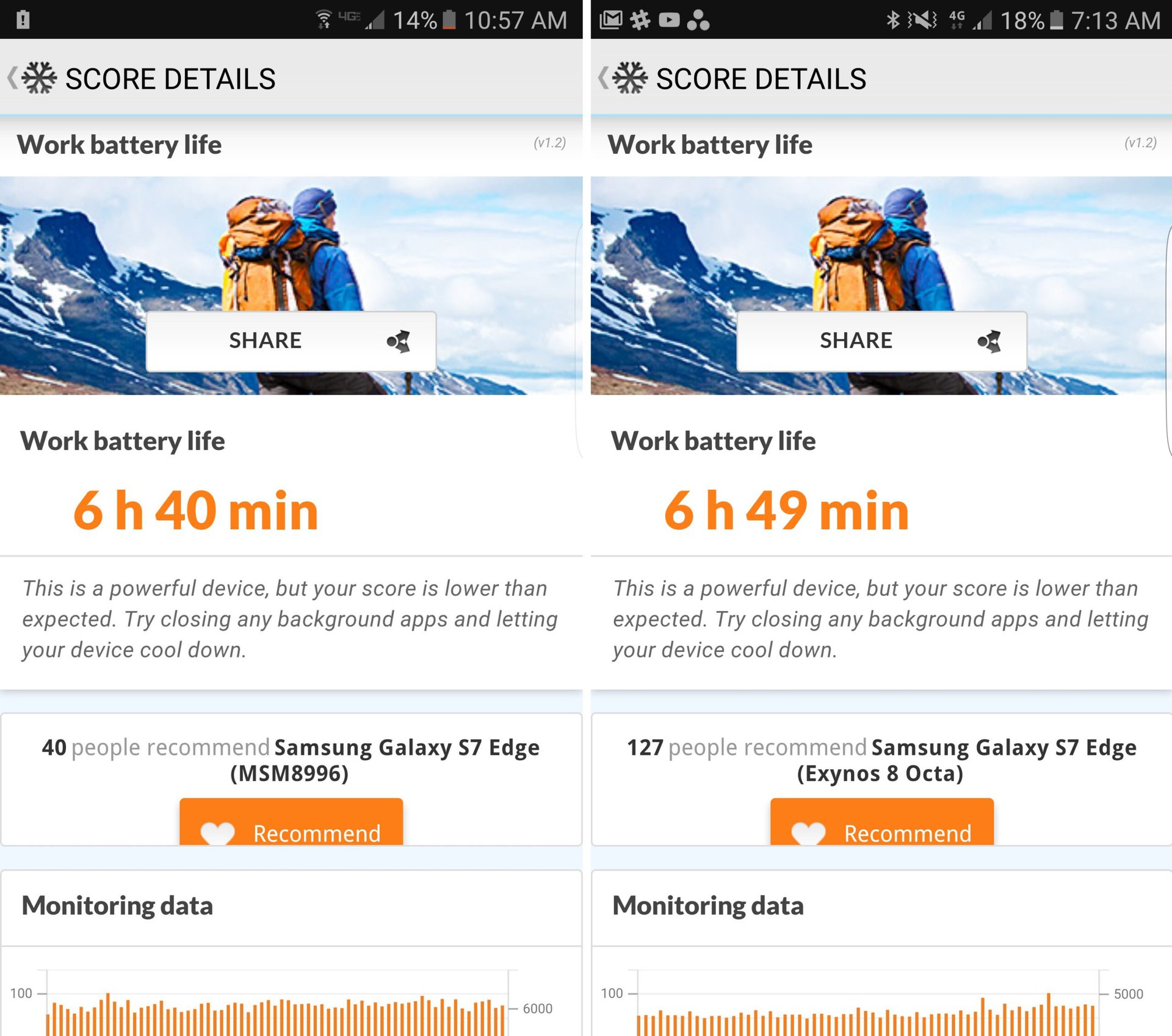
Our results for the Snapdragon model reported a “work battery life” of 6 hours and 49 minutes for the Exynos model and 6 hours and 40 minutes for the Snapdragon 820 model – once again suggesting that battery life between the two models is pretty consistent. Interestingly, this worst case battery life was on par with the ‘optimal’ average battery life for the GS6 Edge, illustrating how far the S7 Edge has come. Keep in mind that the PCMark test doesn’t drain the battery “to empty”, but simply to 20%, which is the point where most of us start reaching for our chargers anyhow.
For those wondering how the S7 Edge would fare at a more moderate brightness level, according to PCMarks’ average scores (based on user reports), the Exynos model typically averages 8 hours and 40 minutes, with the Qualcomm model getting around 8 hours and 17 minutes. This is relatively consistent with our “real world” battery results when using the Edge day-to-day. Bottom-line, the battery life in the Galaxy S7 Edge is exceptional, regardless of whether you have an Exynos or Snapdragon 820 variant in your hands. And if you do find yourself needing a bit extra juice, Samsung’s quick charging returns here in all its glory.
Typically, the Exynos model averages 8 hours and 40 minutes, with the Qualcomm model getting around 8 hours and 17 minutes.
For the Snapdragon 820 you’ll find Quick Charge 2.0 on board. Yes, 2.0 and not 3.0. While it would be nice to have the newest standard supported here, the charging speed in 3.0 isn’t said to be much better, just more power efficient. The Exynos, the model I personally used, you get Samsung’s proprietary Adaptive Fast Charging standard, which appears to be the same as it was last year.
For the Exynos model, I can tell you that Samsung’s charger promises about 50% of battery life in just 30 minutes. Based on my own tests, I can say that’s pretty close, with about 35 to 45% juice coming across for me in the promised time. Based on talking with co-workers, you can expect similar charging speeds from the Qualcomm variant as well.
The Galaxy S7 Edge (in both incarnations) also supports Samsung’s fast wireless charging, though this wasn’t something I personally tested out.
Camera
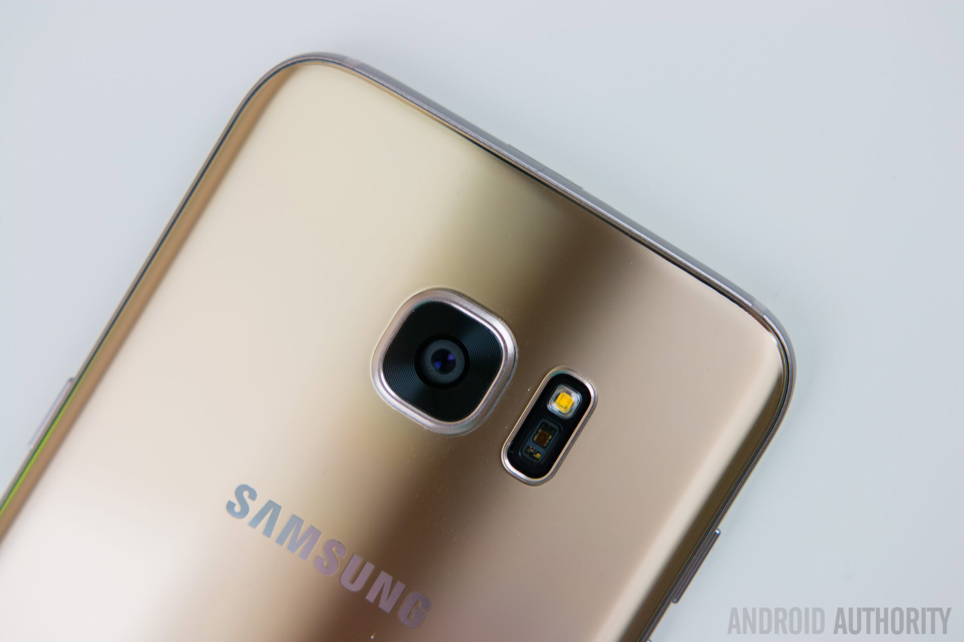
While Samsung has always done a pretty good job when it comes to camera quality in its smartphones, in 2015 we really saw Samsung up its game bringing us one of the best camera experiences ever to grace a mobile device. Instead of keeping the same package or just updating it slightly, Samsung has decided to take a different route with the Galaxy S7 Edge, opting for a 12MP camera instead of the 16MP shooter found in its predecessor.
Of course there’s more to a great camera experience than just megapixels. While the count may be lower, this has allowed for much larger pixels for increased low-light performance, in a move similar to what we saw from HUAWEI and Google with the Nexus 6P. The camera on the Galaxy S7 also has an f/1.7 aperture lens, a change from the f/1.9 aperture found in its predecessor. Some of the camera’s other features include optical image stabilization, phase detection autofocus, LED flash, and dual pixel technology. The end result is a camera with noticeably faster autofocus over competing flagship smartphones, especially in low light.
The new sensor utilizes dual pixel technology which isn’t new in the camera world but is the first of it’s kind in a smartphone camera. This creates for much faster autofocus and coming from something like the Nexus 6P there’s a very noticeable difference in focusing speeds especially in low light.
As for the actual picture quality? I found the experience really good here overall, though whether it’s a step back or forward from the Note 5 and Galaxy S6 family depends on what you’re looking for in a camera. Shots are very detailed and look great in well-lit indoor shots and in the daylight , but at the same time images seem to not be quite as sharp as they were with Samsung’s flagship phones from last year. There’s also a bit of obvious noise reduction going on here, too.
HDR mode is quite subtle with the Galaxy S7 Edge’s camera, and isn’t as aggressive as many other smartphone cameras out there, and that’s probably a good thing really. That said, it works well enough in bringing back more detail from the shadows and brightly lit areas of the photos.
Where the Galaxy S7 Edge’s camera really shines is in lowlight. Thanks to the larger pixels, there’s plenty of detail and the camera does a pretty solid job of keeping highlights in check. Of course there comes a point where even the S7 Edge’s camera can’t handle things, and so in extreme low light conditions you’ll start to find overexposed highlights, a lot of noise reduction, and a yellow hue is casted onto the images.
As for video recording, there’s plenty of modes here, including the ability to take 4K videos and OIS to help footage from getting too shaky. Keep in mind that there is also optional software video stabilization, but it cause a lot of warping in the footage and so you’re better off not using it.
On the front, you’ll find a 5MP camera that performs about how you’d expect. As is typical from front-facing cameras, low-light images tend to look less than great, but in good lighting, you can certainly get some pretty good selfies in. One special thing about the camera though is that you’re actually able to record at QHD resolution up front, which means you can get some pretty good video quality out of the front facer.
Summing it up, the camera experience on the Galaxy S7 Edge is better than the Galaxy S6 series in some ways, and perhaps a small step back in others. At the end of the day though, it’s still one of the best smartphone cameras available.
Camera software
Looking at the camera interface, you’ll find that not much has changed here from what we saw with the Note 5. Once again you get typical modes like auto, pro, and panorama, as well as some of Samsung’s special modes like slow motion, YouTube live broadcast, and selective focus.
One thing that is new is the addition of a feature records a short clip before a photo is taken. Samsung dubs the feature “motion photo”, and if it sounds familiar, that’s because it’s basically Samsung’s take on Apple’s live photos for the iPhone. Honestly, this isn’t a feature I’d personally use but I’m sure there are some of you who might find it worth messing around with.
Software
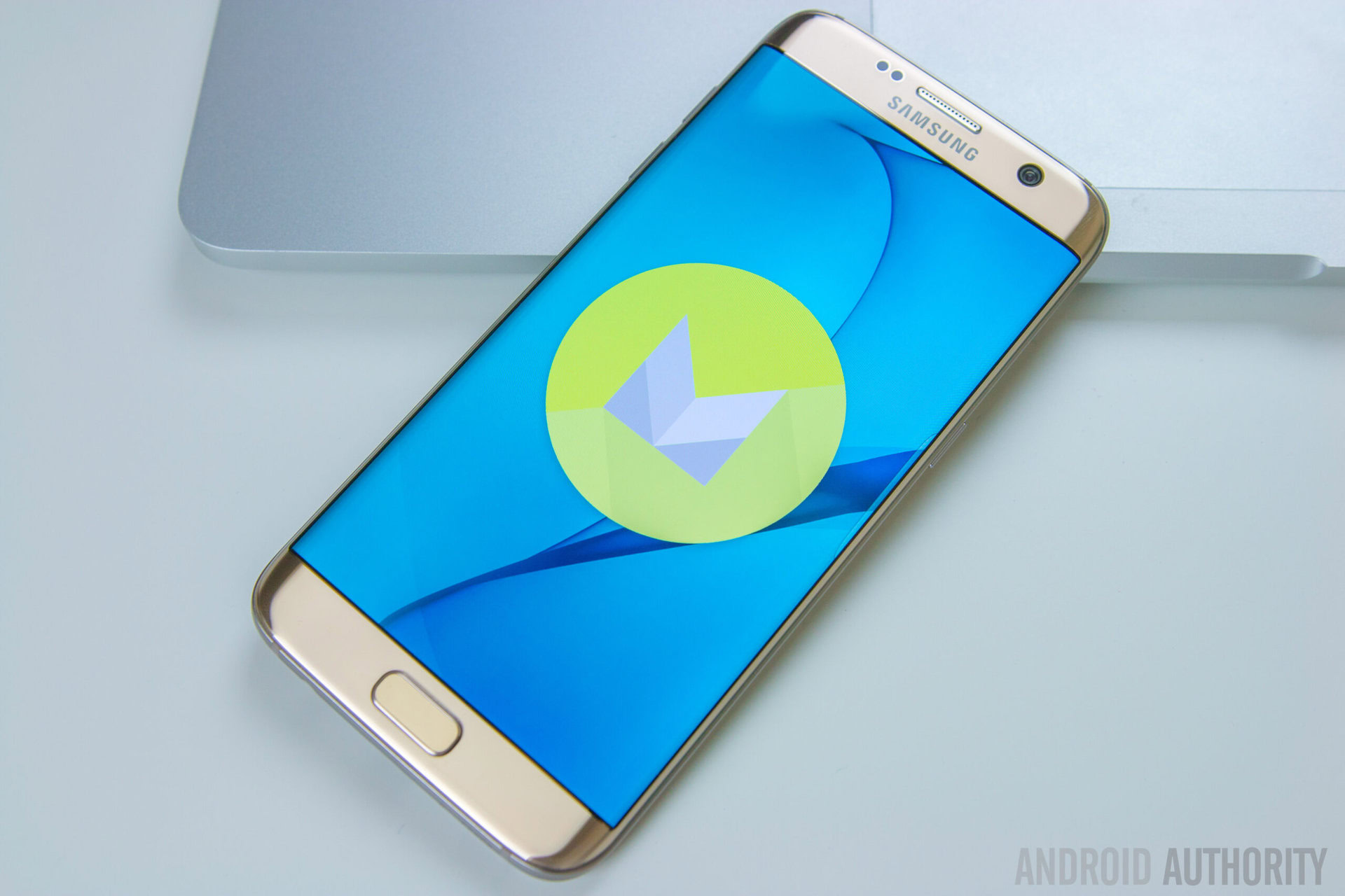
For a long time, TouchWiz has been criticized for being overly heavy and bloated, but this changed starting with the Galaxy S6 and S6 Edge. While the overall look and feel remained about the same, in 2015 Samsung trimmed down the number of pre-installed apps and ditched a lot of its more gimmicky features. It also toned down its nagging tutorials for the features it did leave in, and made many of its extras disabled by default. This meant that the out of the box experience was pretty clean and easy to dive into, but those who wanted to explore would find many unique options just waiting to be toggled on under the surface.
With the Galaxy S7 Edge, this same philosophy continues, and despite being built on Android Marshmallow, the software here looks very similar to what we saw in 2015. That’s not to say there aren’t any changes. Aesthetically speaking, the bright colors in the notification shade have been traded in for subtler tones of blue and gray. Some of the animation effects throughout the UI have also been switched up a bit, with some of the changed animations seemingly taking inspiration from Google’s Material Design guidelines this time around.
The whole experience is actually very fluid and quite impressive.
The UI also feels pretty snappy, and the aggressive RAM management issues from the Galaxy S6 Edge seem to no longer be a problem. While there are a few dropped frames here and there while swiping around the UI, especially when dealing with Upday (international) or Flipboard (USA), the whole experience is actually very fluid and quite impressive. Honestly, the same could be said for the Note 5 and Galaxy S6 series for the most part, though things seemed to be even more refined with this latest Marshmallow build of TouchWiz.
In late 2015 Samsung was rumored to be working to optimize TouchWiz to provide a faster experience, and so it’s hard to say if this refinement is the result of this optimization or simply the faster processor and extra gig of RAM are helping to keep things lag-free and responsive. Perhaps a combination of both factors? Regardless, I have no real complaints about UI performance and found TouchWiz to be a pleasant experience overall. As far as looks go, that’s a mostly subjective thing, but if you’ve enjoyed TouchWiz in the past, you’ll like what you see here. And even if you don’t, options like a Theming engine give you the flexibility to change up the look and feel a bit.
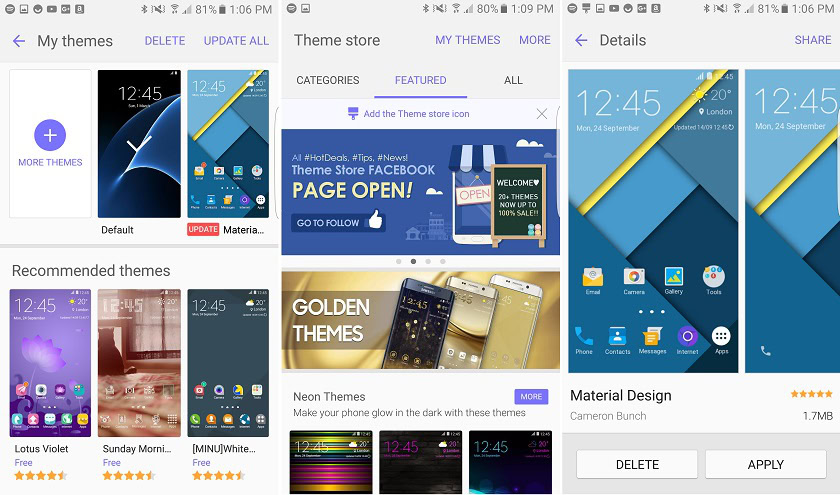
Listing every single feature that TouchWiz adds or tweaks over stock would make this review thousands of words longer than it already is (and it’s already practically a novel), and so we plan to explore TouchWiz’s software in an in-depth feature focus that will be making its way out to you in the weeks to come.
That said, we did want to focus on a few key features, almost all of which are returning from the Galaxy S6 family and/or the Note 5:
Smart dialer

Samsung’s dialer is clean, easy to use, and has some really cool additions including the ability to automatically scan unknown numbers and inform you if they are common scammer/spammer numbers. There’s also the ability to reject calls with a predefined message, or quickly shoot the caller a custom message.
Multi-tasking
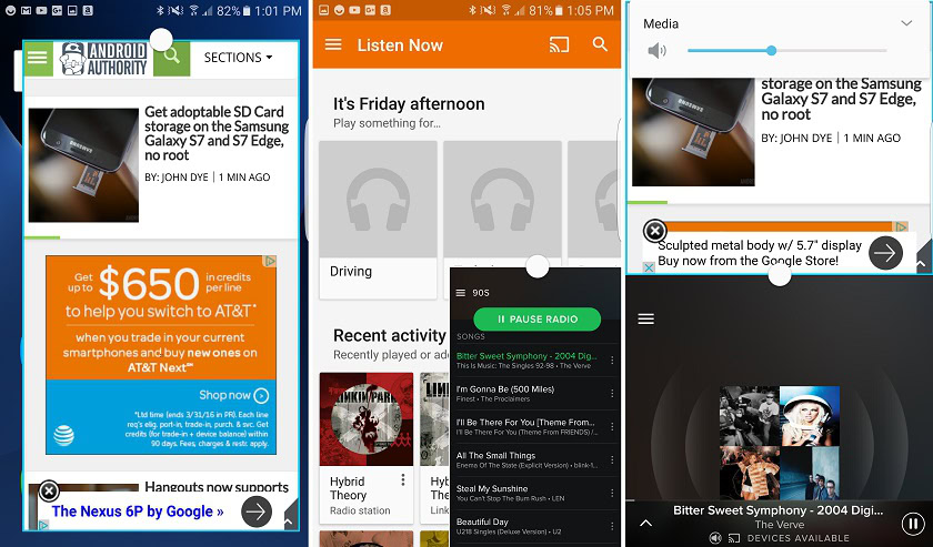
Samsung isn’t the only Android OEM to offer improved multi-tasking modes, such as floating window and multi-window functions, but its implementation is without a doubt the most polished. From splitting your screen to moving things around as a floating window, everything was fast and fluid here and while not everyone will use these features, I found them pretty useful personally.

I also have to say that while there are certainly apps that don’t work with Samsung’s multi-tasking additions, there’s a surprisingly large number of apps that do. This is in stark contrast to implementations like we saw with HUAWEI’s Mate 8, which only offers a few first party apps. Then again, considering the prolific nature of Samsung’s brand, we can’t say we are too surprised to see that so many 3rd party app developers have integrated the functionality.
Smart Manager
Samsung’s smart manager aims to make it easier to see information about your battery life, your remaining RAM and storage space, as well as details on security with the ability to scan for malware and turn on options like Knox. The RAM manager allows you to manually kill different apps. The storage manager lets you look at what’s less and helps you remove “unnecessary data”.
As for battery, you can quickly turn on power saving mode, ultra power saving mode, check out app power saving details, and access your battery usage information. This is without a doubt the most useful part of the Smart Manager and the only one of the options I actually found myself using more than once.
Easy Mode
Increasingly common in OEM skins is the presence of an “easy mode”, which aims to make the UI… easier. For TouchWiz, the UI gets simplified into a homepage with a few largescreen icons for dialer, messages, web, camera, gallery, and contacts. To the left of the homescreen is an easy to use page for assigning contacts, and to the right of the main homescreen is a page for your app icons as well as a way to open up the app drawer.
The app drawer also features enlarged icons, and even the settings UI has been simplified a bit, removing the ability to quickly search for things – which seems to make things harder in my opinion, but is probably aimed at keeping users from being inundated in options.
Honestly, I have no use for easy mode, but it could be great for those who are coming to a smartphone from a more traditional old-school device.
Samsung Pay
Competing for attention against both Apple Pay and Google’s own Android Pay, Samsung Pay’s biggest trump card is the fact that it utilizes special tech that lets it be used even in readers without NFC. I’m not going to get into too many details here, but recommend checking out Lanh’s video that shows off what Samsung Pay is, and how it works, below:
Gaming tools
One of the few new features found in the Galaxy S7 Edge’s implementation of TouchWiz is the new “Game Launcher” and its accompanying “gaming tools”. The first of these features gathers up all your games into a special folder and allows you to turn off notifications, turn on power saving modes while gaming, and of course makes it easy to launch your games quickly. As for the gaming tools feature, a small icon peaks out of the corner of your display, and expanding it gives you options to turn off alerts, lock recent and back keys, minimize the game, take a screenshot, or even record what’s going on.
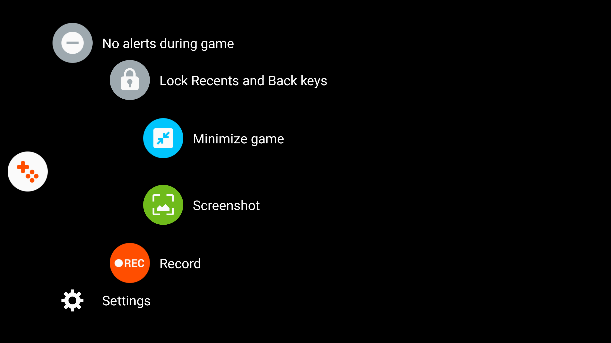
Whether or not you use these features will be up to you, but I found them fairly useful and could see how they could become even more important as Samsung continues to push forward with VR, gaming, and the like.
Edge features
Samsung’s Edge features return once again, but in this third iteration they receive a few new tweaks. In fact, the Galaxy S7 Edge features bring back some of the functionality of the Note Edge’s features, which were removed in the S6 Edge likely in favor of simplicity.
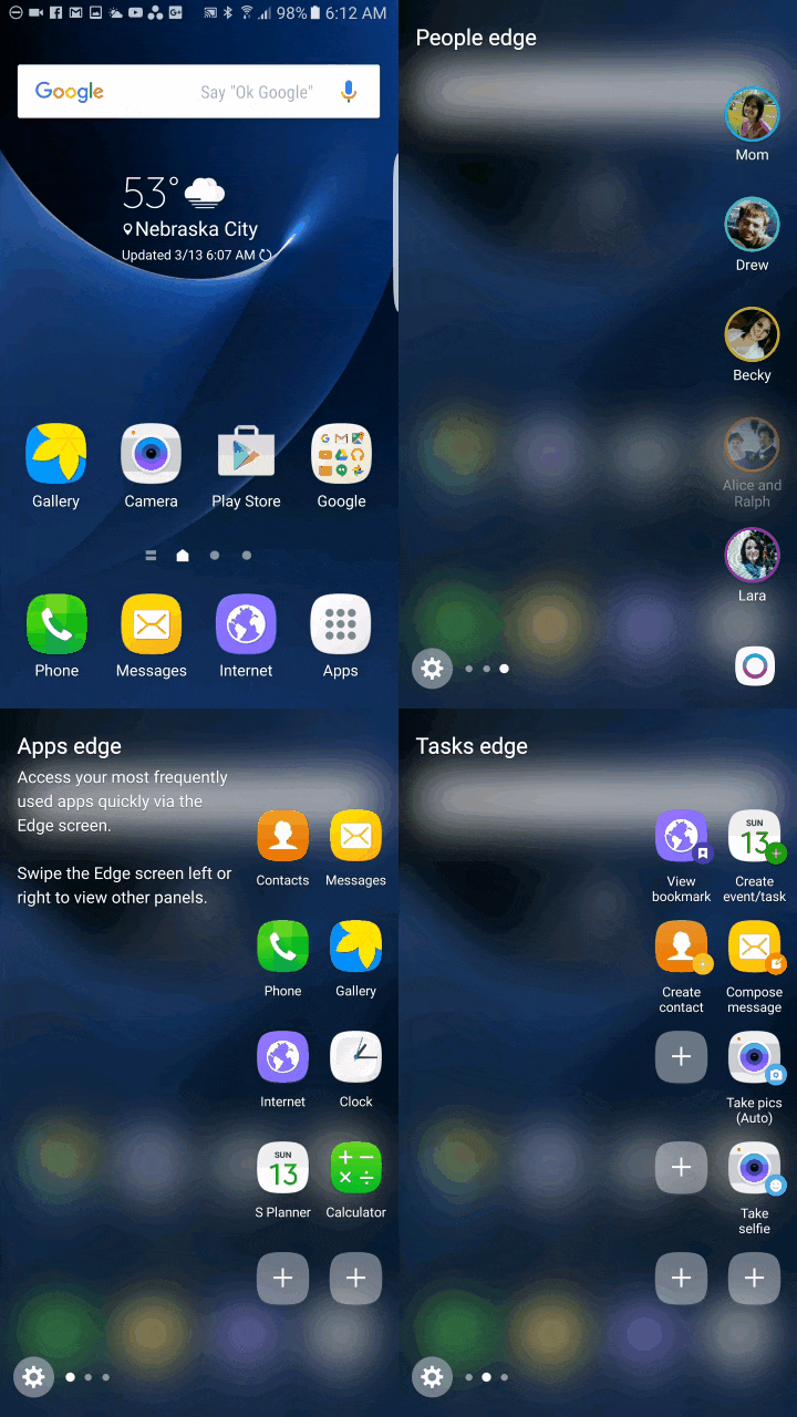
You still get edge lighting, apps edge, and people edge, but the interface is now wider and allows for twice as many app shortcuts. Samsung has also added the tasks edge that lets you create shortcuts for common task like taking selfies, creating calendar events, adding alarms, composing emails, and more.
There’s also plenty of new optional edge panels, and this is where we see an experience a bit more akin to the Note Edge, with options including a compass, ruler, weather, sports scores, stocks, Yahoo News, and more. Most of these I didn’t find necessary for long-term use beyond initially messing with them, but it’s nice to see Samsung injecting a bit more functionality into the Edge UX this time around.
Galaxy Labs: turning off the app drawer
I like the app drawer and hope the rumors that the final Android N builds will ditch the app drawer prove to be incorrect, even if LG has made the move with the LG G5. That said, options aren’t a bad thing and so Samsung gave folks a special “Galaxy Labs” feature that lets you toggle off the app drawer, giving you an iPhone-esque homescreen experience.
I suspect most Android users won’t use this feature, but it’s there if you want it. Worth mentioning though is that the option isn’t there on the Verizon or T-Mobile models, and likely has been removed from all US versions of the phone, at least carrier models. Those internationally should find the feature in-tact, however.
Software – my impressions
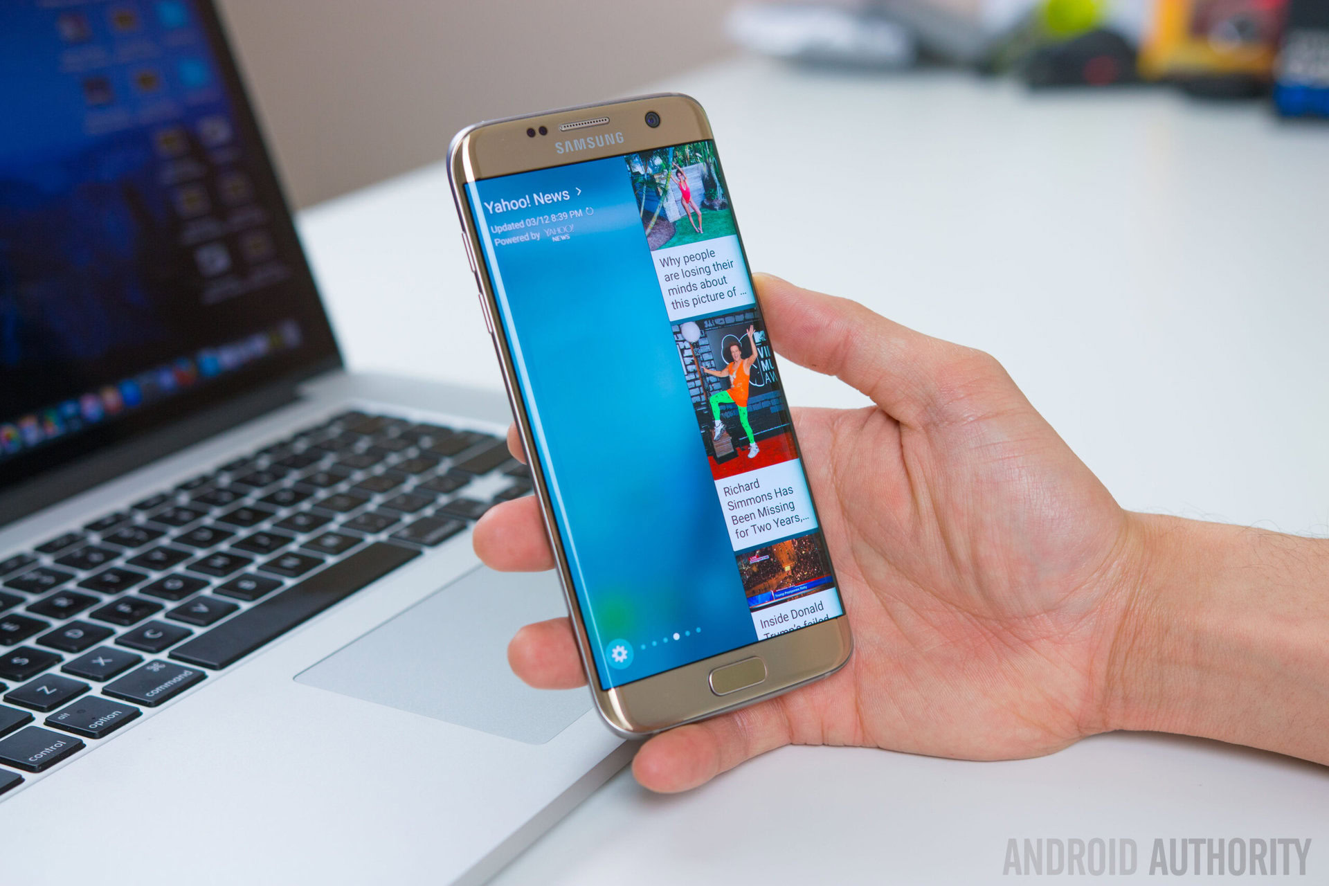
On Friday I released a feature where I talked about my reactions to the TouchWiz experience as a primarily stock Android user. Overall, I was impressed. The truth is TouchWiz in this latest iteration is very functional, fast, and has tons of great options for you to explore – or ignore, totally up to you.
Is it perfect? No, but it’s pretty close and there’s enough cool extras to make any of its existing faults and flaws worth putting up with and the more you use the phone, the less these little quirks bother you.
Just remember that, as Lanh mentions in the video above, the US carrier versions have a good deal of added bloat. Thankfully this isn’t the case with the international Exynos model I’m carrying, though I agree with Lanh that there are still redundancies such as the existence of many Samsung apps that do the same thing as Google’s apps (S Voice, etc), but it’s not the end of the world by any means.
Gallery
Pricing and final thoughts
While the Galaxy S6 Edge was about reinventing and reinvigorating Samsung’s design language, the Galaxy S7 Edge’s story is far more modest, as Samsung has instead opted to merely refine and evolve what it believes is a winning formula. Mission thoroughly accomplished.
It’s amazing how just a few tweaks and changes can totally take a concept from being good to great. When the Galaxy S6 Edge debuted last year, I remember thinking that Samsung was on to something and that the phone was absolutely gorgeous, but I still felt Samsung had managed to miss the mark in a few ways. With the S7 Edge, Samsung has fixed just about every single remaining pain point that users had with the Galaxy S6 Edge before it.
The Galaxy S6 Edge too sharp for you? No worries, the S7 Edge’s curved back solves the problem. Feel TouchWiz is a tad too slow? Optimization and an improved processing package to the rescue. Missed that microSD and waterproofing from the Galaxy S5? Those return too. For those that felt that the S6 Edge was bit too small for their tastes but that the Edge Plus was too big for easy one-handed use, the S7 Edge is a perfect compromise here as well, fitting great in the hand and, though it’s a bit of stretch, the phone isn’t too terribly hard to use with just one hand either.
About the only complaint point users might have at this stage are the lack of a removable battery. Honestly though, this matters a lot less this year thanks to a combination great battery life and fast charging. Yes, I realize that swappable batteries are still very import to some of you, but for many of us, it’s just not that crucial of a matter.
Okay, some of you might also consider TouchWiz a ‘pain point’, but honestly I believe that much of the hate that comes its way is built on preconceived notions built either simply by what we’ve read or by our experiences with earlier versions of TouchWiz. The reality is that TouchWiz might have its quirks, but – at least in 2016 –it’s fast, fluid, and one of the best performing Android skins on the market.
Here’s what Lanh had to say about his experience, using the Snapdragon 820 (T-Mobile carrier branded) model:
Even though Samsung’s UI has made some improvements, it’s still far from perfect. It’s a lot less intrusive and if you don’t like many of the features you can simply turn them off but Samsung still packs a lot of crapware and redundant applications into their phones. For basically every google application, there’s a Samsung equivalent of that same app so on the S7 Edge you have two email apps, two web browsers, and two voice assistants with google now and s voice, and depending on which carrier you’re on you may be dealing with even more redundant apps or bloatware.
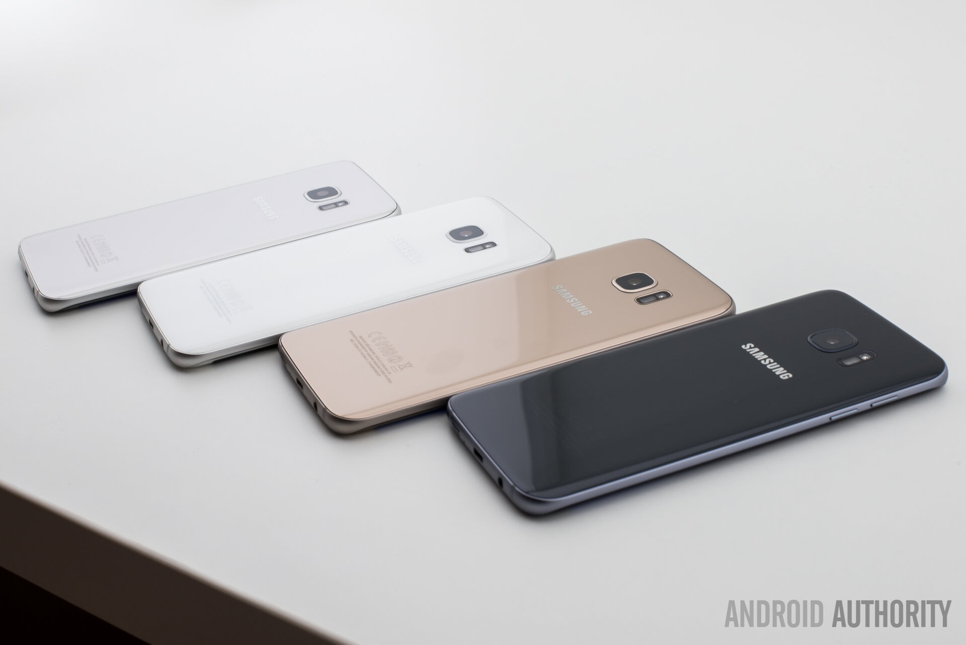
Bottom-line, the Galaxy S7 Edge might not be the ‘perfect’ phone, but it’s damn close. If you don’t mind giving TouchWiz a shot and want a well-performing phone with great looks and just about every feature you could possibly want, the Samsung Galaxy S7 Edge is worthy of your consideration. Just keep in mind that it isn’t the cheapest phone on the market, with a price tag right around the $800 mark and available in your choice of black, gold, white, or silver – depending on the market and your carrier.
Yes, that’s a hard price to swallow in a world where it’s possible to get a pretty high-end Android experience for hundreds less with devices such as the Nexus 6P, Motorola Moto X Pure Edition, and several others. Of course these phones also come with their own set of compromises, sacrifices, and quirks. Ultimately, it comes down to whether you feel that the S7 Edge’s features, performance, and good looks merit such a high price tag. Some of you will say yes, others will say no. As always, that’s the beauty of choice in the world of Android. Nonetheless, the big takeaway here is that the Samsung Galaxy S7 Edge continues what the S6 Edge started and has significantly perfected the Edge formula in 2016.
Want o keep the conversation going beyond the comment section?