Affiliate links on Android Authority may earn us a commission. Learn more.
Talon for Twitter: The App Review
Published onJanuary 14, 2014

Functionality
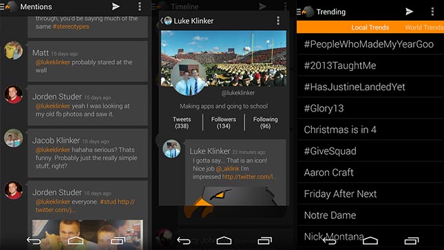
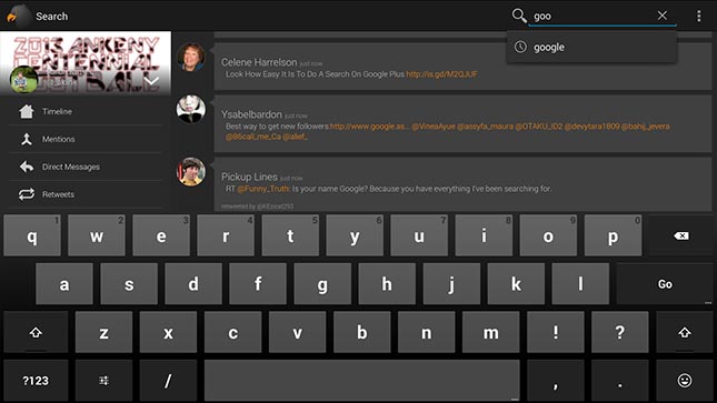
Talon falls in the middle when it comes to functionality. It isn’t the most feature heavy Twitter app out there, but it’s worlds better than the stock Twitter app and for a lot of reasons. To start, you can do all the Twittery things that Twitter users can do like browse trends, send tweets, respond, retweet, favorite, use lists, browse your timeline and many others.
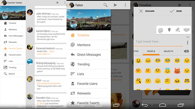
Where this app really shines, though, is the under the hood tweaks. You can have it stream tweets live instead of having a timed refresh if you prefer. You can customize your notifications, theme, add emoji support in the settings, access a built in browser and YouTube player, and you can even choose between the Standard Talon layout and the Hangouts layout. It also supports two Twitter accounts for you multi-account users out there.
One of the more unique features is Talon Pull which is an ongoing process that shows up in your notifications that opens a pop-out window so you can check Twitter more quickly. This is awesome for two reasons. One, it allows you faster access to Twitter and two, because it shows up in the notifications but not in the status bar. BBM could learn a thing or two from this app.
There is also a themer engine so eventually there will be more options as to what theme you want to run. For now, the standard three are available including black, dark, and white. There is also a Dash Clock widget, Google style pull to refresh, and the standard slide out menus on the left side.

Design
In terms of design, Talon is all aces in our book. It follows many of the Android standard design elements like the pull-to-refresh, the slide out left side menus, sliding tabs, and more. The timeline is easy to read, the pop out windows look good and the theme engine is sure to bring a lot of custom themes that people can use to augment their experience further. Simply put, it looks as nice as it works.
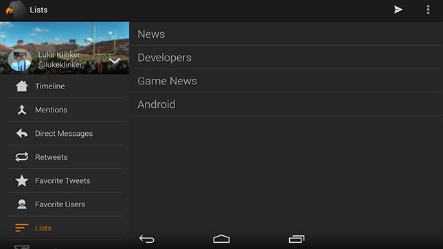
The tablet interface is pretty much the regular interface with the menus extended. This allows easier navigation and uses the extra screen real estate more efficiently. Otherwise, it’s pretty much the same as the phone layout in all of its design goodness.

The Good
So here’s what stood out to us as the best parts of this app.
- Talon Pull allows quick access to Twitter without opening the app or interrupting what you’re doing. We especially like that it shows up in the notification bar without adding an icon to the status bar.
- The design is gorgeous and only helps to augment the experience. Things are proportionate and you’re never more than a swipe and a click away from accessing anything.
- The theme engine is fairly powerful and it’s going to be sweet when themers get in there and start making custom themes.
The Bad
Like any app, Talon isn’t perfect. Here are the things we didn’t like so much.
- It’s still a little rough around the edges. We managed to get it to force close on us once while sending a tweet and it took us a couple of attempts to send a picture with our tweet. Also, refreshing takes a little bit longer than average sometimes.
- The only other issue we could find is a lack of some hashtag specific features. There is no hashtag auto complete which is essential for Twitter. The developer has stated that he’s working on this, but that there are bigger fish to fry first.

Final Thoughts
The bottom line is that this is a very beautifully done Twitter app. We’ve no doubt that the issues mentioned earlier are simply early jitters and that the bugs and kinks will be worked out eventually. Aside from those small problems, we couldn’t find anything negative to say about Talon.
It’s $1.99 in the Google Play Store and, frankly, there are a lot of things that you can spend $2 on that are worse than this. The only potential problem down the road is if Twitter’s dastardly token limit will cut this app’s life
