Affiliate links on Android Authority may earn us a commission. Learn more.
Things the Google Play Store could improve: Part 1 - The top charts
Editor’s note: this is the first post in our new series discussing Play Store flaws and what Google could do to improve user experience. Feel free to join the discussion and suggest new topics.
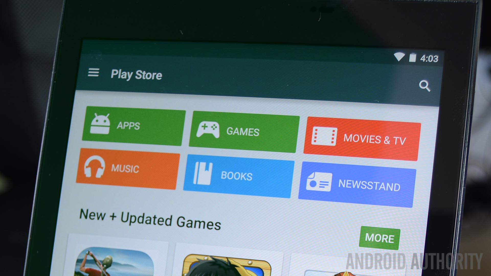
The Google Play Store top charts are an amazing tool for consumers. It shows a quick glance of the popular and trending applications that everyone else is using which kind of allows consumers to curate their own experiences. The idea is amazing but far from perfect. Games seem to run the place and there exists only moderate continuity between the web and mobile platforms. Let’s dig in and talk about the problem.
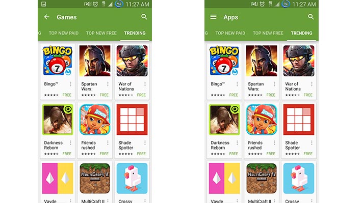
The Main Top Charts in both Apps and Games are actually just two charts for games
To show what we mean, we decided to go through the top apps charts to show you just how few apps you can actually find in the top apps categories. We had no need to do this for the games because the top games charts were, predictably, all games.
Here’s the breakdown:
- Top Free in Android Apps
In the Top Free in Android Apps section of the Google Play Store, we took a look at the top 50 apps. Of those, 29 were games and 21 were apps. - Top Paid in Android Apps
In the Top Paid in Android apps section, we again looked at the top 50 apps. Of those, 35 were games and 15 were apps. - Top Grossing Android Apps
You can see where this is going. Out of 50, 48 were games and 2 were apps. - Top New Paid Android Apps
Out of 50, 26 were games and 24 were apps. - Top New Free Android Apps
Out of 50, 43 were games and 7 were apps.
When you don’t take duplicate apps into account, the top 250 apps across five categories are actually 181 game entries and 69 apps. In other words, 72.4% of the apps you’ll find in the top Android apps charts are actually games. When you add in the 250 top games across the same categories on the Games side, that means across ten categories and 500 apps, 431 are games and 69 are apps.
Now let’s count duplicates!
Let’s go a step further. I took a close look at the top 50 apps and games listed over the ten top charts across both apps and games. Here are some observations.
- Total number of duplicates
In the top 500 apps listed in the top charts, 160 apps/games were listed at least twice. Of those, 12 of them were listed three times, 12 were listed four times, SimCity BuiltIt was listed five times, and Trivia Crack was listed an astounding six times. - There are less than 300 unique apps in the top 500
The total number of applications and games actually listed in the top 50 of each of the ten top charts categories is 290. Only 130 of those are listed just one time. - Games win again!
Of the 160 apps and games listed multiple times, 159 were games. Pandora Internet Radio is the only application listed twice.
If you need to see these numbers for yourself, I’ve compiled a nifty spreadsheet that you can view here. The bottom line is the top charts don’t really show much variety and give games a heavy spotlight by allowing them to invade the Top Apps charts, despite having a whole set of charts specifically for games.
Most of the duplication takes place between the same charts on Apps and Games. For instance, Clash of Clans tops both Top Grossing charts and that’s really unnecessary. Further duplication takes place when newer games hit the top spots on the new games and apps charts and then become popular enough to make it on to the regular top apps and games charts. Back in January 2015, this happened to Trivia Crack, which appeared on six different charts.
Note: The spreadsheet was put together in January, 2015. The top charts do change periodically and while the numbers may not be exactly the same, the ratios should remain consistent.
The website and mobile apps don’t work the same
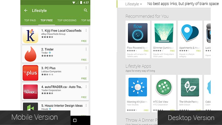
Now that we’ve discussed the front pages, let’s dig a little deeper. On the mobile app, going to any app category gives you a range of lists to look at based on Google’s recommendations for you and just some general lists as well. You can then swipe over and see the top charts for those apps. It’s a fairly simple layout that makes sense and exposes people to a wide variety of recommendations and top apps in each category. No problems there.
On the website, however, none of these things are true. There is zero access to top charts unless you Google Search them directly. This is especially confusing considering the UI. The white bar that houses the category name is otherwise left totally blank and there seems to be more than enough space to put links to the top charts there. After all, they do exactly that on the front apps page and on the front games page. Furthermore, it doesn’t make sense not to link to them because Google has these webpages. They already exist. Why not give us a link to find them more easily?
To their credit, the recommended content and specialized lists (e.g. the top apps for teachers in Education) remain the same in both the web and desktop versions.
What can be done to fix it?
Thankfully, these shortcomings could be easily fixed:
- Remove games from the top apps: This is fairly obvious. There is a whole section in the Google Play Store specifically for games. It seems incongruous to put games in the top apps categories while maintaining a totally separate section dedicated solely to games. This would also cut down dramatically on the number of duplicate entries resulting in a wider variety of apps to choose from.
- Graduate top new free and paid to actual top paid and top free: Many of the duplicate listings take place on the top new free and top new paid in both games and apps. If a game or an app is so popular that it makes the regular top paid and top free charts, would it not make sense to remove them from the new paid and new free to make room for the next generation?
- Put the top charts links back into the website version: That white bar at the top isn’t being used for anything else anyway. Plus, the top charts for each category actually do exist and Google does maintain them. There seems to be no reason not to put a link there.
Wrap up
There are two sets of charts that you really can’t do anything about and they are Trending and Top Grossing. Changing Top Grossing in any way would compromise the integrity of the information. That means some duplication will invariably take place. Trending is a whole different story. I’m not entirely sure what that chart actually is, what it does, how it’s calculated, or if there’s anything actually wrong with it.
With the proposed solutions in place, there should be a wider variety of apps for consumers to choose from. With maintenance on the top new paid and free charts, new developers and new apps have a greater and more frequent chance of being noticed. It may also coax those who long ago abandoned the top charts to revisit with the promise of newer, more varied content.
That should also help with the app discovery problem and expose more people to more new content more often. With the links restored in the website version, Google will achieve more continuity between the desktop and mobile experience which will make both platforms easier to understand for consumers.
Of course, we’d love to know what you think. Are there any other solutions you would suggest to fix this problem or are we way off base with any of ours? Sound off in the comments!
Check out the other parts of the series:
Part 2: In-app purchases