Affiliate links on Android Authority may earn us a commission. Learn more.
Toys and jewels, or why I love the Pixel 4’s design
Published onNovember 24, 2019

Warning: What follows is just, like, my opinion, man.
I think the Pixel 4 XL is the best designed smartphone of 2019 and probably the nicest phone I ever tried.
I see you rolling your eyes. You’re perfectly entitled to think that your Note, or your Mate, or your iPhone is, in fact, The Prettiest Phone Ever. But you’re still reading this, so I am going to assume you’re at least vaguely curious to know why I find the Pixel so alluring.
In a nutshell, it’s because the Pixel 4 feels like a toy, and that, my friends, is the best thing about it. Let me explain.
Modern high-end smartphones are almost universally like expensive jewelry. Just think about it. They are pricey. They are status symbols. They are fragile metal-and-glass miniatures designed to look nice, rather than feel nice. They are shiny, blingy, colorful. They catch the eye, but god forbid your toddler gets hold of them, or that you throw them too hard onto the nightstand when you go to sleep at night.
Just like diamond rings and pearl necklaces, we’ve all kind of accepted that flagship phones are worth more than their intrinsic value. Otherwise why would we keep buying phones that cost $1,200 when there are phones out there that do the same things for a third of the price?
Read: Flagship killers used to be exceptional. Now they’re almost old news.
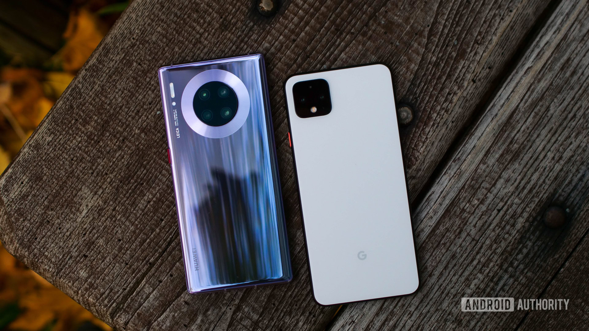
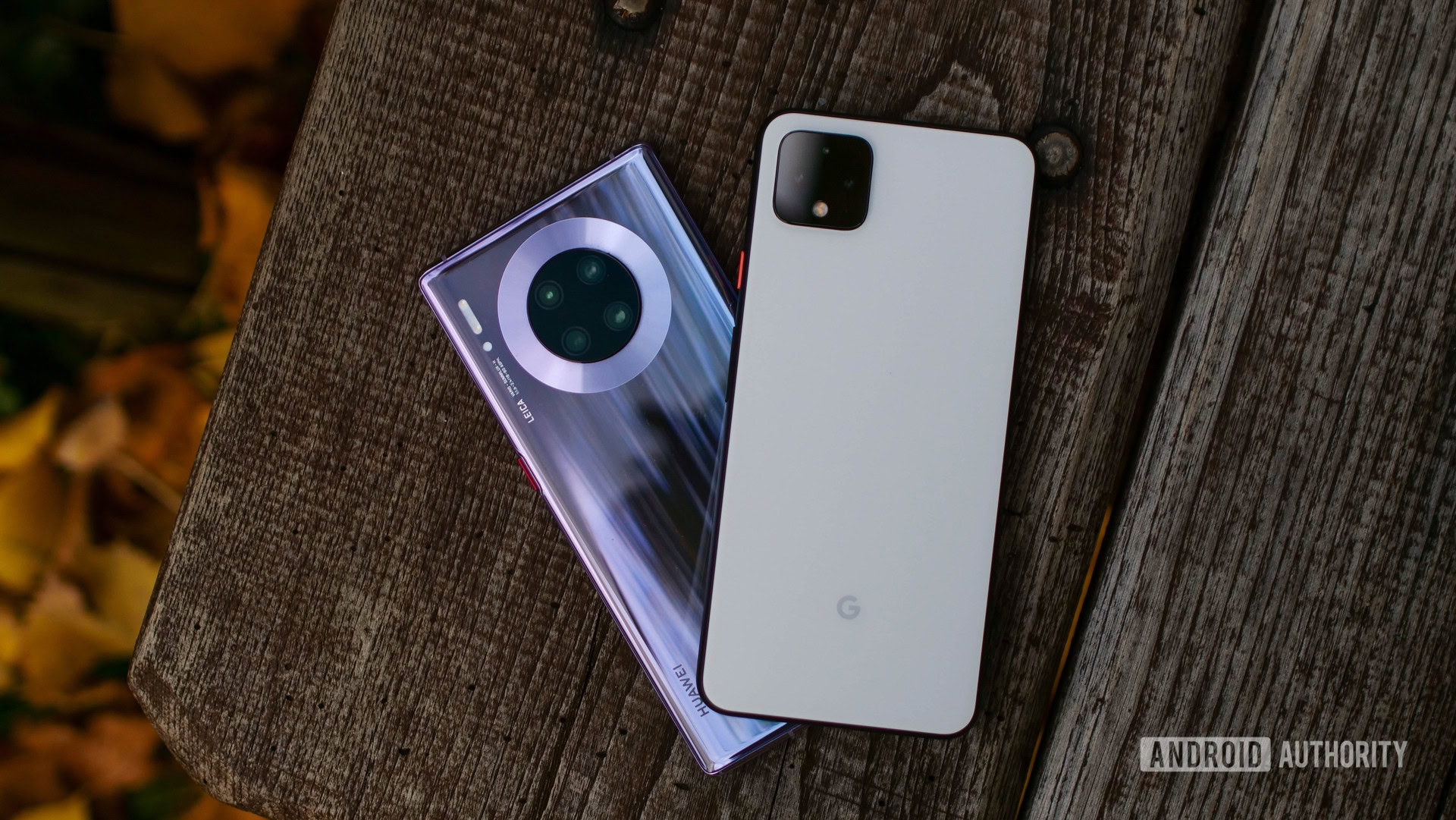
The HUAWEI Mate 30 Pro exemplifies the jewel-phone trend. Incidentally, it’s the phone I used before the Pixel 4 XL, and the contrast between them couldn’t be any starker.
Don’t get me wrong, I enjoy the Mate 30 Pro’s design, with its futuristic wraparound screen, smooth curved body, and sophisticated colorway. It’s gorgeous, it truly is. It’s also cold, sterile, and impersonal.
Using a Mate 30 Pro on the go gave me constant low-key anxiety that I was going to drop it and then I would have to explain to my boss how I managed to ruin a €1,100 piece of kit. But even when I had it safely tucked in my hands, I couldn’t shake the feeling that the Mate 30 Pro was just too rich for my blood.

The Pixel 4 XL, in contrast, feels infinitely more approachable. I have the white model, but it’s not the sterile icy white you’re afraid to stain with your greasy fingers. The matte texture, the black frame and camera module, and the playful orange power button give the Pixel a warm personality that I can’t help but love.
The black-white-and-orange color palette and the matte finish make the Pixel look and feel like a toy. This was an intentional stylistic choice and the proof is there for anyone to see in the form of the default live wallpaper. Called Doodle, it shows bouncy little gizmos that are clearly inspired by a toddler’s playset. They move around the screen as you play with the phone, and you can even experiment with your own designs.
The Pixel 4 feels like a toy, and that's the best thing about it
You may find the Pixel 4 XL’s toy-like design a bit much. After all, toys tend to be cheap and disposable and we quickly outgrow them. These are not exactly qualities you want to associate with a product that starts from $900. I totally get it, but I still love that the Pixel is approachable, fun, inspiring, and warm, just like the favorite toys of my childhood.
If anything, I wish Google had gone all the way in on the toy esthetic. Even though the frosted finish gives it a warm, plastic-like texture, the Pixel 4 XL is still glass, as fragile as any jewel-phone on the market. Unfortunately, the stigma around plastic seems too deeply ingrained, even for Google’s bold design team. Again, this is my totally subjective take, but I think there are many like me. There’s a reason why plastic phones like the Galaxy S2 and the Nexus 5 are still so fondly remembered.
Read: Waterfall displays: The latest design trend nobody’s asked for
As a side note, I really don’t mind the Pixel 4’s top bezel. Sure, it looks a bit dated, but it becomes invisible as soon as you start using the phone. It’s function over form for a change.
The more we advance in the smartphone era, the more serious we seem to take them. The Pixel 4 XL bucks that trend. It’s a playful jab at an industry that takes itself entirely too seriously.
The Pixel 4 XL has many flaws that are well documented. In more than one way, the Google phone is trailing competition from within the Android ecosystem and from Apple. But design is not one of them, and I wish more phone makers would take inspiration from Google.
We have enough sophisticated jewel-phones already. So, phone makers, give me more fun toy-phones, and while you’re at it, maybe give plastic another shot, would you?