Affiliate links on Android Authority may earn us a commission. Learn more.
10 ugliest phones ever made — brace yourselves, people!
July 24, 2018
Phone makers took a lot of design risks back in the day to make their phones stand out from the crowd. A lot of them failed miserably, producing handsets that are ugly beyond belief. Some didn’t look like phones at all, resembling things like powder cases and AC remote controls — check them out for yourself below.
Siemens Xelibri 6
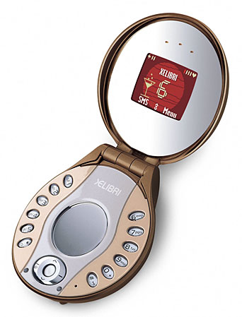
This ugly thing was announced in 2003 and targeted at women. It looks like a powder case and sports two mirrors for adjusting your makeup while on the go. The keys were weirdly arranged on the sides — making texting a pain — and the screen was way to small. It was available in two colors: sheer bronze (brown and silver) and platinum blush (pink and silver).
Motorola StarTac Rainbow
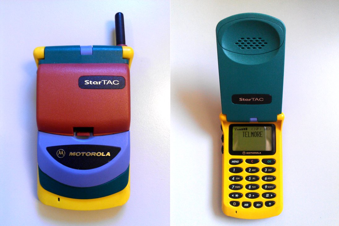
The Motorola StarTac Rainbow looks like something you’d get for free in a cereal box. It has a toy-like design featuring way too many lively colors and an uneven surface up front that’s horrible to look at. The ugliness is toned down a bit when you flip open the device, but not by much. The combination of yellow and dark green is far from fabulous and gives the device a very cheap look.
Toshiba G450
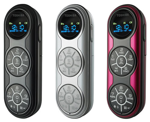
This looks more an air conditioner remote control than a phone. The design incorporated three circles — the top one housed a screen and the bottom two featured number pads. Not only does this make the Toshiba G450 ugly, it also makes it extremely hard to use. Just imagine how difficult texting on this device would be.
Read next: Android smartphones with the best battery life
F88 wrist phone
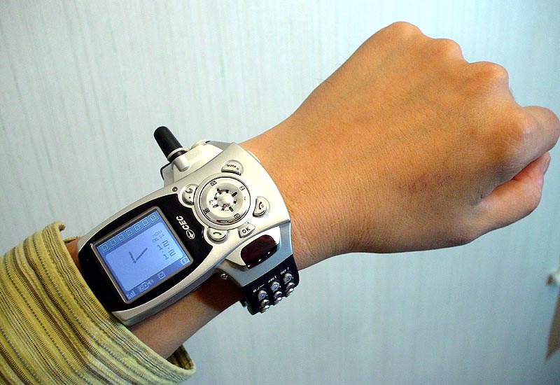
Are words even necessary? I mean, just look at this thing. It’s ugly as hell. It’s a phone you wear on your wrist, with a number pad integrated into the strap and a display that sticks out from the side. There’s also an antenna on top that adds to the overall ugliness of the phone. CEC Corp initially made it exclusively for one of the most famous Chinese ping-pong players, but later started selling it to everyday consumers as well.
Goldvish Le Million
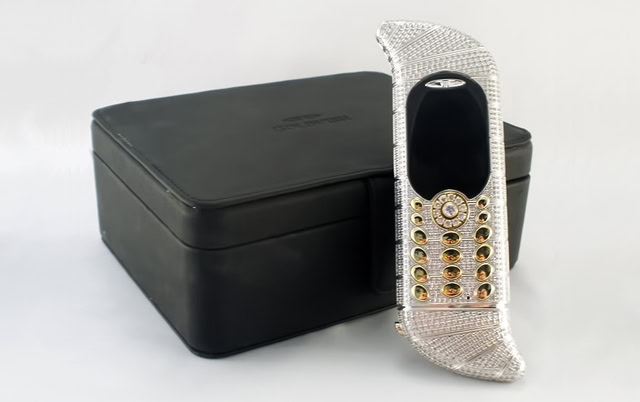
One of the ugliest phones to date also happens to be one the most expensive phone ever sold. Valued at around $1.3 million, the Goldvish Le Million is made of 18-carat white gold and features 1,800 diamonds — all making it look extremely tacky. The overall design is too over the top, partly due to the strangely curved top and bottom — a shape which kind of reminds me of Santa’s hat. Also, the bottom has to be removed in order to charge the device.
Bang & Olufsen Serene
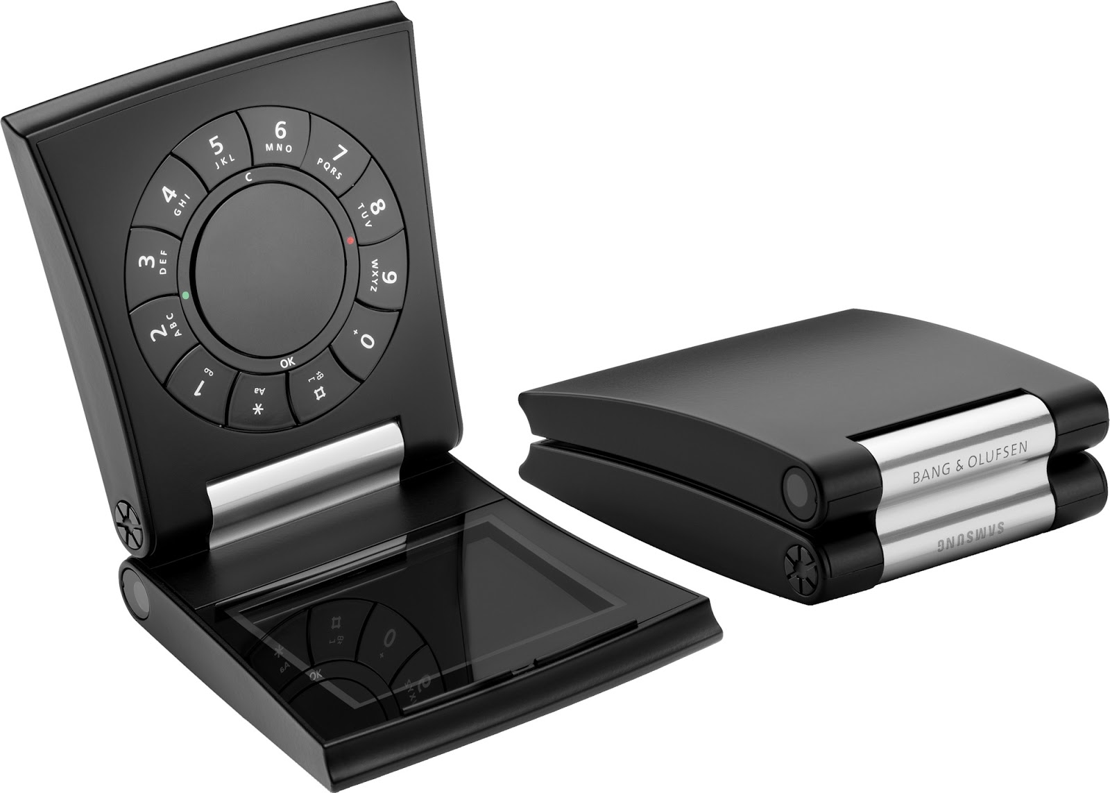
The Serene was designed by Bang & Olufsen and manufactured by Samsung. It truly is a unique phone — not in a good way. It has a clamshell design and a built-in motor to open and close the phone. It featured a rotary-style keypad on the top and a screen on the bottom, which was pretty odd. The phone’s camera was also on the side of the device. It even come with a special screwdriver for accessing the battery and SIM card — seriously.
Read next: 5 best notch-less phones for all you notch haters out there
Motorola V100
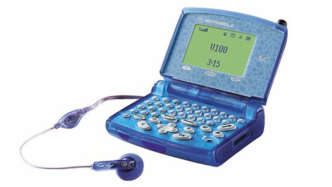
The Motorola V100 reminds me of a toy calculator. Everything about it is hideous — from the buttons and color to the shape and that weird pattern around the display. It came out in 2010 and is quite thick at 2.5cm. It’s great for texting because of its full QWERTY keyboard but sucks at everything else. It also has a transparent body that doesn’t look nearly as cool as the HTC U12 Plus and Xiaomi Mi 8 Explorer Edition.
Nokia 7280
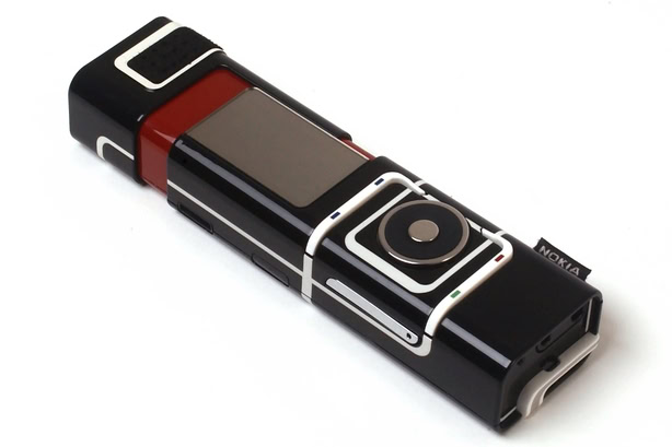
Nokia produced many gorgeous phones in the past, but this sure wasn’t one of them. The 7280 was dubbed the lipstick phone because of its weird shape. It featured a rotating wheel called the Navi spinner instead of a keyboard. So to send a text, you have to use the spinner to select each letter, which takes a lot longer. The phone also has a Nokia-branded piece of fabric on the side, just like the ones you normally find on T-shirts.
Sierra Wireless Voq Professional
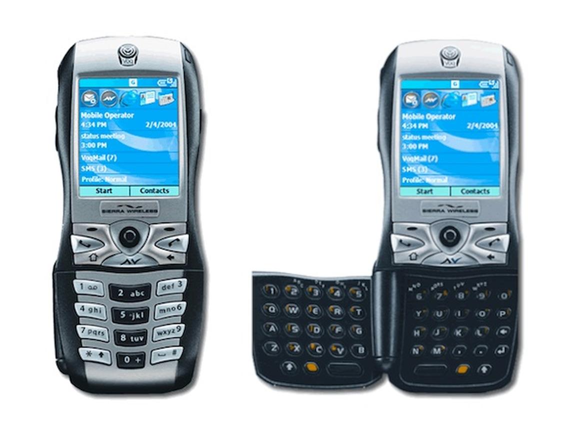
Released in 2004, this phone looked dated even for its time. It has an unattractive curvy design and features a hideous fold-out QWERTY keyboard for faster texting. The silver and black color combo also doesn’t look appealing in my opinion. The Sierra Wireless Voq Professional isn’t the ugliest phone on this list, but it definitely still deserves to be here.
Siemens Xelibri 2
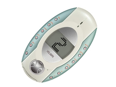
The Xelibri 2 is the second Siemens handset on this list. It reminds me of a slightly larger Tamagotchi. The phone has a small screen in the middle, with keys positioned vertically to the left and right, which makes using it a nightmare. The design’s definitely unique, though it’s also cheap, bland, and plain ugly.
Read next: Here are the 10 most sold phones of all time — you’re in for a surprise
These are the ten ugliest phones ever created in my opinion, but plenty of others out there could have made the list. Which ones would you add? Let me know in the comments!