Affiliate links on Android Authority may earn us a commission. Learn more.
vivo Nex 3 review: A solid alternative to the Mate 30 Pro, actually
Published onSeptember 16, 2021
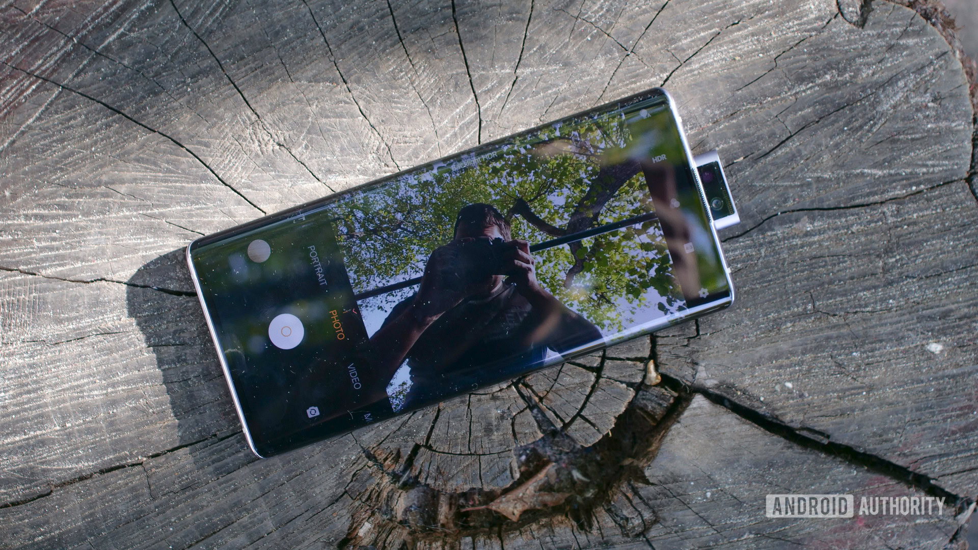
I got to check out the vivo Nex 3 right after I reviewed the Mate 30 Pro, and it struck me how similar these phones are.
They are about the same size, they both feature waterfall displays, pack serious specs, and sport similarly styled cameras on the back. They lack Google apps out of the box (though it’s much easier to get your Google fix on the vivo Nex 3). They also come in 4G and 5G variants, and primarily target the Chinese market.
I don’t want this vivo Nex 3 review to devolve into a comparison with a better-known competitor. However, I think the Mate 30 Pro angle shows just how good vivo’s high-end phones have become. They can go toe-to-toe with some of the very best smartphones out there and perhaps even make you forget about the forbidden fruit that is the Mate 30 Pro.
Here’s Android Authority’s vivo Nex 3 review.
Google Pixel 4 hands-on: Picture perfect in nearly every way
What is the vivo Nex 3 (5G)?
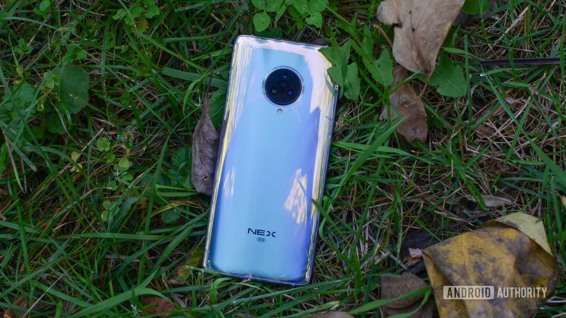
The vivo Nex 3 is the company’s highest-tier phone to date. The phone is available in two versions – 4G and 5G – that are almost identical in every regard. I reviewed the 5G version, though I wasn’t able to test the 5G connectivity due to lack of access to a compatible service.
In its third generation, the vivo Nex series changes in one significant way – the vivo Nex 3 feels less experimental and more polished than its predecessors. The original vivo Nex introduced the pop-up camera and notch-less display. The second-gen vivo Nex Dual Display added a second screen on the back. Meanwhile, the vivo Nex 3 doesn’t do anything too uncommon really. It’s just a really well-rounded smartphone that can stand on its own without any gimmicks.
The Nex 3 is a really well-rounded smartphone that can stand on its own without any gimmicks.
vivo Nex 3 5G specs
| vivo Nex 3 5G | |
|---|---|
Display | 6.89-inch Super AMOLED, waterfall 2,256 x 1,080 resolution |
SoC | Qualcomm Snapdragon 855 Plus |
GPU | Adreno 640 |
RAM | 8/12GB |
Storage | 256GB fixed storage UFS 3.0 |
Cameras | Front camera: 16MP, f/2.0, with LED flash Rear camera: 64MP, f/1.8 aperture 13MP, f/2.2 ultrawide 13MP, f/2.4 telephoto |
Battery | 4,500mAh 44W fast charging USB-C |
Headphone port | Yes |
Software | Android 9.0 Pie with Funtouch OS 9.1 |
Dimensions and weight | 167.4 x 76.14 x 9.4mm 218.5g |
What is it like using the vivo Nex 3?
It is obvious from the second you pick it up that the vivo Nex 3 is a high-end phone. It feels sturdy, well-built, and refined, with none of the flimsiness you tend to see on devices that cut corners.
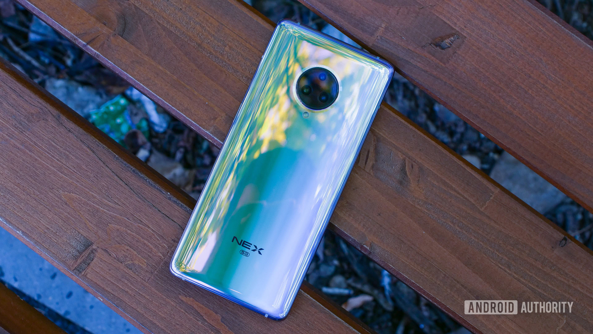
The vivo Nex 3 is made of glass and aluminum, fused together almost seamlessly. The phone feels nice in the hand, but there are a couple of issues hindering usability.
For one, the curved edges of the display flow over the sides, making it feel like the whole phone is glass. Glass edges are slippery and fragile, and as I explained in-depth here, they’re impractical in more ways than one. They do look cool, though.
The vivo Nex 3 is also a large phone. Its display is 6.89 inches from corner to corner. Even without much bezel space to speak of, the phone is still a handful. It’s quite heavy at 218g – roughly 10% more than the Mate 30 Pro.
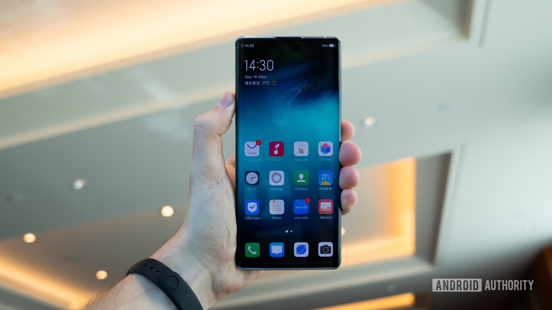
The phone feels fast and smooth, thanks to the Snapdragon 855 Plus processor (the latest and greatest from Qualcomm) and solid specs. You won’t notice stuttering or lag, and this phone is likely to remain fast for years to come.
Should you pick the Snapdragon 855 Plus over the regular 855?
Where is the volume rocker on the vivo Nex 3?
Instead of pressing a volume rocker, you simply press the right side of the phone, either above or below the power “button.” I use quote marks because it’s not actually a physical button – rather, it’s a pressure-sensitive portion of the frame, marked by a ridged texture.

The frame gives off a satisfying little haptic buzz when you press the volume and power keys. Unlike earlier versions of the concept, like the HTC U12, I ran into no usability issues with the pressure-sensitive frame of the vivo Nex 3. I still think physical buttons are better for the job, but vivo deserves credit for delivering an acceptable replacement.
How is the vivo Nex 3’s camera?
The front-facing camera on the vivo Nex 3 pops up from the top of the phone. This pop-up camera module is larger than on previous vivo phones, as it integrates a tiny speaker, as well as a small LED flash. The LED will serve to add a little light to your self-portraits, but it’s not very strong, so it doesn’t blind you.
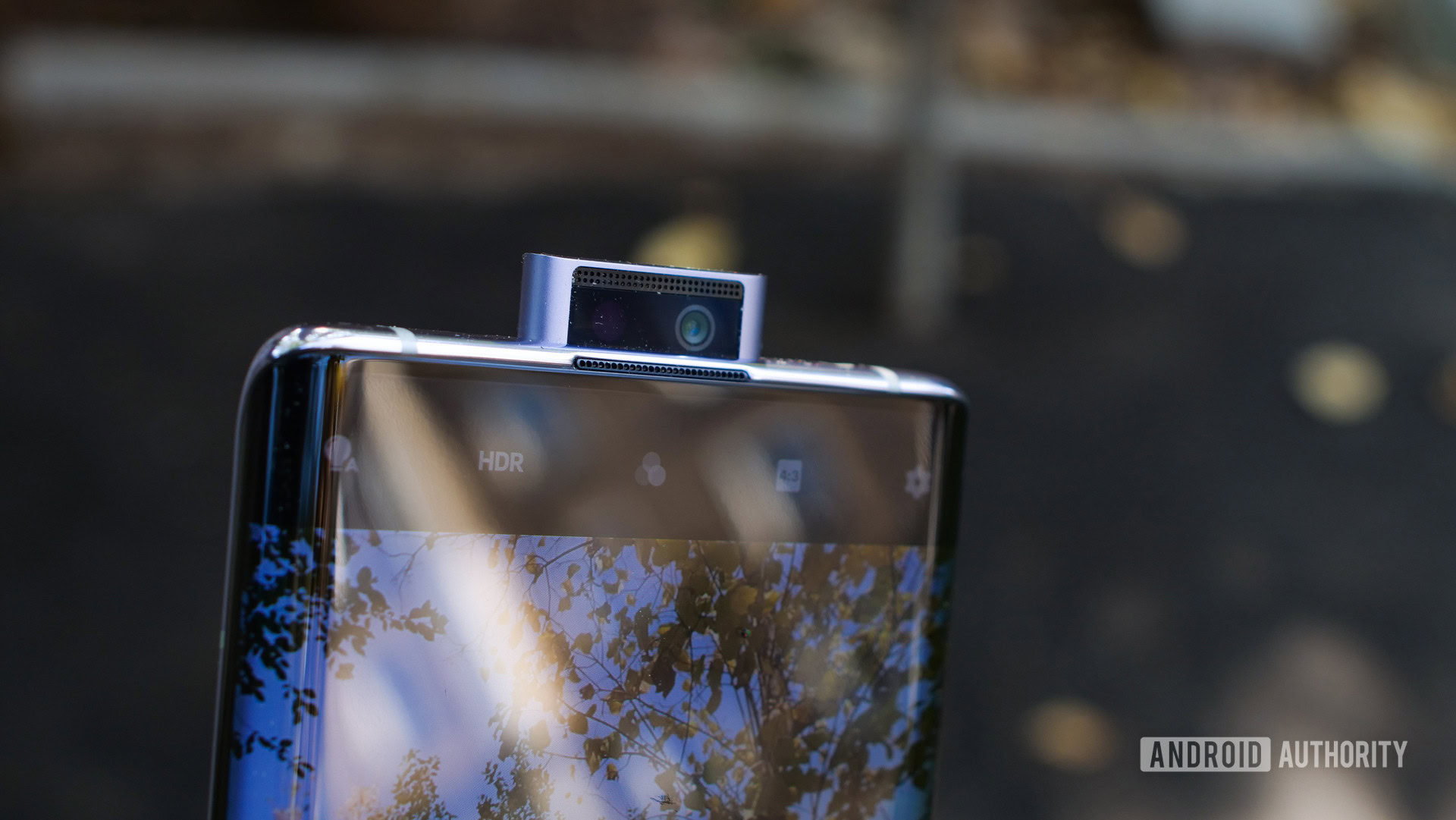
The camera pops up smoothly, with a cute robotic noise (you can turn it off). I noticed gunk accumulating on it, even though I treated the phone with care.
The 16MP selfies are usually good, but backlight can throw the camera off. Check out this comparison between selfies taken in identical conditions on the vivo Nex 3 5G and the Mate 30 Pro. The vivo got better detail and clarity, but completely flunked exposure.
The rear camera module includes the now-conventional standard, telephoto, and ultra-wide lens combination. I like its versatility. The wide angle is great for capturing landscapes or buildings, while the 2X telephoto kicks in when you need to get closer.
Dynamic range is great in most situations. Pictures can turn out a bit too dramatic on occasion due to high contrast, but colors are accurate. The main issue I noticed was some over-sharpening, even when light wasn’t very low.

Low-light pics are decent, if not as impressive as the Mate 30 Pro’s. Because there’s no OIS, the viewfinder tends to “shake” a lot when you’re zoomed in, which makes it hard to capture some shots.
Overall, the vivo Nex 3 gets thumbs up for its feature set, but image quality can be inconsistent occasionally. Full camera samples are available in this Google Drive folder.
How is the vivo Nex 3’s battery life?

The battery on the vivo Nex 3 5G is a massive 4,500mAh unit. That’s on par with the Mate 30 Pro, and better than the Galaxy Note 10 Plus or the OnePlus 7T Pro. You should easily get through the day in most cases, while light use may even let you reach the two-day mark.
The phone supports fast charging at up to 44W, meaning you’ll be able to top up the battery from zero in around an hour. That’s very good, and one of the best performances on the market.
Vivo’s Funtouch OS feels like a half-baked iOS skin thrown on top of an Android base.
Is the software good?
If there’s one thing that would prevent me from recommending the vivo Nex 3 it is the software. It’s not that it’s lacking Google apps out of the box (international versions won’t have this issue, and installing the Play Store is easy). The user interface is the real issue — it’s a weird mish-mash of Android and iOS elements that I just couldn’t learn to love.
For reasons I can’t fathom, vivo hides the quick settings in a “Shortcut center” you access by swiping from the bottom left side of the screen. It clearly apes the similar feature from iOS, but it’s objectively worse than the Android implementation on most other phones. The UI icons are also iOS imitations, and there’s no app drawer either. That said, I don’t hate all design elements borrowed from iOS — for instance, I really like the gestures for switching between tasks.
Even though I had my unit set to English, a bunch of software elements were in Chinese on my vivo Nex 3 5G review unit. It was pretty confusing.
A Siri-style personal assistant app called Jovi aims to replace Google Assistant. It offers a mix of information and recommendations about the device and info it pulls from your calendar and other apps. Also, a “Skin Inspector” app because apparently, people want skincare tips from their phones.
There are good things too. The dark mode is nice, the gestures work really well, and there are lots of customization options. Overall, though, vivo’s Funtouch OS feels like a half-baked iOS skin thrown on top of an Android base. Which I guess it is.
What’s good about the vivo Nex 3 5G?
- Design – This is a big phone that you’ll need to use with two hands. Other than that, I really like the vivo Nex 3 5g’s design and build quality.
- Performance – Smooth, hiccup-free functionality.
- Front-facing camera – It’s just fun.
- Battery – The large capacity and fast charging battery mean you won’t need to stay tied to an outlet much.
- Fingerprint sensor – The in-display fingerprint reader seemed faster than the Mate 30 Pro.
- Headphone jack – Yay!
What’s not so good?
- Waterfall display – The glass edges make this phone harder to handle and more fragile than it should be. But the screen is large and beautiful.
- Image quality – No OIS, some over-sharpening, loss of detail, and a few weird selfie issues.
- Software – It’s really not good.
vivo Nex 3 is a strong alternative to some better-known flagships out there.
Should I buy the vivo Nex 3?
The vivo Nex 3 is currently available in China, with availability in Asia Pacific, Southeast Asia, and other markets to follow in the next months.
Starting at 4,998 yuan (~$700, 4G model), the Nex 3 is priced to sell against the Mate 30 Pro, which starts from 5,799 yuan ($817, 4G) in China. For comparison, in China the OnePlus 7 Pro costs 4,498 yuan (~$635) in the same configuration, while the Galaxy Note 10 cost 6,599 yuan ($930).
If that price difference is maintained in other markets, the vivo Nex 3 should definitely be on your list of options. It’s fast, has a beautiful display, a versatile camera, and overall it feels pretty well rounded. The software is objectively worse than on most competitors, however, and camera performance isn’t as good as it could be. It’s up to you to decide how much weight you put on these features, but the vivo Nex 3 is a strong alternative to some better-known flagships out there.
Behind realme’s unstoppable smartphone cycle: Go big or go home
Are you interested in the vivo Nex 3?