Affiliate links on Android Authority may earn us a commission. Learn more.
vivo Nex review: Frustratingly imperfect, undeniably desirable (Update: Video added)
Published onJuly 2, 2018
Vivo Nex S
What we like
What we don't like
Our scores
Vivo Nex S
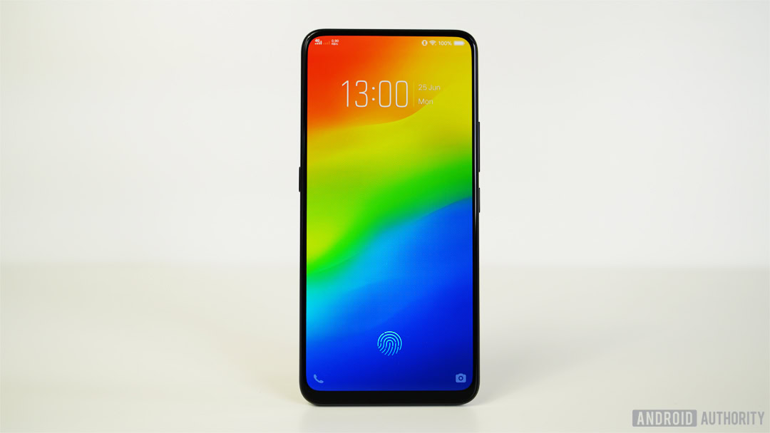
The best part of the move to truly bezel-less phones is the weird and wacky solutions to the question of where to put everything that used to live above and below the display. Front-facing cameras, fingerprint scanners, speakers and sensors all need relocating if we’re going to have proper full-screen phones.
The vivo Nex valiantly addresses those necessities, in pursuit of that notch-less and bezel-free ideal. It doesn’t succeed on every front, and there are more than a few caveats you need to be aware of before you decide to import one. As you might have guessed, owning a first-gen smartphone from the future – today – isn’t a pain-free experience. It’s a gorgeous and exciting phone, but sometimes window shopping is better than a shopping spree. That is why, ultimately, the vivo Nex should probably remain an object of desire rather than become the phone in your pocket.
| Pros: | Cons: |
|
|
Display
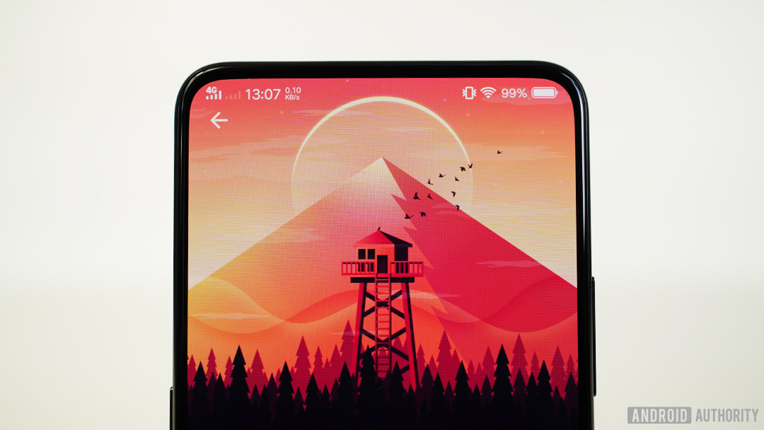
Let’s start with what made all the Nex’s design decisions necessary: the display. The vivo Nex houses a massive 6.59-inch Full HD+ AMOLED panel in a chassis that’s only a smidge larger than the 6-inch Pixel 2 XL. For a phone as big as this it’s surprisingly manageable, with very little bezel around the top three sides and only a small chin below the screen (1.71 mm on the sides, 2.16mm on top and 5mm below the display).
The display offers all the usual OLED benefits, like deep blacks, rich colors, and an always-on display. According to vivo’s marketing material it’s a Super AMOLED panel, but the company wouldn’t confirm it was sourced from Samsung. However, Samsung recently demoed an OLED panel with the same audio emission capabilities (more on this later) at Display Week.
Regardless, in bright sunlight the vivo Nex screen didn’t get quite as bright as I’d like, making outdoor visibility no better than most phones. (For those interested, the ambient light sensor lives underneath the 19.3:9 screen, where it peeps right through the display at the center-top of the panel.) White balance is good, as is color accuracy generally. A night light mode is available in the settings and you can adjust the color temperature to suit your blue light filtering needs.
Long story short: the vivo Nex’s display is every bit as good as you’d want an all-screen phone to be. Not everyone will be happy with the Full HD+ resolution and relatively low pixel density (1,080 x 2,316 pixels and 338ppi), but it’ll serve most consumers perfectly well — with power savings to boot.
Design
Accidental palm touches were never an issue for me, unlike what David experienced on the Find X. The Nex has a slightly larger chin than the Find X, but there’s nowhere to rest your hand meat on either device. Fingerprints are a problem as with most glass-backed phones, but the holographic laser etching does a great job distracting from the accumulated grease.
While the Xiaomi Mi Mix was the first to remove the top and side bezels without adding a notch, it did so by including a larger bezel on the bottom, a dodgy piezoelectric earpiece speaker, and what might be the dumbest location for a front-facing camera yet. Almost in response to Xiaomi’s effort, vivo shrinks the bezels even further, uses under-glass vibration for the earpiece speaker, and puts the front-facing camera inside the chassis of the phone, popping up on command whenever the camera app switches to the front-facing viewfinder.
I could watch this all day… #VivoNEX pic.twitter.com/UdAJK2u5xa— Kris Carlon (@kriscarlon) June 21, 2018
More than the screen and its impressive 91.24 percent screen-to-body ratio, the vivo Nex’s pop-up camera is arguably its biggest wow factor. Every time the Nex’s camera popped out from the phone, I was asked to “do it again” by whomever I was with. It elicits almost childish expressions of wonder in anyone that sees it. It’s undeniably cool and the novelty hasn’t worn off even after a couple of weeks.
The downside of such a nifty piece of tech is the simple fact that adding a moving part to a smartphone adds a degree of risk. Considering the frequency with which many of us drop our phones, there’s a justifiable concern about the camera breaking or the mechanism simply wearing out over time. vivo has shared durability data to allay those concerns, but for most people it will come down to a simple decision. You’re either comfortable with the risks, or no amount of assurances will make you think this is a good idea.
The Nex's pop-up camera is arguably the biggest wow factor in a phone jam packed with them, but adding a moving part to a smartphone is a contentious decision.
It’s impossible to say just how much effect the Nex’s camera mechanism has on the battery, but at least it has to be less than the Find X. OPPO’s rising camera mechanism elevates the entire top of the phone and contains both the front and back cameras. Its reliance on facial recognition means the cameras pop up every time you want to unlock your phone. By comparison, the vivo Nex’s selfie-only power needs seem negligible, especially if you’re not terribly prone to selfies.
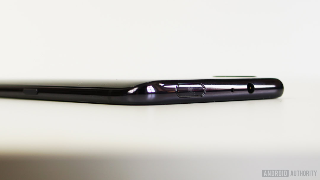
For anyone that barely ever uses their front-facing camera, the Nex offers an ideal solution: it’s there if you need it and spares you the unsightly compromise of a notch.
According to vivo the camera module can push up to 500g in repeated trials, and it can apparently can be raised and lowered repeatedly up to 50,000 times and withstand up to 45kg of thrust force when extended.
For what it’s worth I had absolutely no problems with the Nex’s elevating camera. The dust that inevitably accumulates on it didn’t actually obscure the lens, so cleaning it wasn’t as necessary as you might think.
It has also proven to be more rugged than I was expecting, and I’ve been purposefully rough with it. The camera’s very snugly fit. You can’t wiggle it from side to side and pulling it upwards is fruitless. If you press down on the camera while it’s out it springs back down before taking the hint and retracting itself fully.
While it’s still early days, I’m increasingly confident this thing could handle some battle scars before you have any problems with it. If you’re concerned about causing damage to the camera by dropping it you probably have more to fear from breaking the display than the camera.
Audio
The small bezels on the Nex’s display mean the earpiece speaker also had to be re-engineered. Rather using than a typical smartphone speaker, vivo’s vibration motor transmits sound through the entire screen. That means when a call comes in you can place your ear anywhere on the display to hear the other person (although towards the top where the vibration motor is located is best). It sounds much like any regular smartphone speaker and isn’t as audible to those near you, as I initially expected.
After a couple of weeks of using it, I can’t say I’ve found it any worse than a normal earpiece speaker. Considering the sound comes from beneath the screen itself, that’s a big win. Expect to see the same tech in more phones down the line.
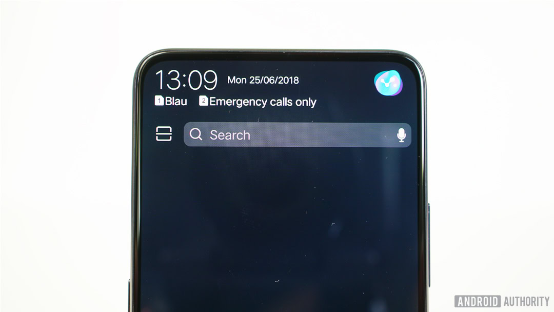
The vivo Nex also has a bottom-firing speaker that gets plenty loud and offers better bass than something like the Pixel 2. The degree to which the display vibration contributes to overall audio quality is arguable, but it is noticeably less shrilly at full volume than the Pixel, giving some credibility to vivo’s claims of “more powerful bass and softer, smoother treble.” I wouldn’t call external audio the vivo Nex’s best selling point, but it fares no worse than the competition, achieving comparable results through some impressive technology with other benefits than just sound.
There’s a set of decent bundled earbuds in the box, but the vivo Nex has a 3.5mm headphone jack, so you can just use what you’ve got. The V1 chip and built-in DAC means you’ll get great audio out of a good pair of wired headphones.
vivo has put the fingerprint scanner under the display glass on the Nex and turned the screen itself into an earpiece speaker.
In-display fingerprint scanner
Like a lot of other things we’ve come to expect on a phone, you won’t find a visible fingerprint scanner anywhere on the vivo Nex either. The company partnered with Goodix to include an under-glass scanner, so you can unlock your phone with your fingerprint through the display. It hasn’t gotten old, even after spending a while with this phone.
Interestingly, a recent teardown revealed it’s actually a camera doing the scanning through a peephole in the display, not an ultrasonic solution. While vivo had been working with Synaptics when we first saw this tech at CES, the scanner on the Nex is made by the same company that supplies HUAWEI and Xiaomi with in-display fingerprint scanners. This means that the sensor isn’t visible at any angle, unlike previous Synaptics scanners and even the vivo X20 UD.
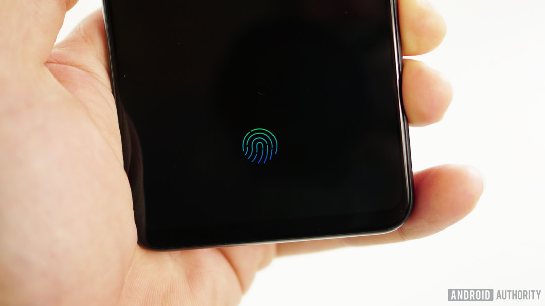
The vivo Nex’s fingerprint reader is not as fast as a capacitive scanner and yes, it occasionally freaks out and fails to read your print at all, but I’m willing to cut it some slack. In-display tech will improve in time, and only those willing to put up with it as is would be advised to pick up a Nex, anyway. It unlocks almost instantly in the right conditions, but in less than ideal situations, the unlock animation might flash three times before it finally unlocks or fails in the attempt.
The in-display fingerprint scanner is slower and less reliable than current capacitive sensors.
If you need your phone unlocked in a split-second every single time, the Nex is not for you. Given the frequency with which we unlock our phones, this could understandably make or break your experience. Much like the notch or the HTC U12 Plus’ capacitive power and volume buttons, it’s either something you feel strongly about or will quickly adapt to. Personally, I didn’t mind the delays or the failure to unlock much, but your mileage may vary depending on how impatient you are.
When the fingerprint logo is visible on screen the camera is active; when it’s not visible it’s inactive, meaning no unlocking. If your phone is lying on a table, you’ll have to give it a nudge to activate the fingerprint camera or hit the power button. It’s also activated by movement, so picking up your phone activates the scanner camera automatically. You can turn off the fingerprint logo on the always-on display in the settings, but if you do so you’re also disabling the camera, making unlocking your phone from a screen-off state impossible.
Bright ambient light can also cause issues for the fingerprint scanner, as it uses illumination from the screen to get a sufficiently contrasty image of your fingerprint. In these cases, the Nex falls back on a lock screen PIN. The Nex scanner works with banking apps and payments within WeChat and AliPay, just don’t expect it to work with many banks outside of China.
The vivo Nex is a cutting edge but flawed device that tries to do a lot of amazing things and inevitably can't do them all perfectly.
For all the fancy new tech the Nex includes, there are drawbacks. The under-glass fingerprint scanner is not as fast or reliable as current capacitive scanners. The front-facing camera raises valid concerns about durability even if it does mitigate privacy concerns by being hidden most of the time. Shoving sensors into the bezel like the proximity sensor or under the screen like the ambient light sensor or finger scanner make the display more expensive to manufacture. The vivo Nex is a cutting edge but flawed device that tries to do a lot of amazing things and inevitably can’t do them all perfectly.
So far, though, everything the Nex fails to do is arguably made up for in sheer coolness. There’s no denying that it is it an exciting phone to use.
Software
When I talked about window shopping earlier I was referring to the idea that while it may be fun to lust after runway fashion, should you ever get the chance to wear some you’d likely find it uncomfortable and impractical.
This sums up the Nex perfectly for me.
It is almost irresistibly cool. It’s also not the smartphone you and I desperately want it to be. The Nex was made for China, not the Western market. It’s hard to get in the West and even harder to deal with vivo’s FunTouch OS.
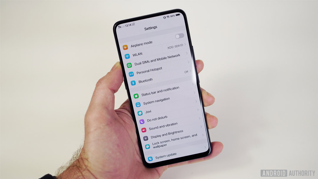
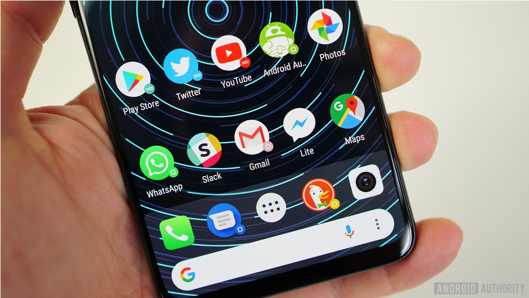
Vivo's FunTouch OS is app drawer-less and heavily iOS-inspired.
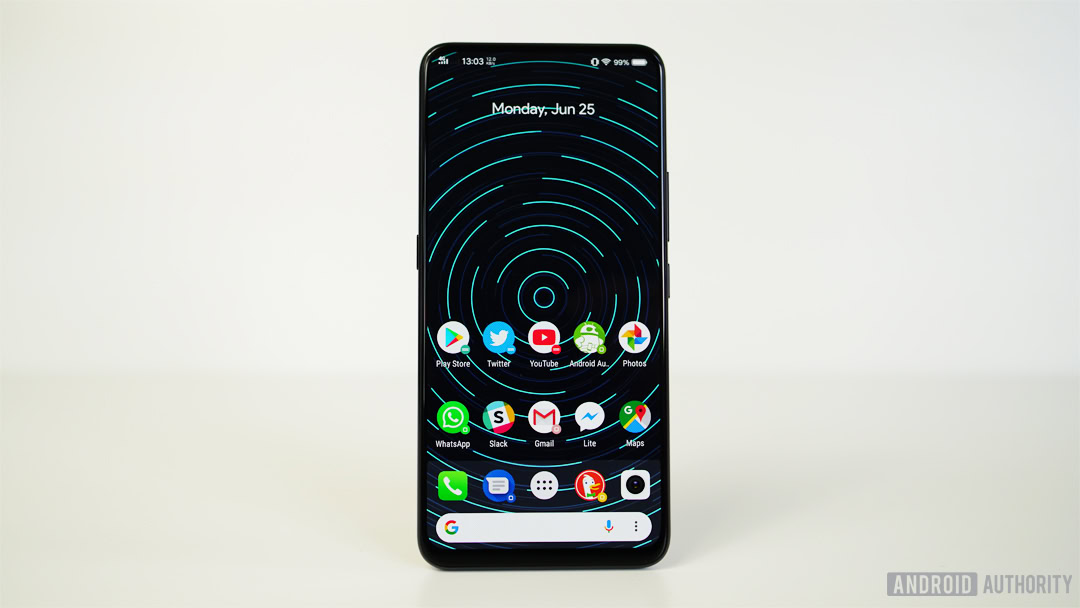
To call FunTouch an abomination would be unfair. It is app drawer-less and heavily iOS-inspired. That might make Android fans in the West cringe, but it’s considered a selling point in Asia. You can’t just install a different launcher, either. Despite being able to change the default launcher in the Settings, the Nex automatically defaults back to the FunTouch Launcher whenever you hit the home button.
Even using Greenify to hibernate vivo’s launcher isn’t a simple solution. Even using Greenify to hibernate vivo’s app drawer-less launcher isn’t a simple solution. To grant the necessary permissions Greenify needs, you must have a vivo account – something only possible with a valid Chinese phone number.
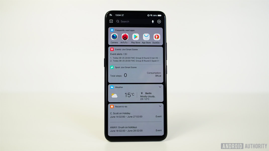
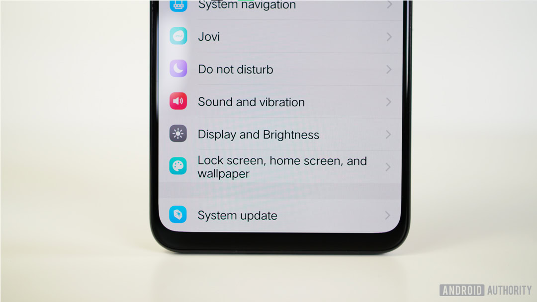
Likewise, some of the interface is only in Chinese and there are some formatting issues with Latin characters like large spaces between apostrophes and the “s” that follows them. The Jovi virtual assistant, for which there is a dedicated hardware button, only works with the Chinese language and with Chinese services, making it largely useless to Western audiences.
There are a lot of pre-installed Chinese apps most Westerners would instantly remove, and there’s no Google Play Store or Google apps out of the box. These can be force-installed but even then you’ll have issues downloading pretty common apps from Google. You’ll also encounter problems getting push notifications to come through properly. Likewise, the always-on display shows notification icons, but only for a very limited number of vivo apps. There’s also no way to quickly access the settings unless you have the app icon on the home screen, with no shortcut in the notification shade and command center or quick settings. I could go on but I’m sure you get the point.
As it stands, the vivo Nex is not a phone you actually want in your pocket unless you live in China.
The FunTouch experience is admittedly mitigated by an understanding of the Nex’s target market, but the vivo Nex is not a phone you actually want in your pocket unless you live in China. If vivo ends up releasing a global unit that may well change — it’s possible given the company’s sponsorship of a sporting event as global as the World Cup. For that to happen though, vivo would need a European or American launch plan and agreements with Google and (hopefully) carriers. But for now, I wouldn’t advise anyone outside China to try buying one unless you have an extraordinarily high tolerance for inconvenience, incompatibility, and inconsistency. If you really want a Nex, you can import one for a little over $800.
Performance & Hardware
Ignoring the usability of the software, the vivo Nex lacks very little on the hardware front. The Snapdragon 845 with Adreno 630 GPU, 8GB of RAM, 256GB of storage, Android 8.1 Oreo and a 4,000mAh battery with fast wired charging should keep all but the most discerning specs hounds happy. There’s no microSD expansion, NFC, or wireless charging. Nor is there an IP rating which has become increasingly important as a standard flagship feature.
When it comes to specs there's very little lacking in the vivo Nex, barring an IP rating, wireless charging, microSD expansion and NFC.
I never found myself in need of additional power or memory while using the Nex, but at this stage of the specs game stutters and lag are pretty rare in the Android world. If benchmarks are your thing, the Nex performs very well, posting almost 290K in AnTuTu, well above the Galaxy S9, OnePlus 6 and Xiaomi BlackShark. It also ranks very well in Geekbench 4, Vellamo and 3D Mark benchmarks. The Nex’s performance problems lie more in peculiar software behavior than in a lack of power.
Out of the box, navigation is handled via swipe gestures from the bottom of the screen. You can remove all visual clues or use a dot or line to remind you of the swipe targets. On-screen navigation buttons can be added and, whether you opt for gestures or virtual buttons, you can rearrange the order to your liking.
In keeping with the all-screen experience, I opted for gestures and they were easy enough to get used to. Accessing recent apps is achieved by swiping up and hold as the third gesture (after back and home) is to bring up the Nex’s iOS-like command center. Even with the Google app and Assistant installed, there’s no way to access it with a long press of the home button and Oreo’s quick app switching is not possible either.
Battery
Battery life is another issue entirely. Despite its impressive 4,000mAh cell, battery life is not the Nex’s strong point (at least on the review unit I picked up). vivo’s software doesn’t report screen-on time but I can tell you that even on days of what I consider very light usage, the Nex still needed charging every day.
This could have something to do with being a Chinese unit in Europe, but I’ve not experienced such rapid battery drain on a non-international review unit in recent memory. Heavy usage days required a top up in the late afternoon, something I’d never dream of on another 4,000mAh device, like the HUAWEI P20 Pro.
The Nex received several software updates during the two weeks I had it, so it’s not unreasonable to assume battery life could improve rapidly. The Nex ships with vivo’s 22.5W fast charging solution which will top up your phone in short order when required.
Stay tuned for our full vivo Nex battery review coming up soon for more.
Camera
Perhaps the biggest surprise for me was the quality of the vivo Nex camera. It’s not necessarily better than the Pixel 2, but as you might have seen, it’s a pretty close race. The Nex camera tends to overexpose most shots and over-saturate colors, with a bit too much sharpening under scrutiny.
The quality of the Nex's camera was a nice surprise, although it does tend to over-expose, over-saturate and over-sharpen.
Whether you like this approach is entirely up to your personal tastes. I tend to bump colors and contrast while editing my photos anyway, and I don’t mind a little sharpening if it makes my photos look better on my phone and when I share them to friends. If you prefer more sedate colors, can’t stand the over-sharpened HDR results that are common to the new breed of AI cameras, or judge a photo by how it looks at 100 percent crop, you probably won’t like the Nex’s camera as much as I do.
It’s either something that saves time or adds unwanted and impossible-to-remove “enhancements.”
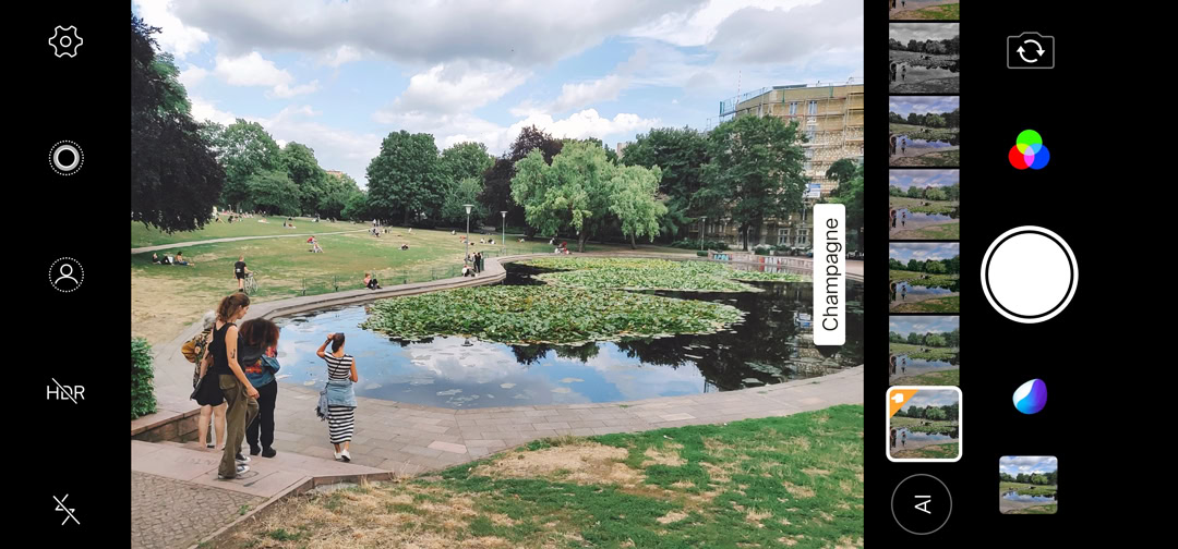
Then there’s the AI camera features. Like basically every other smartphone company right now, vivo has packed the Nex with “AI” camera features, from AI beauty mode and AI scene detection, to AI HDR and AI Filters. How much AI goes into each of these features — and how useful they are — is up for debate, but on other phones with AI cameras (like the P20 Pro), the AI is primarily used to detect scenes and automatically enhance the photo based on what it recognizes, usually by bumping the saturation and sharpening the result. The vivo Nex does this by default.
The “AI” in the Nex camera seems largely relegated to glorified filter suggestions. Again, the P20 Pro lets you disable AI or use it to do what the Nex does by default, without the option to turn it off. So rather than an on/off state, you get an “on and even-more-on” situation. While I don’t particularly mind this myself, it could be make-or-break for some smartphone photographers.
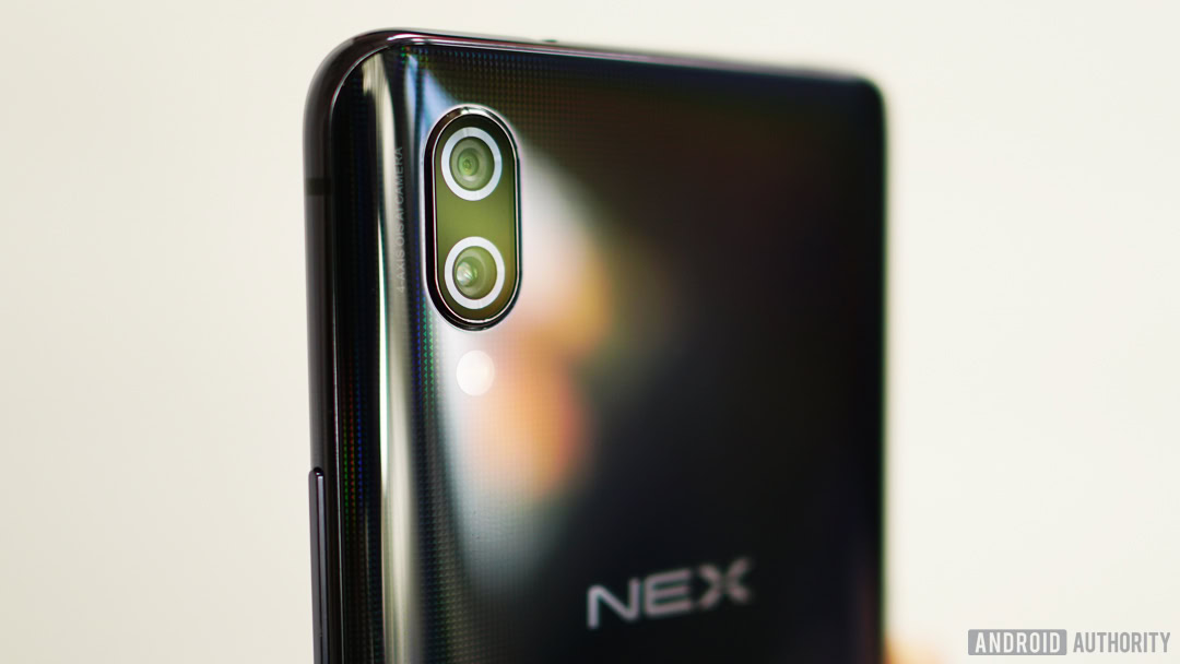
The main cameras on the Nex are a 12MP f/1.8 sensor with 1.4-micron pixels and a 5MP f/2.4 lens with both optical image stabilization (OIS) and electronic image stabilization (EIS). Despite the Nex not implementing the de facto standard camera shortcut of two quick presses of the power button, you can assign the same shortcut to a long-press of the volume down button. It’s not as fast but it gets you the same result. Fortunately, the shutter lag I noticed while in China was resolved with one of the updates the Nex has received in the last two weeks.
The camera app is pretty standard fare. Swipes take you to different shooting modes like AR stickers, panorama, manual mode, face beauty, and 30fps video at 4K resolution, as well as 1080p slow-motion at 240fps. Time-lapses are also possible on the Nex and video is stabilized, although it doesn’t come out as smooth as the P20 Pro’s AI stabilization or EIS on the Pixel 2.
There are some curiosities to the camera app. If you have HDR set to auto and you turn on portrait mode, it’ll disable HDR, as you would expect, but once you leave portrait mode HDR stays off. The same goes for live photos. If you’re in either mode and turn HDR back on, portrait or live effects are instantly disabled.
Portrait mode supports from 16 to 0.95 aperture, but the results at wider simulated apertures are as unrealistic as you might expect (the ping pong table in the gallery below includes a normal shot, a f/16 shot, and a f/0.95 shot. You can clearly see the issues with the cutout and the artificiality of the blur).
Even with the AI filters disabled, the Nex unnaturally bumps saturation in landscape shots. Over-saturation notwithstanding, color reproduction on the vivo Nex is extremely accurate. In the tricky photo below of various pigments, the photo is almost spot on barring the vibrancy of the yellow which is brighter than in reality. The red, orange and green pigments, as outlandish as they appear in the photo, are actually that bright in real life.
In low light the Nex holds up quite well, keeping noise to a bare minimum (and outperforming the Pixel 2 in my testing), but it loses realistic detail with post-processing. Dynamic range is decent but isn’t as good as something like the Pixel, with the Nex struggling with the lighter parts of the shot. The Nex handles detail in shadowy areas very well, often even better than the Pixel 2, but once again tends to over-expose and blow out the highlights. It’s a simple enough task to jump into manual mode to change the exposure settings, but as we all know, this is a step most users will not take.
I asked vivo about Super HDR, which was announced before the Nex’s launch, but that isn’t (yet) present on the device. The company declined to confirm if Super HDR would be added to the Nex’s repertoire via a software update or if it lacks necessary hardware. vivo said the Nex’s AI HDR is “based on” the company’s research into HDR technology and captures “more frames of a wider dynamic range (11eV) than previously possible.” Even without Super HDR, if vivo modifies the Nex’s default exposure setting a bit, the company could have a very competitive camera on its hands.
For a phone that makes the front-facing camera hardware as big of a deal as the Nex does, it produces soft results.
The front-facing camera is an 8MP f/2.0 shooter offering the usual bokeh portrait mode, which suffers from the same issues with cutouts and fake-looking results as most phones. It supports HDR, filters, beauty mode, live photos, and a variety of different aspect ratios including 4:3, 16:9, 19.3:9 and 1:1.
Unfortunately, the front-facing camera produces notably soft results that lack detail and proper exposure. It’s a shame vivo didn’t put the same effort into image processing for selfies as it does for the rear-facing cameras, especially considering how big of deal the Nex’s camera mechanism is.
Specs
| vivo Nex | |
|---|---|
Display | 6.59-inch Super AMOLED, Full HD+ (2316 x 1080, 338ppi), 19.3:9 aspect ratio |
SoC | Qualcomm Snapdragon 845 with AI Engine, 64-bit, octa-core, 10nm |
GPU | Adreno 630 |
RAM | 8GB |
Storage | 256GB |
Cameras | Rear: Dual pixel 12 MP f/1.8 (Sony IMX363) with 1.4µm pixel size, OIS and EIS + 5MP f/2.4 Front: 8MP, f/2.0 with elevating mechanism |
Audio | 32-bit/192kHz audio, 3.5mm audio jack |
Battery | 4,000 mAh, fast charging |
IP rating | No |
Sensors | Fingerprint (3rd generation in-display), accelerometer, proximity, compass, gyroscope, infrared, ambient light |
Network | GSM 850 / 900 / 1800 / 1900 CDMA 800 & TD-SCDMA HSDPA 850 / 900 / 1900 / 2100 LTE band 1(2100), 2(1900), 3(1800), 5(850), 8(900), 34(2000), 38(2600), 39(1900), 40(2300), 41(2500) |
Connectivity | Wi-Fi 802.11 a/b/g/n/ac, 2.4G/5.1G/5.8G, hotspot Bluetooth 5.0 A-GPS microUSB 2.0 3.5mm headphone port USB Type-C |
SIM | Dual SIM/hybrid slot |
Software | Android 8.1 Oreo Funtouch OS 4 |
Dimensions and weight | 162 x 77 x 7.98mm 199g |
Gallery
Final thoughts
When all is said and done, the vivo Nex is a glimpse of the future. It’s an ambitious product that in many ways still acts and feels like a concept device. For all its shortcomings, I wholeheartedly commend vivo for even daring to produce a phone like this for the mass market. That said, it’s probably for the best that it won’t make it to Western markets. It’s an infuriatingly imperfect but undeniably desirable phone.
Despite its appearance, the vivo Nex is still a phone like any other. Its display is great, the (main) camera is surprisingly good, performance is outstanding, audio is fine, the fingerprint scanner needs work, the software is atrocious, and the battery isn’t great. In short, it’s a lot like most phones available today. vivo hasn’t solved a smartphone problem as much as it has just transferred existing smartphone problems into a more futuristic form factor.
vivo hasn't solved a smartphone problem as much as it has just transferred existing problems into a more futuristic form factor.
The vivo Nex is the most exciting phone I’ve seen in years. I’ve enjoyed using it, enjoyed the reactions I’ve gotten from those I’ve shown it to, and even enjoyed grappling with its shortcomings. It has made the smartphone experience fun and exciting again, but it’s as fraught with frustration and surprise as my earliest Android memories.
Compared to the polished and soulless phones we’re currently surrounded by, the Nex is a breath of fresh air. It’s a way-marker on the inexorable march to truly bezel-free phones, even if it is imperfectly executed. Hopefully it will serve as a clarion call for the phones that come after it.