Affiliate links on Android Authority may earn us a commission. Learn more.
Waterfall displays: The latest design trend nobody’s asked for
Published onOctober 8, 2019
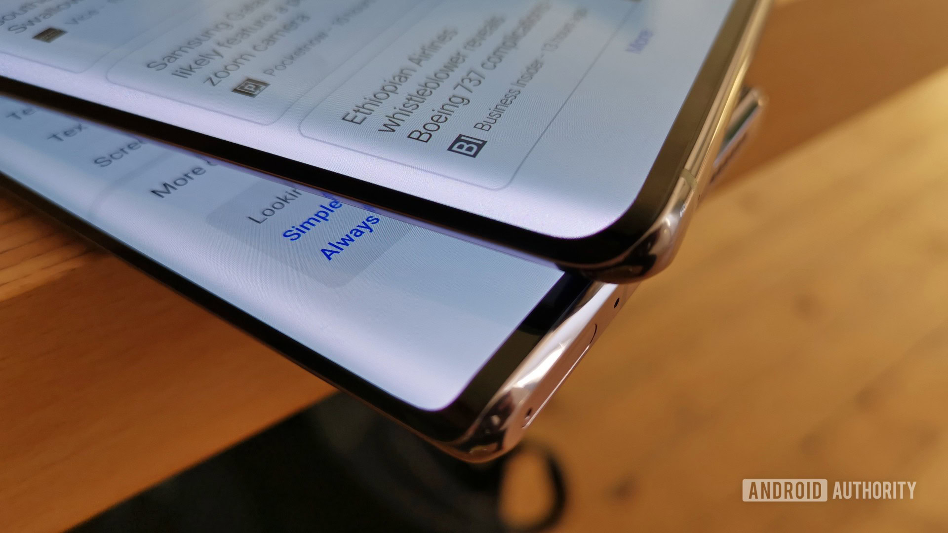
Phone screens are getting more curved, and on one superficial hand, I admit I kind of like it. “Waterfall” displays look beautiful and futuristic. My reptilian brain loves how they feel against the palm of my hand. They do make bezels even less visible, and you could argue that they let make manufacturers fit more screen in the same body size.
I got to use waterfall screens on the HUAWEI Mate 30 Pro and the vivo Nex 3 5G. Before them, I tried phones with edge screens going all the way back to the Galaxy Note Edge of November 2014.
As much as I enjoy looking at and holding the Mate 30 Pro and the vivo Nex 3, I’m ready to go back to a phone with straight edges, or at least less-curved ones. I just don’t think current designs are good enough. While they may look good, they just aren’t practical.
Here are a few reasons why waterfall displays are not for me.
Edges make me edgy
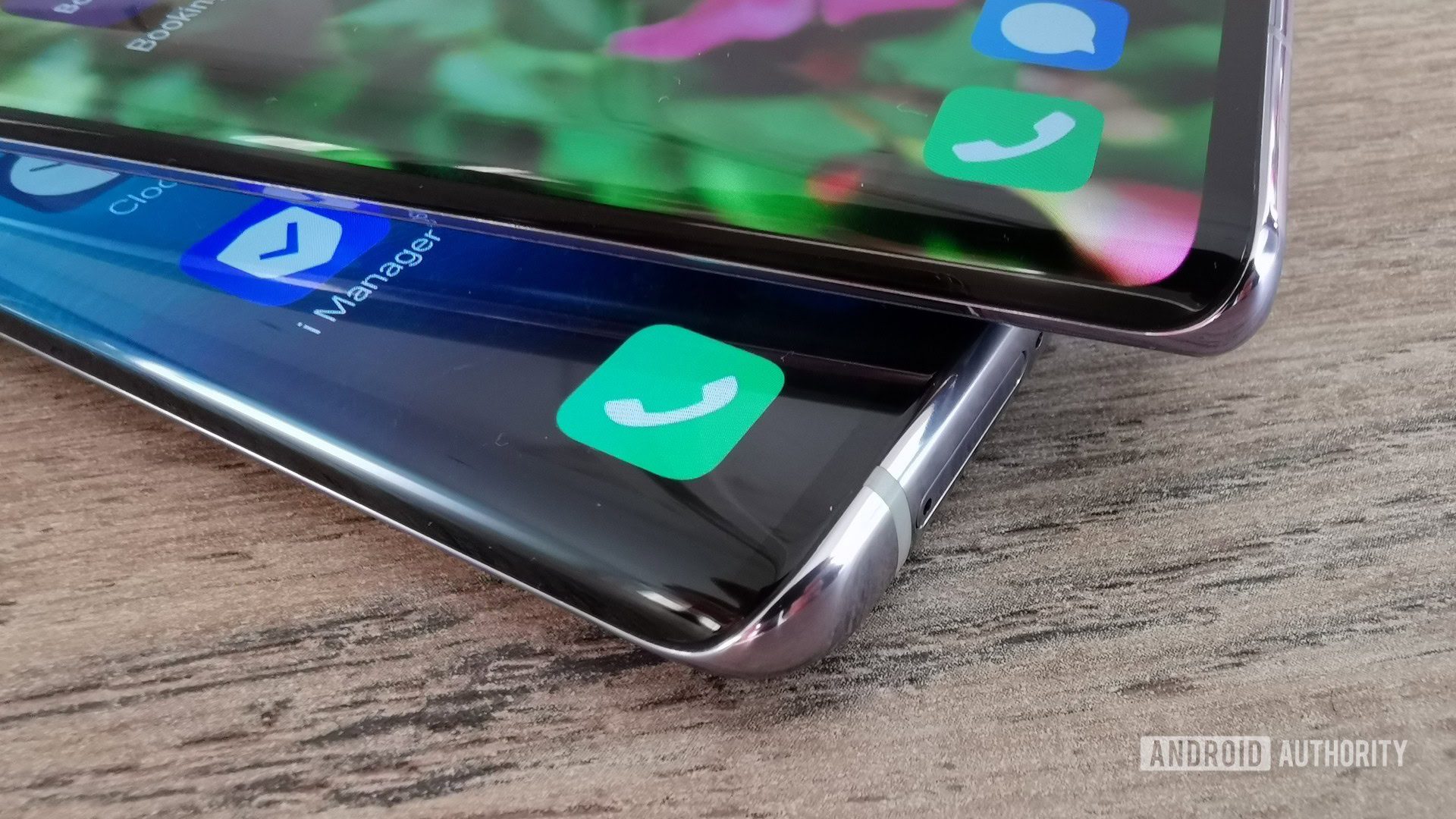
To start with the obvious, curved glass edges are just as slippery as they sound. Naturally, more exposed glass means a higher chance of breakage if and when you drop a phone.
Strong as modern cover glass may be, it’s just not made to protect phones from inevitable drops on the sides. Not only is there more glass exposed, the internal stress forces in a curved piece of glass make it more fragile.
Now, I did drop the Mate 30 Pro a couple of times, including once on some mean-looking stone tiling, and it did survive without much damage. But I am pretty sure that was just sheer luck. David dropped his Note 10 Plus once and it broke immediately.
To add insult to injury, curved sides means screen protectors and cases are less effective at protecting your very expensive phone. Cases have to leave most of the glass edges uncovered so they don’t obscure any content or block out controls. Meanwhile, finding a good screen protector for some devices is already pretty hard — finding one for these new ultra-curvy screens will be a whole new exercise in frustration.
Apps and content are not quite ready for waterfall displays.
Discontent with the content
Apps and content are not quite ready for waterfall displays either. Or maybe it’s the other way around.
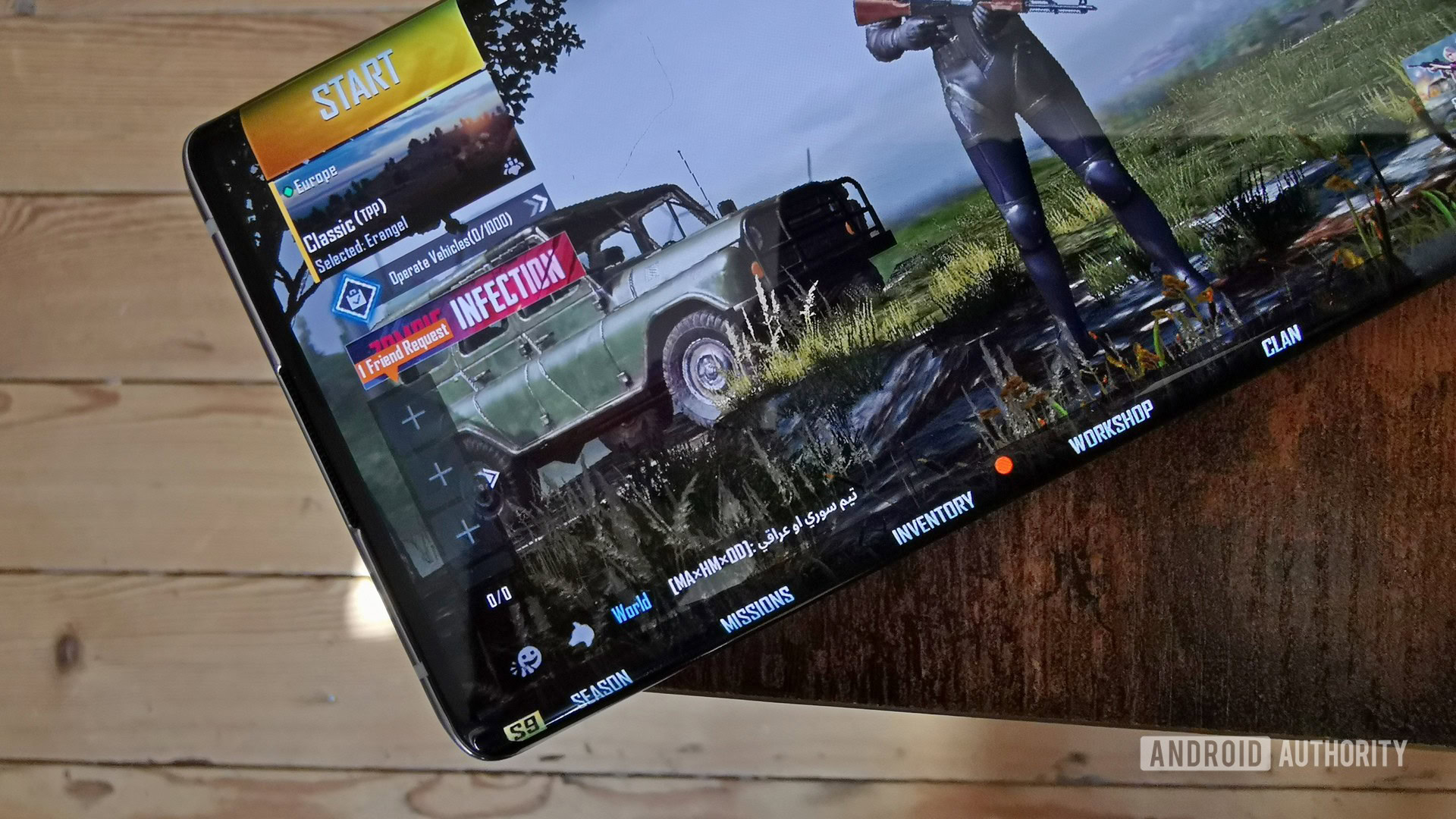
While most apps won’t have any issues, some apps have controls on the very edge of the rendered area, making hitting them on a curved display difficult. Some UI elements in PUBG Mobile, for instance, are less visible and harder to touch on waterfall displays.
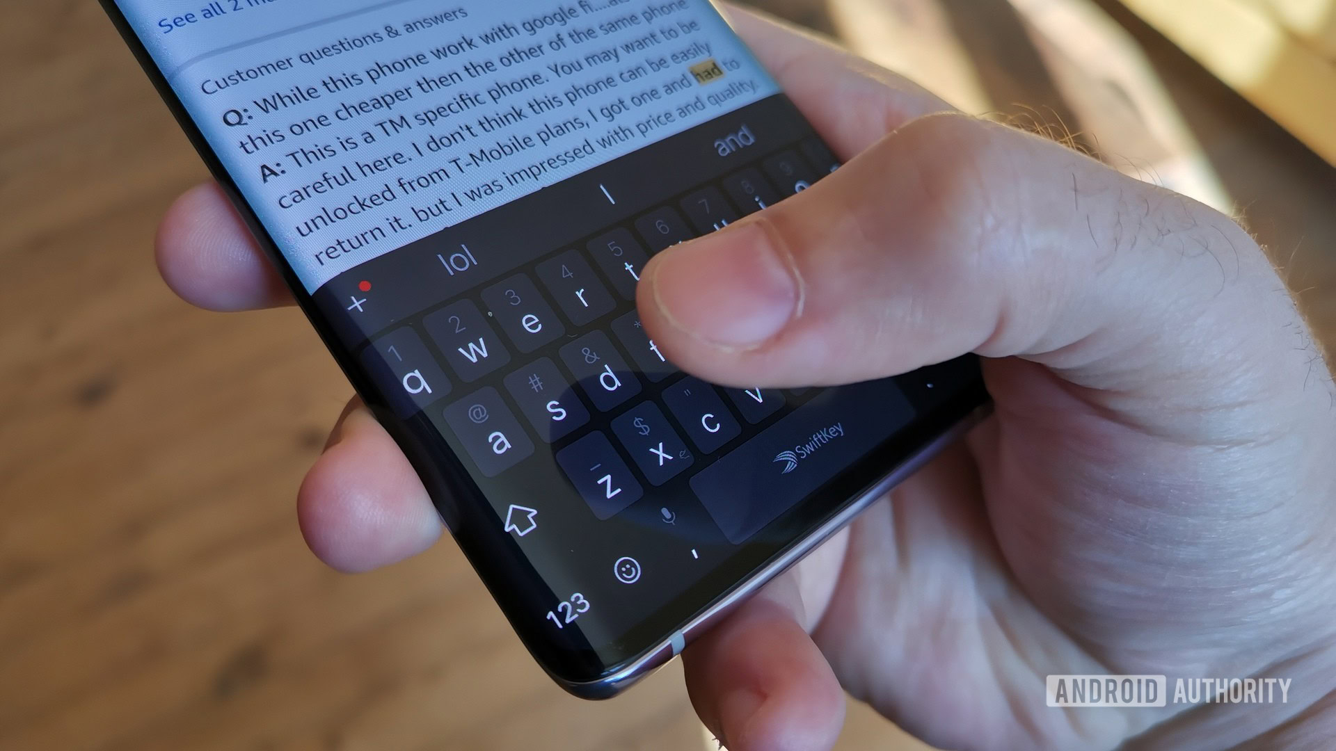
Not everyone’s a gamer, but everyone types. In Gboard or Swiftkey, I had issues typing while holding the Mate and the Nex 3 in portrait mode. To type fast, I need to type with my thumbs, but I couldn’t really do that because the “q” and “p” keys were too far off on the edge for me to easily touch them.
It’s the same story with websites. While most site layouts have decent margins, some display text right to the very edge of the screen, making it hard to read.
Bad optics
Even when you don’t have to touch them, waterfall displays can cause issues. There’s still a fair bit of distortion on the edges when watching video that can get distracting.
When using the phone under bright sunlight, the curved glass can create strong glare. Having a shiny bar of light running along the edge can make it hard to read text and view media.
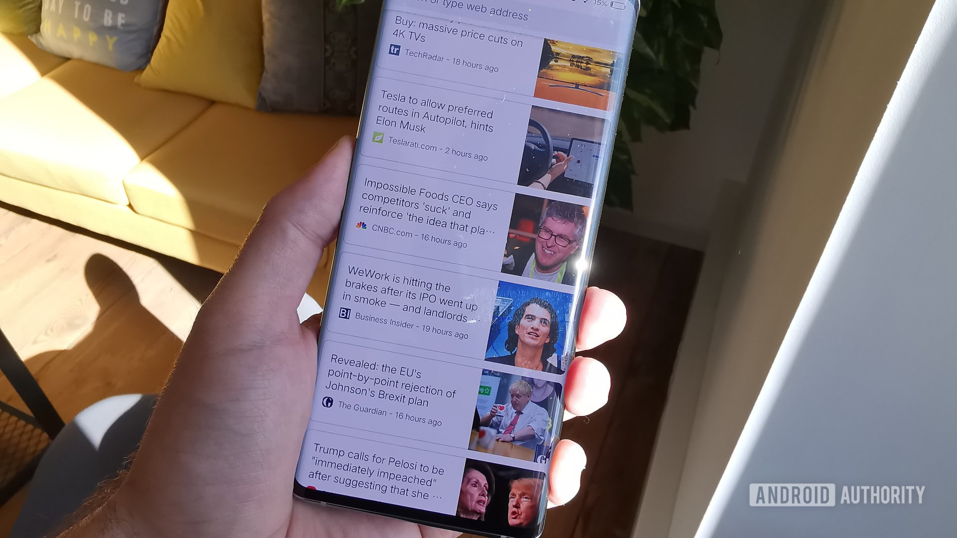
Even under normal lighting conditions, the curvature of the display creates a slight discoloration effect on the edges. Depending on the color of the background and the angle you look at it, you’ll see the edges become slightly darker or brighter than the rest of the screen.
Samsung Galaxy Note 10 review: Why you should want it — and why you shouldn’t
Pushing my buttons
Even when we’re not talking about the screen itself, curved screens have given rise to some other undesirable side effects. For example, in order to deliver clean, uninterrupted edges, HUAWEI and vivo removed the volume rockers from their latest phones.
On the Mate, you’re supposed to tap twice on the curved edge to bring up software volume controls. Getting used to it requires a bit of a learning curve. By comparison, the learning curve of physical volume buttons is nonexistent.
Software volume controls are both slower and harder to use than regular buttons. It’s not a huge issue, but sometimes you need to adjust volume as quickly as possible (in a meeting, a class, or late at night when everyone’s asleep).
On that note, good luck trying to change your volume with only one hand. Or to change volume while your phone is in your pocket. Or to use the volume rocker as a shutter button for the camera. You get my point…
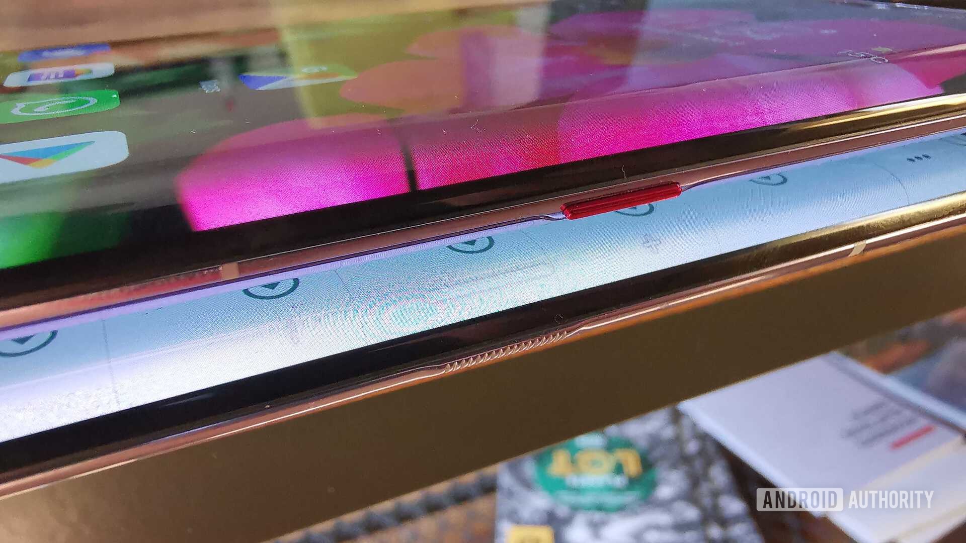
The vivo Nex 3 also lacks physical volume buttons, but it takes a different approach. Instead of the double tap, vivo made the frame touch sensitive. You change volume by pressing either above or below the power button, which itself is just a pressure-sensitive textured section of the frame. A tiny buzz means you successfully pressed a “button.”
While vivo’s implementation is still less practical than classic volume buttons, I found it better than the double-tap on the Mate 30 Pro.
Curved margins = Fat margins
These are all minor annoyances, but they exist for no good reason other than to make our phones look a bit fancier.
That’s the charitable interpretation. One could also argue that manufacturers are deliberately pushing us towards curved glass phones because they figured out they can make a lot of money out of the higher repair costs. A cracked screen is a minor tragedy for you and me, especially when it costs more now than it used to. But 100 million replacement screens are a major boon for an industry that’s been vexed by stagnating sales and longer replacement cycles. More fragile and expensive-to-replace curved screens are a decent alternative revenue stream if you aren’t shipping as many phones.
We don’t need to get into conspiracy theories to explain the rise of curved screens though. The simple truth is we all buy stuff with our hearts, rather than our brains. We may know that glass edges are risky, but, oh, they look so good. At least that’s how I always end up paying more for the shiny new gadget, even if last year’s version is almost as good (and maybe a little more durable).
The cutting edge
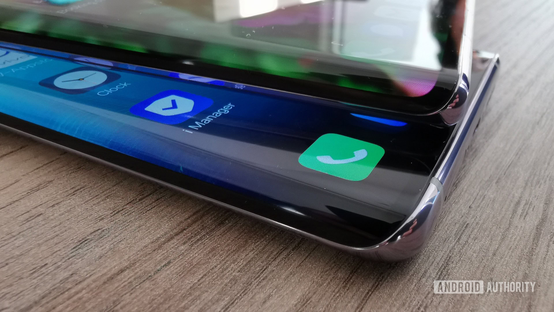
Samsung deserves credit (or blame?) for kickstarting the curved screen trend that’s now evolved into waterfall displays. The Mate 30 Pro and vivo Nex 3 took the concept and pushed it to the next level — and that’s only the beginning. Like it or not, HUAWEI and vivo/OPPO are trendsetters. Like multi-tone paint jobs and pop-up cameras, waterfall displays will be adopted far and wide.
Form trumps function, so that's what we're getting.
By next year, waterfall displays will be par for the course at the high end, and even on some ambitious mid-rangers. In two years, we’ll probably see them on budget phones.
We already know where this trend will eventually take us: full wraparound screens. Xiaomi recently gave us a sneak peek in the form of the outrageous Mi Mix Alpha. The glass edges of the Alpha flow all the way to its back, pushing the concept of waterfall display to its ultimate conclusion. It makes for a hell of a look, I’ll give Xiaomi that. But this bulky, expensive, limited-edition wonder-phone makes me think, have we gone too far? What comes next?
As with microSD slots, headphone jacks, and thinner batteries, smartphone makers are happy to sacrifice a little practicality for the sake of a little style. Especially if that extra touch of style is what sets them apart from the competition. And It doesn’t hurt that it helps them push expensive flash storage options, wireless headphones, or battery packs and “optional extra” fast chargers.
Read next: How much does the RAM and storage in your phone actually cost?
It’s much easier to make a phone look fresh and exciting than it is to actually innovate these days. Nobody asked for waterfall displays, dual screens, fancy paint jobs, and pop-up cameras. But form trumps function almost every time, so that’s what we’re getting.