Email has changed very little since its earliest days. It’s true that web clients have gotten more snazzy and mobile clients have as well. However, it’s also true that’s pretty much the same system with a new coat of paint. A new application that has been released called
WeMail aims to change all that. We’ve done a quick video about WeMail which is linked above or you can read more about it below.
Okay so here’s what WeMail is all about. The idea is to turn your email experience into something that is more simple and enjoyable on your mobile devices. It does this by incorporating a mobile friendly user experience that is adorned by Material Design and bears a striking resemblance to how messaging apps work.
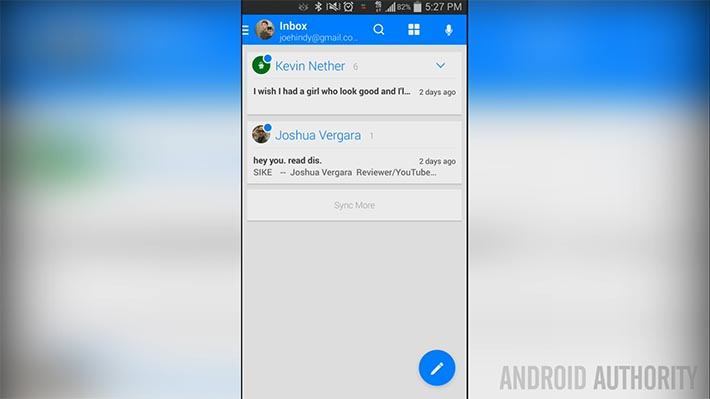
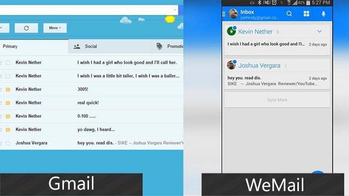
One of the things you’ll notice immediately is how emails are organized. Generally, they’re in chronological order whereas in WeMail they’re organized by sender. So if someone sends you a bunch of emails, they all appear in one space and not as individual emails. Pictured below is a comparison.
In terms of functionality, it actually functions more like a chat application rather than an email app. Messages are threaded and in bubble layout like Whatsapp or Hangouts and that can make them easier to read. You can respond to email and otherwise interact with the email just like you can in a messaging app with a few extra tools because it is email.
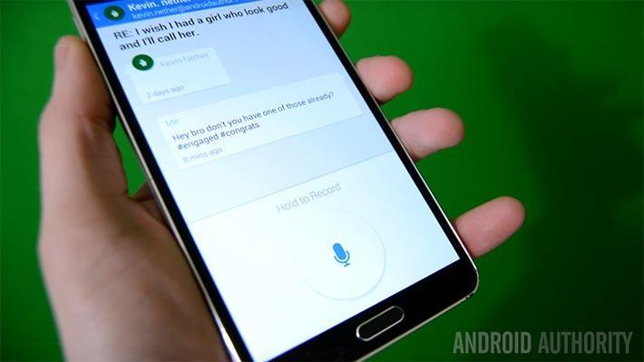
One fun feature is the voice response. Instead of trying to figure out what you’re saying and put it in text, the app actually records what you’re saying and sends it in a sound file. If you’re on WeMail, you can play these right from the chat bubble and if you’re on a regular client, they show up as a sound file attachment that you can download and play.
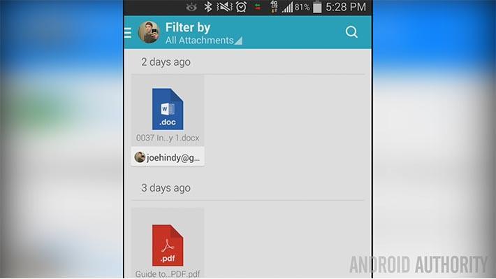
In WeMail, the attachments are managed all under one interface kind of like you’d see in cloud storage. I get a lot of attachments and this actually made it substantially easier to manage and find files and it’s actually my favorite feature of this app. There is also an above average search function to find messages you’ve sent or received.
Overall, this is something very different and whether or not you like it will be determined on how much you like dealing with email in its current form. There are a lot of spots where WeMail is faster and more efficient and that’s especially true with attachments and dealing with a lot of emails from the same people over and over again. The Material Design looks nice and fits this app like glove without being too ostentatious.
I did have a pre-release copy so there were some small things I experienced that probably won’t be in the actual app such as some sync delays, especially in Gmail. It’s also worth mentioning that this app doesn’t include a lot of the things that full featured email clients use like text formatting so if you’re big into that, you may not be writing a lot of emails on here.
On mobile devices, this has a chance to be something truly different. The focus on simplicity is apparent and refreshing and they do support multiple accounts on multiple services. If you’re interested in trying it out, click the button below.


