Affiliate links on Android Authority may earn us a commission. Learn more.
What is Material You? Google's design language explained
January 26, 2023
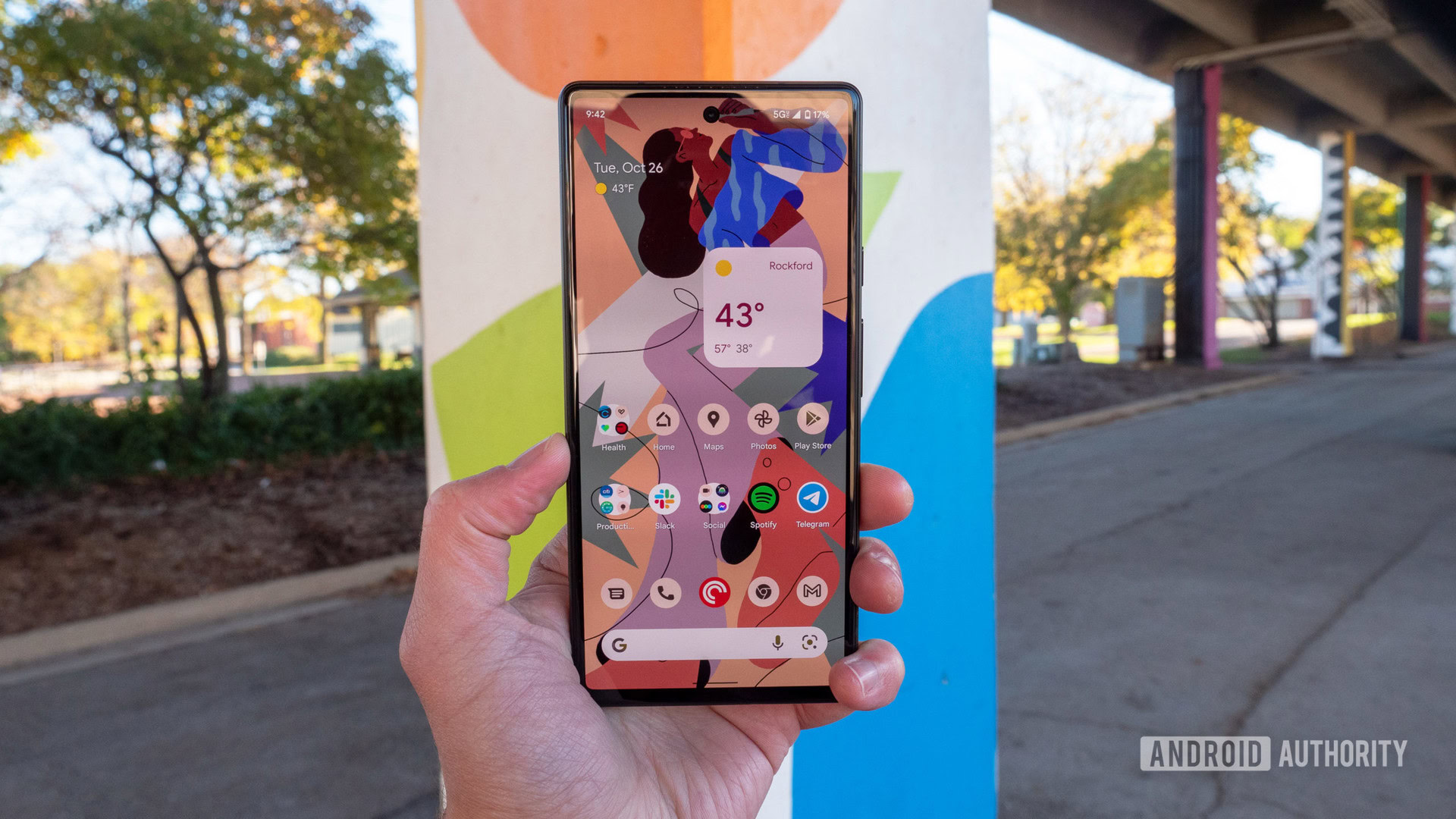
With the release of Android 12, Google announced Material You — a reboot of the Material Design framework it first introduced in 2014. Today, you’ll find elements of Material You on many Android smartphones, but only some of the changes are immediately obvious. So in this article, let’s take a closer look at Material You, what it looks like, and how you can customize its behavior on your own Android device.
What is Material You?
Material You, also known as Material Design 3, is Google’s latest design language and framework. Besides Android, you’ll find it applied across Google products like the Pixel Watch and even smart displays.
Material You introduces user personalization to the original Material Design framework.
When the search giant first introduced Material Design in 2014, it aimed to introduce a modern and consistent UI design across its apps and products. Fast forward to 2021 and Google added personalization into the mix with Material You. The idea is simple: select a new wallpaper and your phone automatically generates a matching color palette. That’s the “you” in Material You, of course, but what about the “material” bit?
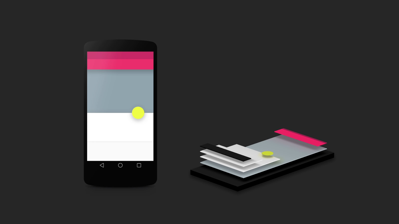
The first iteration of Material Design toyed with the idea of representing tangible materials (like paper) in 3D space. Google’s designers designed UI elements to mimic surfaces and objects that we already interact with in the real world. In early demos, for example, they highlighted how shadows would represent the stacking of objects, like a button floating on top of a paper-like card or a pull-out menu hovering over the UI elements underneath.
Motion is also a big part of Material Design — animations take inspiration from real-world forces like gravity and friction. Likewise, tapping a button generates a ripple effect from the point of your touch, with a new card gradually expanding to fill the screen.
Finally, Material Design introduced a much-needed splash of color to the mobile operating system. It replaced Android’s Holo theme, which religiously used the Holo Blue accent color across the entire operating system. By contrast, Material Design featured vibrant pastel hues that allowed individual apps and brands to express their identity through color alone.
See also: The history of Android
Material You takes all of these design principles one step further. Here’s a quick run-down of the highlights.
Color extraction
When Matías Duarte, Google’s VP of Design, unveiled Material You at the company’s annual developer conference in 2021, he pitched it as an individualistic and expressive evolution of the original Material Design. He asked the audience, “Instead of form following function, what if form followed feeling?”
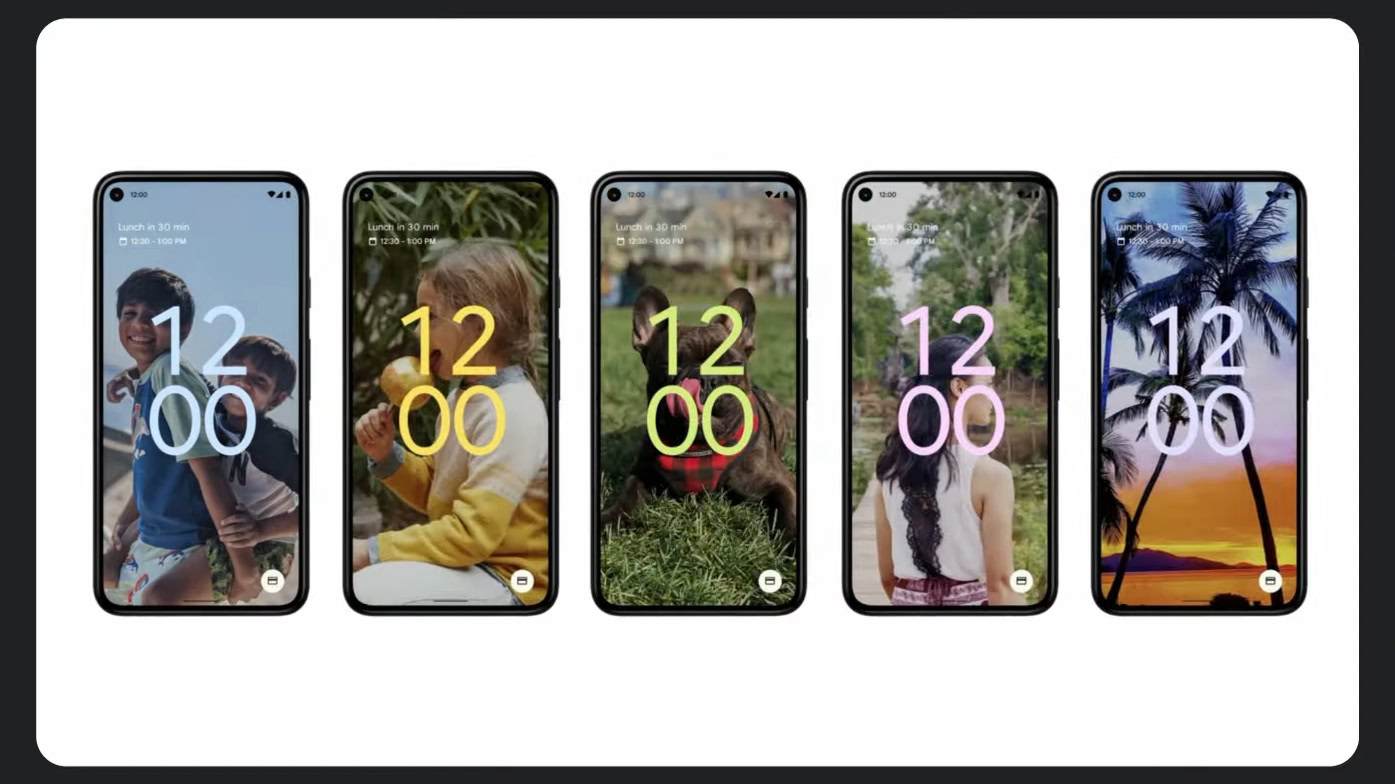
In more practical terms, Material You gets rid of the default Material Design theme and the stock color palette. Instead, it introduces a dynamic theming system that algorithmically picks a primary color based on the device’s wallpaper. It also generates a complete tonal palette and applies it across the entire Android UI, as well as built-in and third-party apps.
With Material You, your device automatically generates a matching color palette when you pick a new wallpaper.
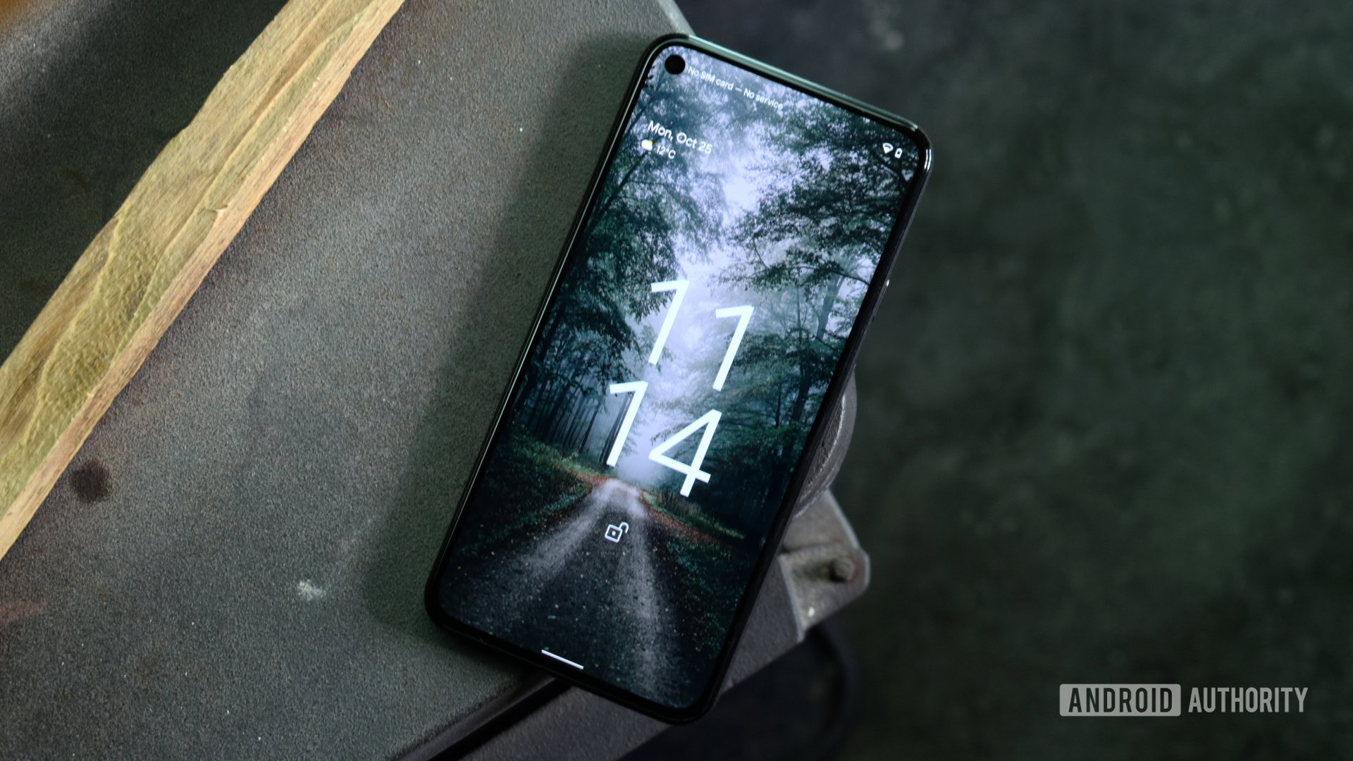
The changes introduced with Material You become apparent before you even reach your home screen. The lock screen clock, for example, is styled based on your wallpaper’s dominant color (pictured above). The stock calculator, dialer, and clock apps all feature Material You-based colors too.
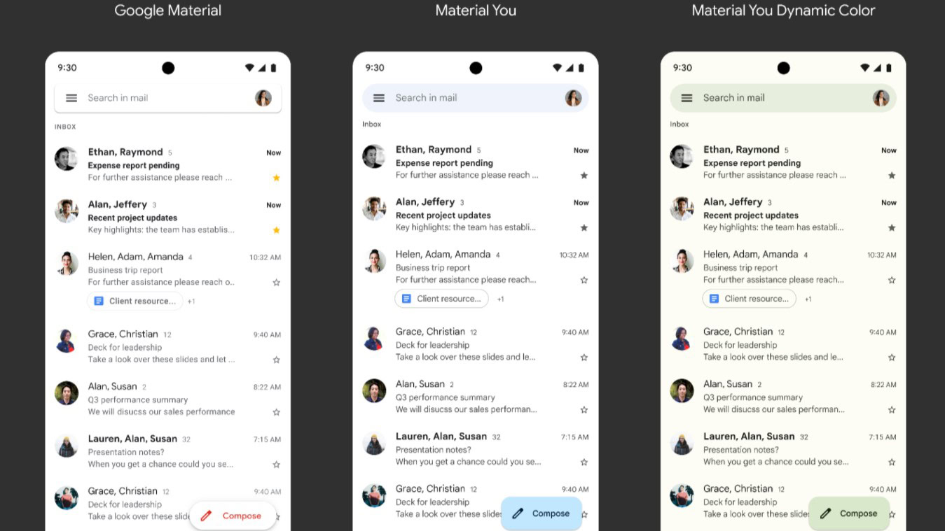
Google began rolling out Material You theming to all of its first-party apps alongside the release of Android 12 on Pixel smartphones. Gmail (pictured above), Gboard, Maps, and Google Meet all apply the dominant and complementary colors across buttons, search bars, and other components.
Bolder widgets

With the release of Android 12 and Material You, Google improved home screen widgets for the first time in several years.
The first big change was to the look and feel — widgets now feature rounded corners and support for device theming, complete with support for dark mode. Both of these improvements go a long way toward matching widgets with other aspects of the UI. And on Google phones, widgets even change color based on where you place them on your home screen.
Refined notification panel and animations
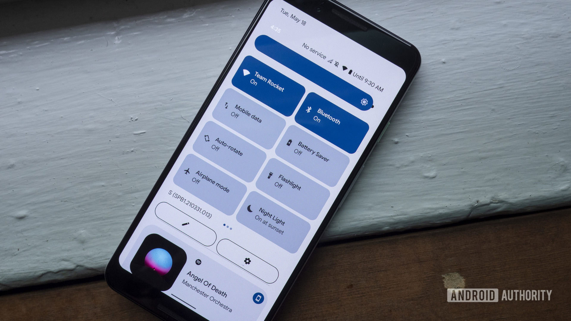
The quick settings menu — and notification shade, in general — received a big overhaul with Material You.
Starting from the top, you’ll notice a reduction in the number of settings toggles and organizes them into a grid with labels instead of a row of icons. Individual settings look like pills or bubbles and use the dominant Material You color to indicate whether they’re enabled or not. Notifications get the same visual treatment with a bubble-like appearance to match Material You’s rounded aesthetic.
Material You also brought refinements to animations, with the aim of making them feel more natural and responsive to user input. For example, when you wake up the phone, the screen lights up from the location of the power button. Likewise, overlays like the power menu and volume control now gracefully slide into view.
Improved accessibility

With Material You, Google added a few new accessibility features to Android. The most notable change is visible in the default Android Settings app, which now includes empty whitespace at the top of the list. This pushes down the first menu entry to the middle of the screen and makes it more convenient to reach one-handed on larger devices.
We first saw Samsung adopt this accessibility feature with its One UI skin, but starting with Android 12, it’s now part of the general Android design language.
Is Material You available on all Android phones?
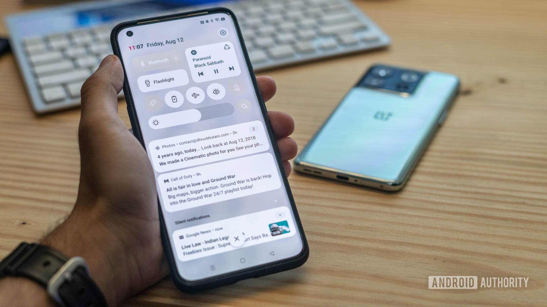
Even though color extraction was billed as a headlining feature, Google didn’t make its wallpaper-based theming engine (codename “monet”) available in the AOSP build of Android 12. In fact, Google didn’t add monet to AOSP until the release of Android 12L in March 2022. That left device makers like Samsung and OPPO with no choice but to build their own color extraction systems in time for their Android 12 updates.
So is Material You available on all Android devices? On non-Pixel smartphones, you should see at least some aspects (like color extraction) on Android 12 and higher versions.
Most phones running Android 12 or newer feature at least a handful of Material You elements.
Google didn’t force manufacturers to adopt Material You design elements, so many changes like the revamped widgets, quick settings toggles, and animations didn’t make their way to third-party skins like One UI or Oxygen OS with Android 12. That said, we’ve seen some manufacturers like OnePlus port even more Material You elements with their Android 13 updates.
You’ll find Google’s monet theme engine implemented in skins like Nothing OS and Motorola’s My UX that are closer to stock Android. But if you want the full and proper Material You experience, you’ll likely only find it on Google devices like the Pixel 7 series.
How to change the Material You color scheme on Android
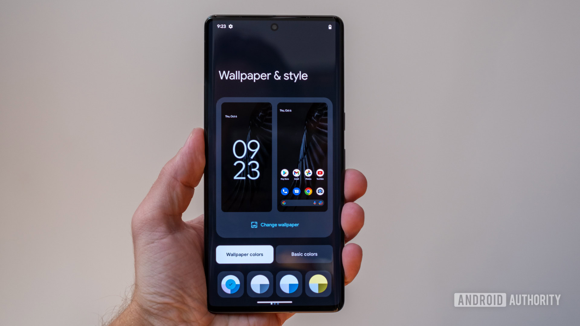
To change the Material You color scheme on a device running Android 12 or newer, simply follow these steps:
- Open the Settings app and navigate to the Wallpaper & style section.
- Pick a new wallpaper with the color scheme of your choice.
- Towards the bottom, you’ll find a new section where you can pick from a handful of color palette options based on your wallpaper.
- If you don’t like any of the existing options, switch to the Basic colors tab and pick your own accent color.
- You’ll notice a little preview at the top showing what the color scheme looks like in various apps. If you’re happy with the look, tap Apply.
- That’s it — you should now see your selected Material You color palette take effect across the Android UI and Google apps.
Thank you for being part of our community. Read our Comment Policy before posting.
