Affiliate links on Android Authority may earn us a commission. Learn more.
WhatsApp gets major makeover, introduces new colors, icons, and better dark mode
Published onMay 9, 2024

- WhatsApp is introducing a new color palette and updated icons, illustrations, and chat background.
- The Android app is getting a bottom navigation bar.
- A new attachment layout is coming to iOS.
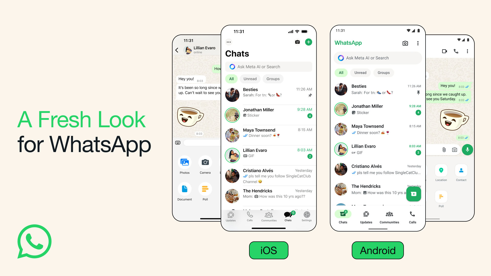
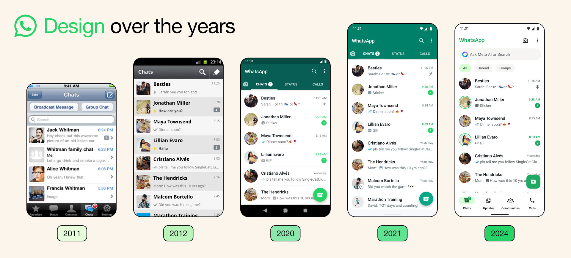
WhatsApp has seen numerous adjustments to its design over the years, with the last major change occurring in 2021. The company has now refreshed the app once again. While some of the changes have already rolled out to the iOS and Android app, there are some new changes as well.
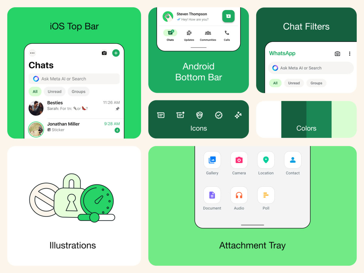
Today, WhatsApp announced it is updating the appearance of its platform to help keep it looking fresh, simple, and approachable. To do this, the firm has applied a variety of changes, one of the most notable being a new color palette. Along with having a more consistent green palette, WhatsApp says they have also increased the usage of neutral colors, which it claims allows it to be more selective about where and how the green is used throughout the app.

Dark mode on the app is also getting a noticeable update. WhatsApp has increased the contrast and is now using deeper tones to make dark mode darker and less eye-straining.
Along with these color adjustments, it looks like icons, illustrations, and the chat background are getting an update as well. Now icons will have a more rounded, outlined style, while illustrations have gained more playful animations. Meanwhile, the team has refreshed doodle for the default background for chats.

You’ll be able to see these changes on both the Android and iOS apps. However, there are a couple of new additions that will be exclusive to one or the other. Something that will be exclusive to iOS is a new attachment layout that introduces an expandable tray for sending media, polls, documents, and more. As for Android, you’ll now see a navigation bar on the bottom. WhatsApp says that adding this bar has enabled it to design chat filters to be at the top of the chats list, allowing people to quickly find conversations without having to scroll through their entire inbox.