Affiliate links on Android Authority may earn us a commission. Learn more.
Even the White House website has a dark mode
Published onJanuary 20, 2021
- The White House website now has a dark mode under President Biden.
- You can even adjust the font size.
- It brings the modern web to the heart of US politics.
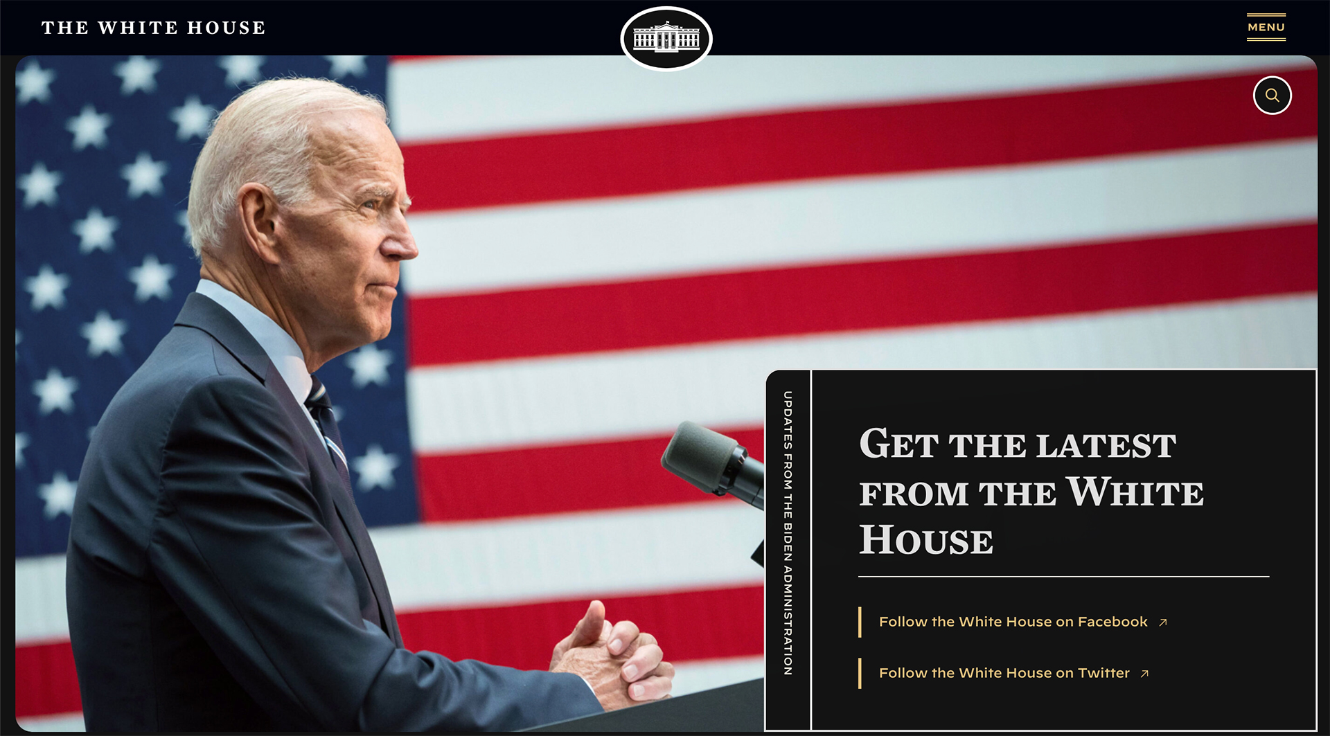
Seemingly every app and website has a dark mode at this point, and that now includes the people at 1600 Pennsylvania Avenue. The White House website has received an overhaul now that President Biden is in office, and one of the most conspicuous changes is a dark mode.

Tap a “toggle high contrast” button on the side and dark mode kicks in across the entire White House site, changing the background and fonts whether you’re on desktop or mobile. That should make it easier to read at night, of course, but it’s also a helpful accessibility gesture — this could make pages legible if vision issues interfere with the default look.
You can also enable a large font size if the text is too small.
The addition of a dark mode to the White House site isn’t surprising. A new administration presents an opportunity to rethink the government’s web presence, and that usually means adapting to newer technologies as well as the incoming President’s priorities. In this case, Biden’s team is acknowledging that a wide range of people might visit the site, whether it’s people who need visual assistance or just late-night web surfers.
