Affiliate links on Android Authority may earn us a commission. Learn more.
Will anyone be sad to lose Samsung's physical home button?
Published onDecember 9, 2016

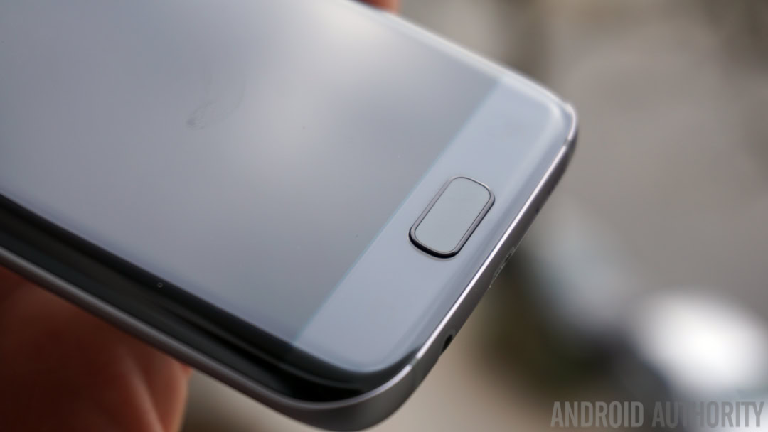
The physical home button is a smartphone facet that’s slowly becoming extinct. In 2016, the flagship devices from Google, Sony, LG, and HUAWEI all lacked such a button on their hardware. Meanwhile, Samsung has been holding onto the physical home button – it was still in place on its most recent flagship, the ill-fated Galaxy Note 7 – though the company is expected to ditch it on its upcoming flagship, the Galaxy S8. But what impact will losing physical home buttons have? To answer that, let’s first explore its origins.
The move to touchscreens
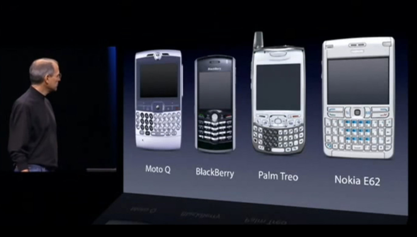
Though it wasn’t the first device to make use of a touchscreen, much can be attributed to the original iPhone for popularizing it. When numbers and letters could be drawn on a display, there was no longer a need for a traditional keyboard setup, meaning screens were able to occupy a larger space on the handset without increasing the size of the body overall. What’s more, the keys could be contextual: when using the dialer, for example, they could act as large numbers. For emails, a traditional QWERTY keyboard could appear.
Though it lost most of the buttons found on prior handsets, the iPhone would feature a power button, volume controls and a physical home button, plopped front and bottom center of the handset. Pressing this would return users to the iPhone’s home screen – hence its name – no matter which folder or app they were currently in, thus eliminating the need to repeatedly hit a return or back button to jump to the main part of the interface.

It’s a setup that would prove popular. So popular, in fact, that the home button placement and function seen on the iPhone are still used today on almost every smartphone. However, its existence as a physical entity is not a steadfast requirement and, perhaps, is no longer even desirable.
Go soft or go home
There are a handful of different approaches to the home button commonly in use today. There’s the “clickable” version found on Samsung’s Galaxy phones, the fixed recess like OnePlus uses, the capacitive buttons which sit off-screen as on the ZTE Axon 7, and then software buttons found on recent Google, Sony, and LG phones.
Software home buttons, which typically replace hardware home buttons at the center of the display, are used by many manufacturers for several reasons. One: mass-manufacturing hardware costs more than software; so when the function of a home button can be included as part of the software, companies can avoid unnecessary production costs. Two: it’s difficult to damage virtual buttons in the same way as physical buttons, by which I mean a software home button won’t wear out over time or be destroyed after an unfortunate fall like a physical one might.
Three: home buttons require space on the handset – space which could instead be used by the display. Just as Apple did with the original iPhone, manufacturers are still trying to optimize the screen-to-body ratios of smartphones (see the recent Xiaomi Mi MIX and the HUAWEI Mate 9 for good examples of this). Samsung is currently rumored to be aiming for a 90 percent screen-to-body ratio on its Galaxy S8; dropping the home button will go some way to helping it achieve that.

So, when removing physical home buttons could result in lower-cost handsets, with larger screen-to-body ratios, featuring one less thing that could break, why would anybody still want one?
Feeling at home
There’s a reason why modern gaming console controllers vibrate, and why modern e-reader apps have page turning animations, and why smartphones have haptic feedback, even when none of these features are critical to functionality. Humans like tactile sensations – and they also like what they know.
Pressing buttons was once necessary to make physical processes happen, we applied force to keys on a typewriter so that they hammered against the paper. Now, designers are seeking to deliver sensory feedback even when it’s not critical.
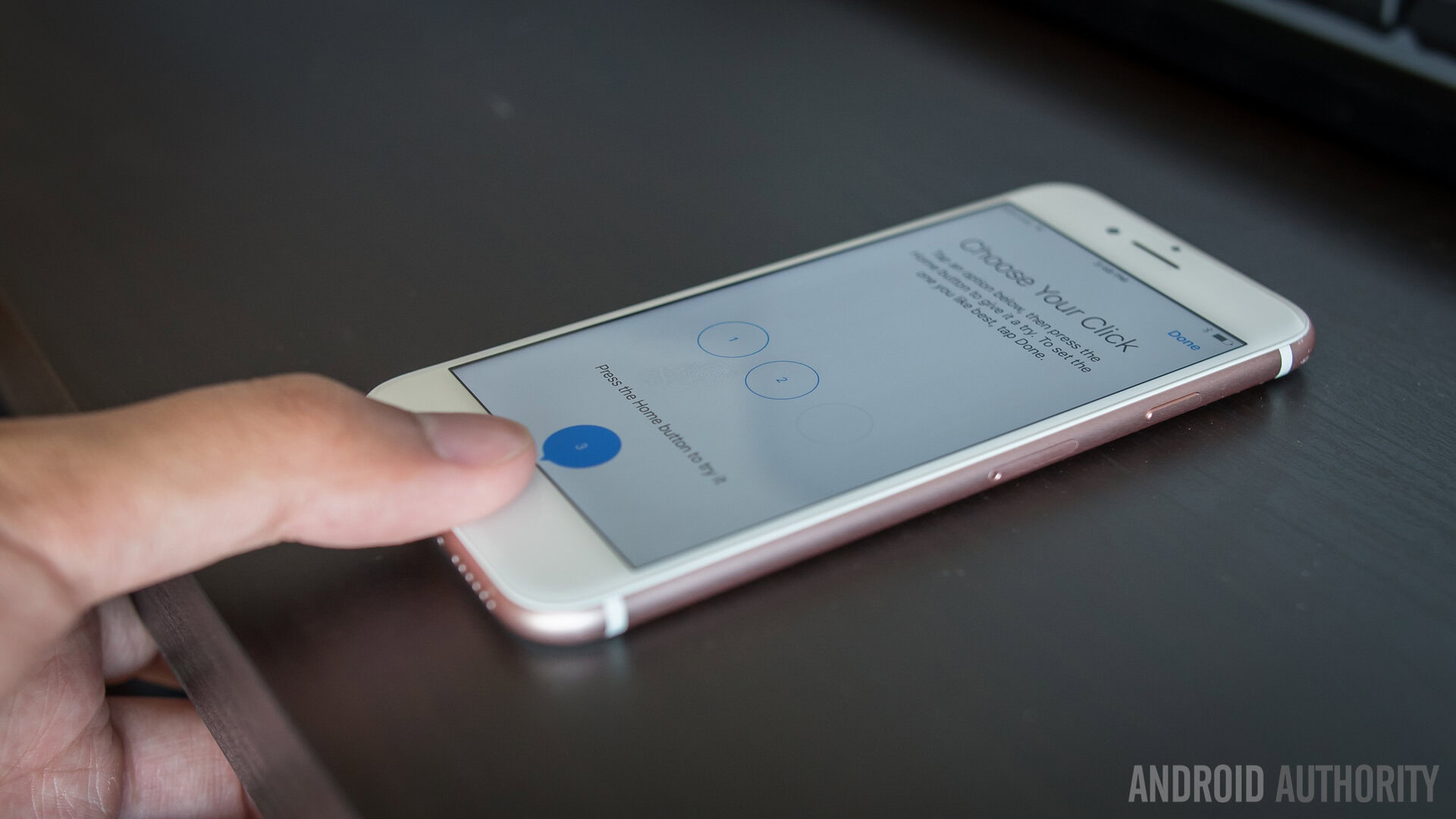
In the iPhone 7, for example, a hardware home button is in place, but whereas it used to physically depress on previous iPhones, it now only simulates the feeling of being pressed. This is achieved through Apple’s Taptic Engine, which can effectively recreate a number of sensations, but what’s interesting is that the home button doesn’t actually need this feature to work – you could use the home button more-or-less the same without receiving physical feedback.

The experience of pressing a physical home button, then, is arguably more satisfying than pressing a software one, in a similar way to how turning a physical page is more desirable to the on-screen equivalent (as much as engineers try to find ways to mitigate this).
But there are functional advantages to the physical home button too. Double pressing the home button to activate the camera as you can on Samsung phones is often more responsive because your body understands when the second press must land – it’s right after that first click. You might not even be conscious of it, it’s automatic. What’s more, a hardware home button is easier to find without looking at the display as it can be located by your fingertips.
Alas, these qualities may not be enough to keep the physical home button alive.
Bright as a button-less future
As manufacturers chase bigger displays on smaller handsets, perhaps it’s only a matter of time before the physical home button becomes a thing of the past (Samsung is even said to be working on a touch-display solution to fingerprint scanning, typically combined in its home buttons).
The physicality of the home button may be desirable – but there are limits to the value these qualities have. BlackBerry recently reintroduced a physical keyboard in its Priv device, however, despite the feeling and function it re-introduced, demand for it was reportedly low and BlackBerry will release its final QWERTY keyboard-equipped device in the near future.
Ultimately, the prospect of bigger displays will likely hold more appeal in the minds of consumers than the benefits of the physical home button, especially when its software alternative is already widely adopted.
I won’t miss them, but where do you stand on physical home buttons? Let me know your thoughts in the comments.