Affiliate links on Android Authority may earn us a commission. Learn more.
The 10 worst changes to stock Android
Published onApril 27, 2024
Android has been available for well over a decade now, and stock Android has come a long way since those heady days of 2008. Subsequent updates brought well-received additions like copy/paste, multi-touch, foldable phone support, a much smoother UI, and more.
But I would be lying if I said Google only ever made great changes and improvements to stock Android. That’s why I’ll be looking at the worst changes Google has made to pure Android over the years. Here are the biggest offenders, in no particular order.
Large quick settings
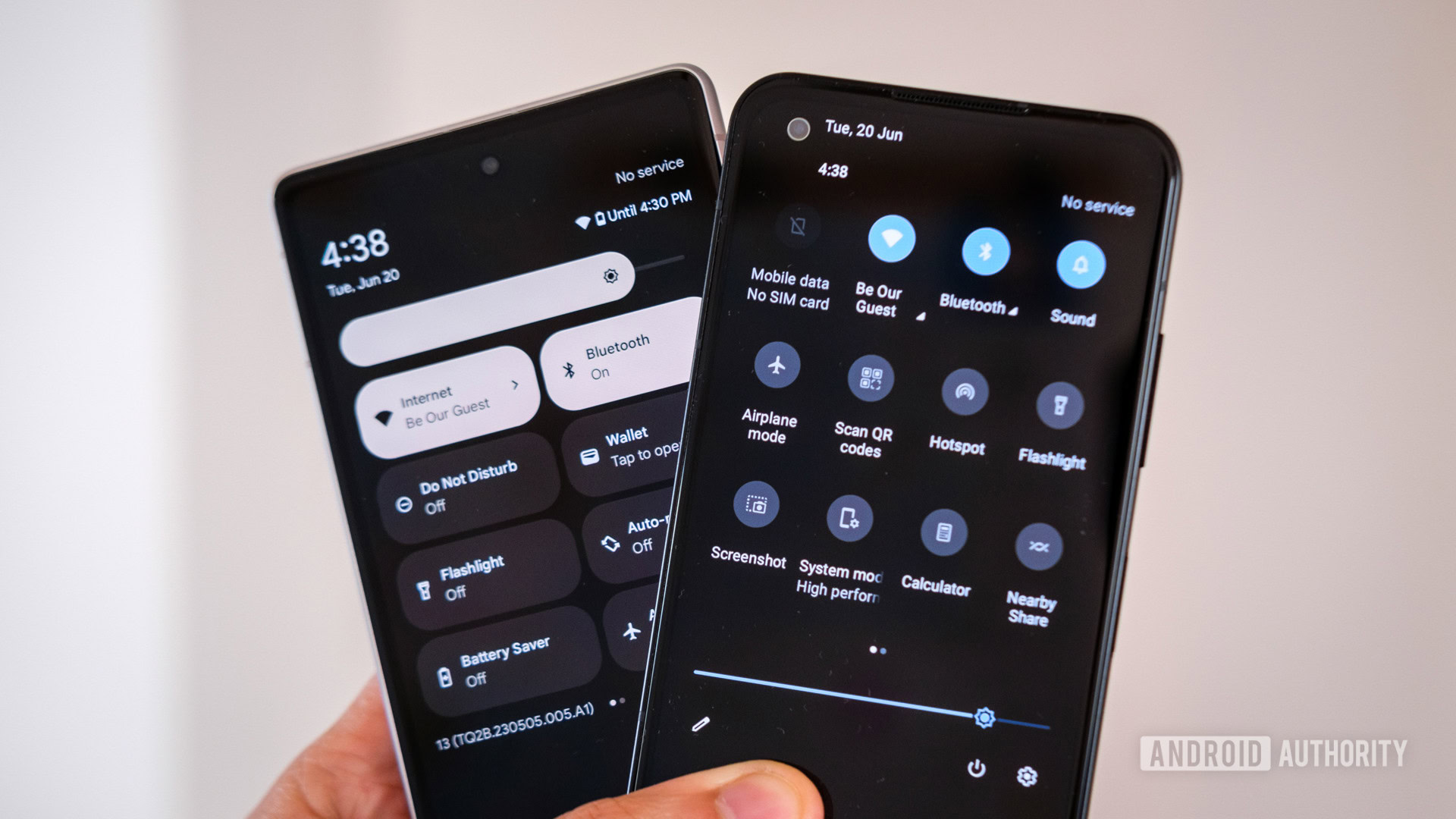
Quick settings have been around since 2012’s Android Jelly Bean release, and they were actually a custom ROM feature before that. With this handy drop-down, Android gives us a quick and easy way to toggle our most-used settings, such as Wi-Fi, Bluetooth, data, the ringer, and more.
But Google decided to dramatically change the look of this menu with the release of Android 12, opting for much larger quick settings tiles in stock Android and on Pixel phones. This dramatically reduced the number of tiles available in the notification shade to just four. You can still swipe down once more to show four more tiles for a total of eight and then swipe laterally to view even more tiles. But that doesn’t beat having eight or more visible tiles from the get-go, as is the case with many OEM skins. So we’re glad most Android brands haven’t fully followed Google’s lead here.
All but killing microSD support (temporarily)
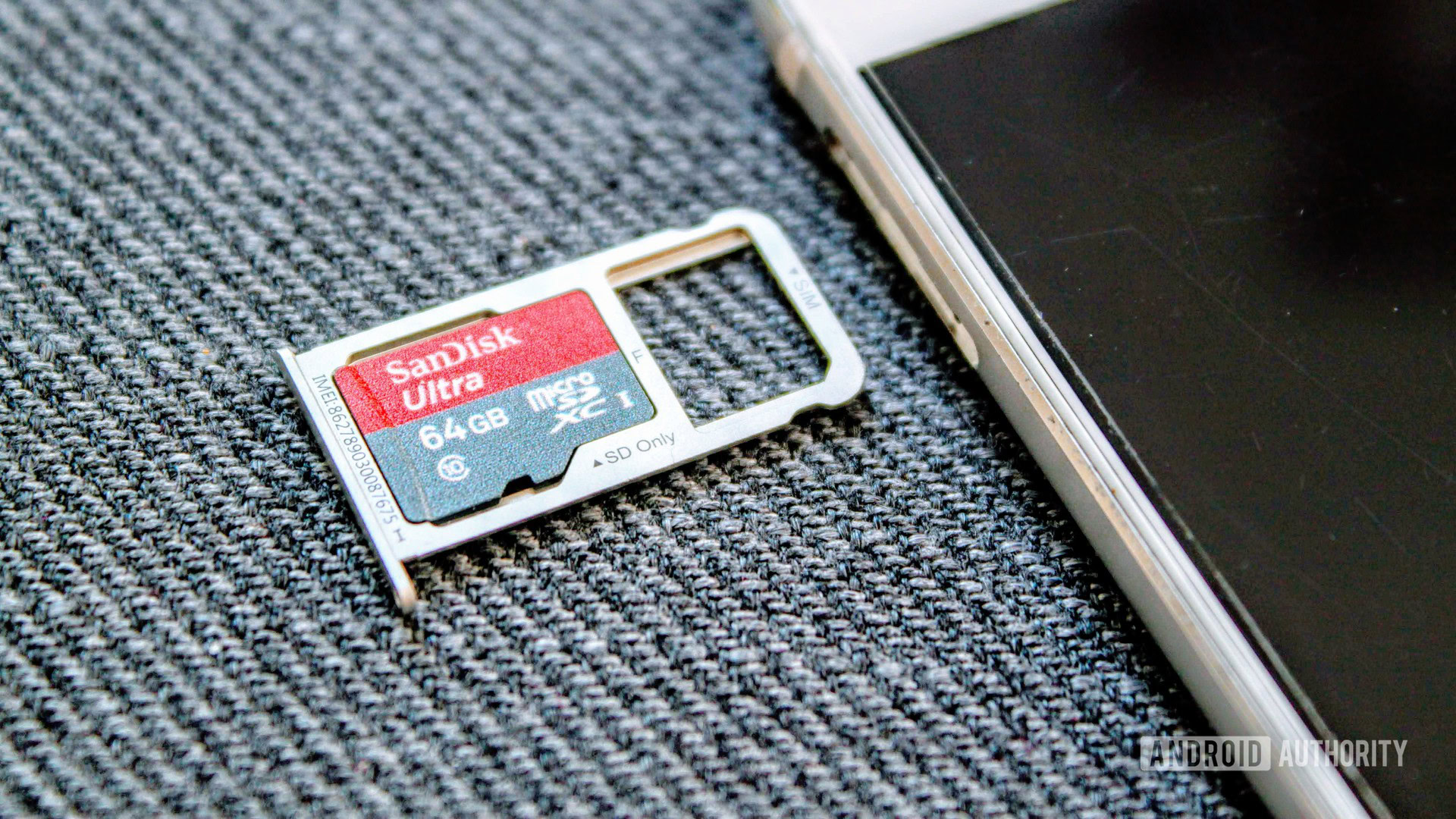
MicroSD card support is a rare feature on many Android phones today, but it’s still a great way to expand your storage on the cheap. So it was disappointing to see Google effectively kill microSD support back in 2013 with the Android 4.4 KitKat update. This change was done in the name of privacy, only allowing read access for a small portion of the card, but it was especially frustrating for people who updated their devices and realized SD card functionality was significantly hobbled.
Thankfully, Google saw the light in 2015 with the Android 6.0 Marshmallow update, which offered adoptable storage (i.e., the ability to unify internal and microSD storage). Using a microSD card on a modern phone is a pretty good, albeit limited, experience today.
Say hello to the Internet tile
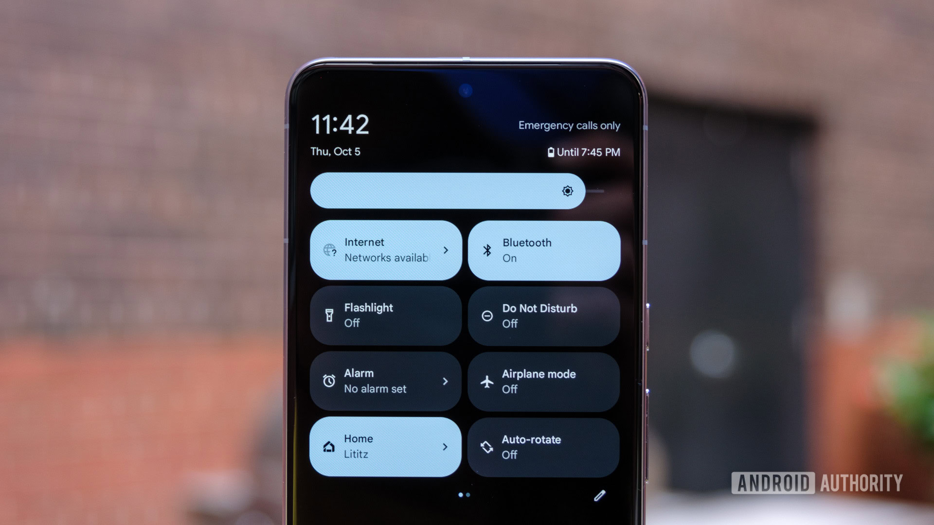
Oh boy, Android 12 really did introduce a few controversial changes! One of the more contentious tweaks was the decision to drop separate Wi-Fi and mobile data tiles in favor of an all-encompassing Internet tile. Tapping the tile would still show you cellular and Wi-Fi toggles, but this was still a case of “if it ain’t broke, don’t fix it” for many people (myself included). After all, it now takes two steps to toggle mobile data or Wi-Fi when it took just one step before.
Google defended the change by claiming that users often switched to their cellular connections due to poor Wi-Fi and then forgot to switch their Wi-Fi back on again. This can lead to excess mobile data usage and a potentially costly bill. The company acknowledged that the Internet tile took some getting used to, but claimed that users eventually found it to be a “more intuitive and straightforward” solution. Then again, Windows and Windows Phone both implemented the ability to automatically enable Wi-Fi after an hour, four hours, or more. If you ask me, that seems like the more straightforward solution.
Messing with the power button
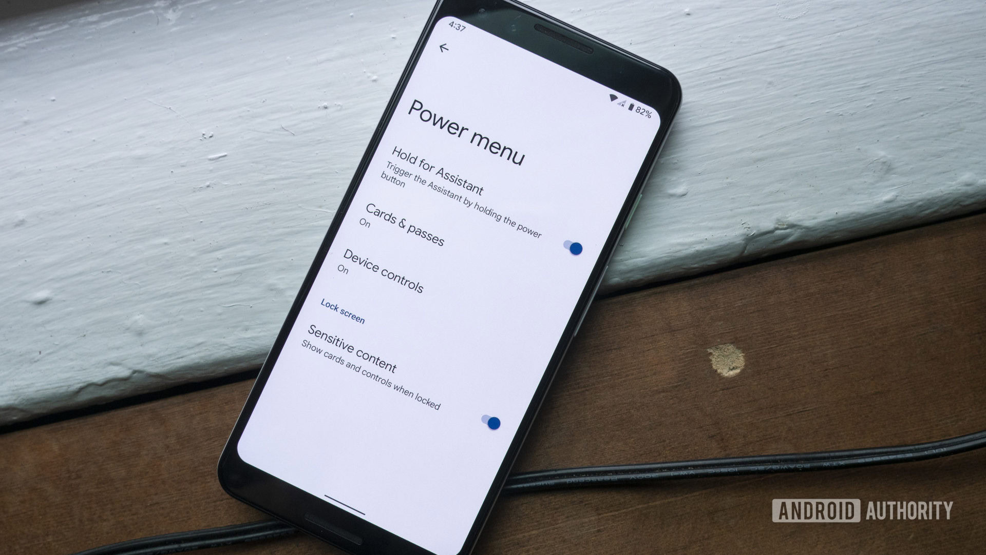
After trying to transform the power button menu into a smart home and wallet control center in Android 11, Google was back the next year with a much more baffling change. The decision to mess with the power button in Android 12 ranks right up there on my personal list of the worst ever changes to Android. Why would you make the power button summon Google Assistant by default? This forced many users to Google search how to turn their phones off. What next, the volume buttons can’t be used to control volume?! My Android Authority colleague Dhruv Bhutani also criticized this change a few years ago.
Thankfully, Pixel owners can revert to the old power button behavior by tapping Settings > System > Gestures > Press and hold power button > Power menu. But why you need to dig that deep in the first place to end this foolishness is beyond me.
Google pulls the App Ops feature
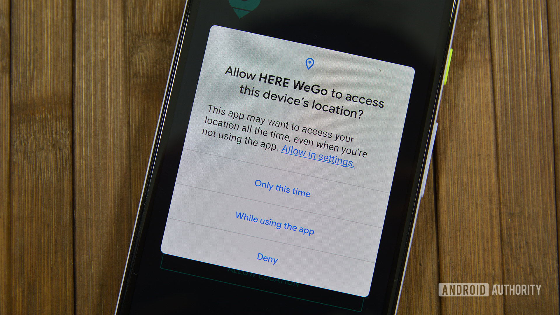
This wasn’t the first poorly received change to Android, but it’s certainly one of the most memorable tweaks in the earlier days of the platform. Google shipped an optional feature dubbed App Ops in Android 4.3, and it was a forerunner to the modern Android permissions system (seen above). This cool feature allowed you to enable/disable individual permissions for an app, as opposed to the all-or-nothing affair at the time.
Unfortunately, Google opted to pull App Ops in Android 4.4.2, with the company being roundly criticized as a result of this. Google insisted that the feature was only there for experimental reasons and could break apps. Either way, it took until Android 6.0 Marshmallow in 2015 for the modern permissions system to be implemented.
Android 5.0 ditches lock screen widgets
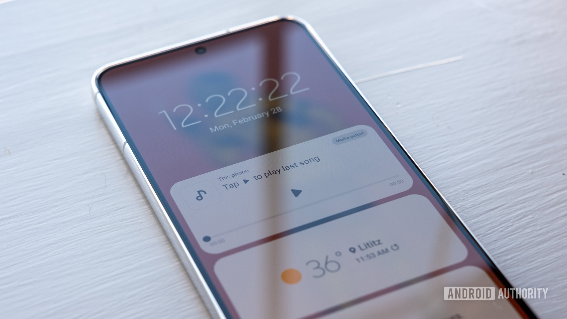
Lock screen widgets are all the rage now that Apple introduced them in iOS 16, but Android had this feature in 2012 on Android 4.2. Unfortunately, Google opted to kill it with the release of Android 5.0 Lollipop in 2014.
That was a real shame as it meant developers and users didn’t get to enjoy the feature for long. It’s especially unfortunate in light of Apple embracing it and showing off some nifty widgets and uses for it. The good news is that both Samsung and Nothing have since embraced this feature, while Android 15 is slated to get lock screen widgets, too.
Changing how you silence your phone
Android Lollipop also introduced another controversial change as Google changed how users silenced their phones. Previously, we could tap the volume buttons to lower the call volume to the minimum and then tap the volume-down key once more to enter silent mode. But Lollipop ditched silent mode altogether in favor of a so-called Priority Mode, which had to be activated from the popup volume menu and only allowed specific notifications to come through. The company also offered a “none” option, which blocked all alerts — even alarms.
The lack of a proper silent mode was pretty disappointing, resulting in third-party apps like SoundHUD resurrecting the silent mode and old volume controls. Google did come to its senses with the Android 6.0 Marshmallow update, though, offering a DND mode and legacy volume controls. Again, another case of the company learning the hard way that if it ain’t broke, don’t fix it.
Gestures or nothing on Pixel 3 (at first)
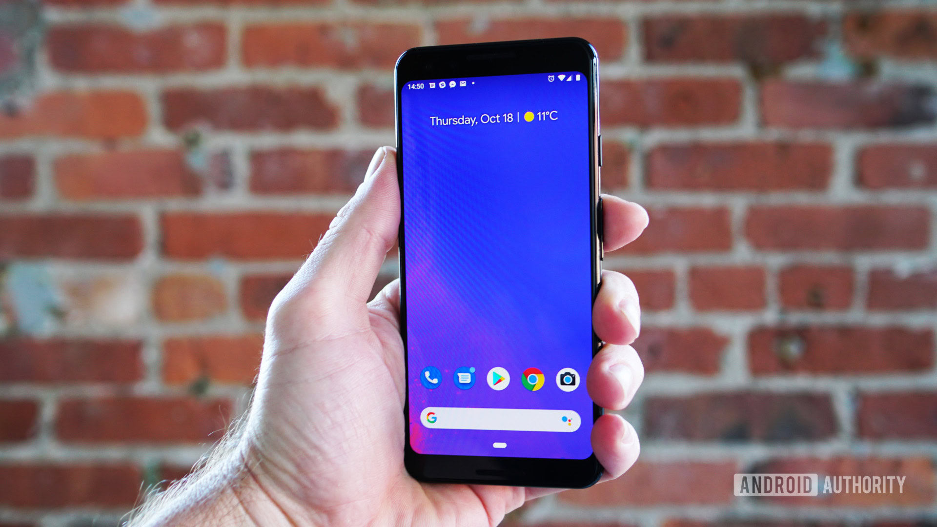
Google adopted gesture navigation with Android Pie in 2018, offering swipe-based gestures for going back, going home, and entering the Recents menu. That’s all well and good, but Google had to ruin things by making this the only navigation option on the Pixel 3 series at launch.
This meant Pixel 3 owners couldn’t actually switch to the classic three-button system if they hated this new navigation method. And these gestures definitely weren’t perfect by any means at first. Google would eventually see the light and revive the three-button navigation option when Android 10 came to the Pixel 3 series.
The disruptive Scoped storage
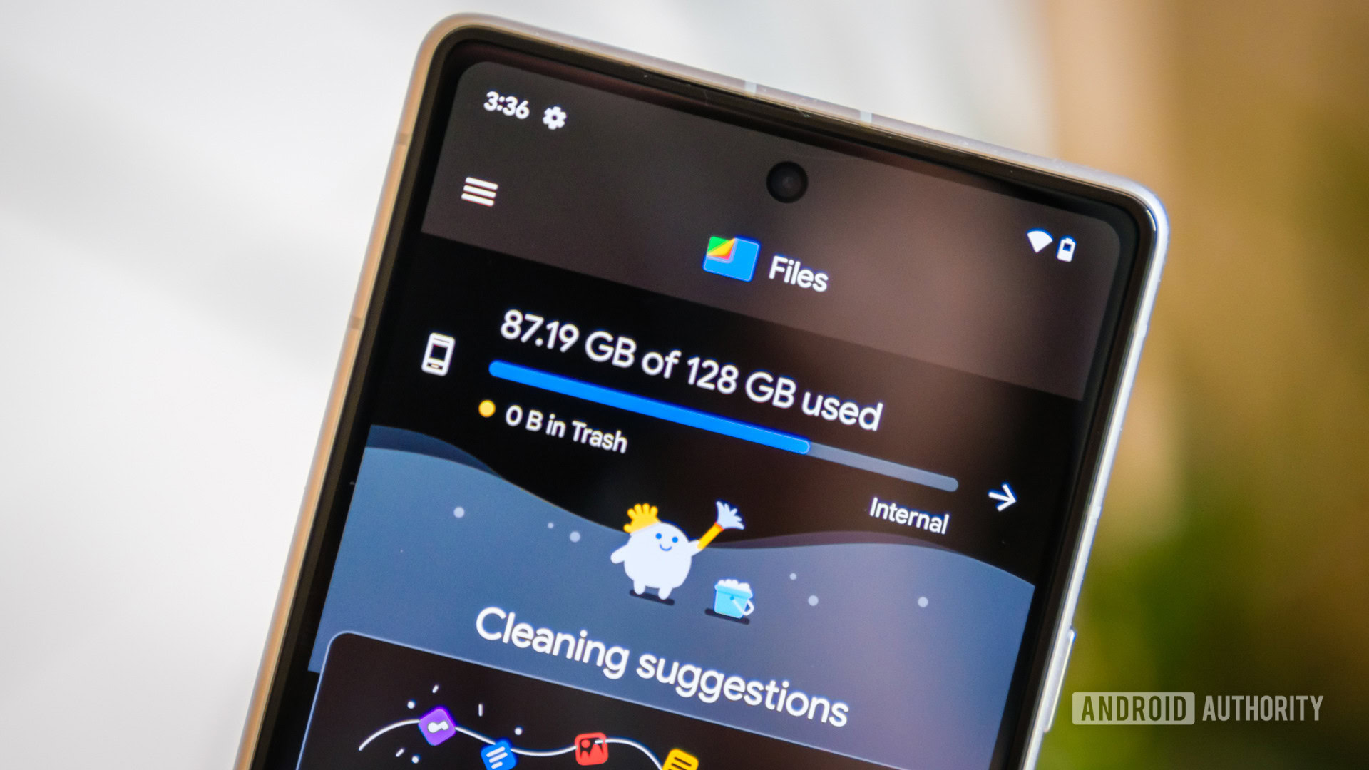
Prior to Android 10, any app that was granted storage permission could theoretically access your device’s entire storage. That’s not great as it means apps could access sensitive files, resulting in a privacy and security risk. Google’s solution was Scoped Storage, which was introduced in Android 10 and made mandatory in Android 11. This feature meant apps could only have access to their own directory of files.
Unfortunately, the feature wrought havoc with some existing apps and was a particularly huge issue for tools like backup utilities and file managers. This was also a major problem for people who wanted to transfer app-specific files (e.g. game saves and game data) to another device. Thankfully, Google did eventually grant exemptions for some “core” apps. But this is still a big issue for some apps today.
SafetyNet vs custom ROMs

Google launched the SafetyNet API in 2017, using it to verify the security and integrity of an Android device. That’s important to ensure that sensitive data and apps are indeed secure. So why do we consider this a bad change to Android?
Devices running custom ROMs couldn’t pass SafetyNet attestation, which meant that sensitive apps like banking apps, Google Pay, and some streaming apps wouldn’t actually work on these phones without third-party workarounds. Even Google’s own Android beta and developer previews failed SafetyNet verification a few times! SafetyNet has been a major blow to the most enthusiastic Android crowds, and you can certainly argue that it’s a big reason why custom ROMs have seen a major drop in popularity.
That’s it for our list of the worst changes to stock Android. Are there any other changes we may have missed? Let us know in the comments!