Affiliate links on Android Authority may earn us a commission. Learn more.
Xiaomi Mi 8 Pro review: Pro ambitions, amateur mistakes
Published onDecember 24, 2018
Xiaomi Mi 8 Pro
What we like
What we don't like
Xiaomi Mi 8 Pro
When Xiaomi launched in the U.K., it brought a brand new phone for the global market — the Xiaomi Mi 8 Pro.
Essentially the Mi 8 Explorer Edition for buyers outside of China, the Mi 8 Pro tacks a few bells and whistles on to Xiaomi’s regular Mi 8 flagship, as well as a unique transparent look.
We already know the phone is built on a solid foundation. A lot of what makes the Mi 8 Pro tick is in its vanilla sibling, which we praised in our Mi 8 review earlier this year.
Does the Mi 8 Pro do enough to earn its slightly higher price tag? How does it stand up against the rest of 2018’s best affordable flagships? Find out in our Xiaomi Mi 8 Pro review.
About our Xiaomi Mi 8 Pro review
I wrote this review after spending just under three weeks with a Mi 8 Pro review unit supplied by Xiaomi. The phone (model M1807E8A) ran MIUI 9 and Android 8.1 Oreo out of the box, but was swiftly updated to MIUI 10 (Global version 10.0.1.0) with the October 2018 security patch. I used it mostly on my home Wi-Fi network, as well as O2’s 4G network in the U.K.
I encountered issues getting the always-on display to work at all, which is an issue I understand other Mi 8 Pro users have also encountered. We have contacted Xiaomi regarding this issue and will update this Mi 8 Pro review when the feature becomes available.
Design
We’ve opined that the regular Xiaomi Mi 8 bears a striking resemblance to the iPhone X and XS on multiple occasions. It shouldn’t be surprising that the Mi 8 Pro — which shares the same dimensions and overall design as the Mi 8 — also looks like it could’ve fallen off Apple’s assembly line.
Xiaomi is far from the only Chinese brand to lift design elements from the Cupertino giant, of course, but it’s by far the highest profile OEM to still rely so heavily on the “Android iPhone” look for its marquee series.
Read more: Best Xiaomi phones
The Mi 8 Pro does diverge a little further from its obvious influence than the Mi 8, however.
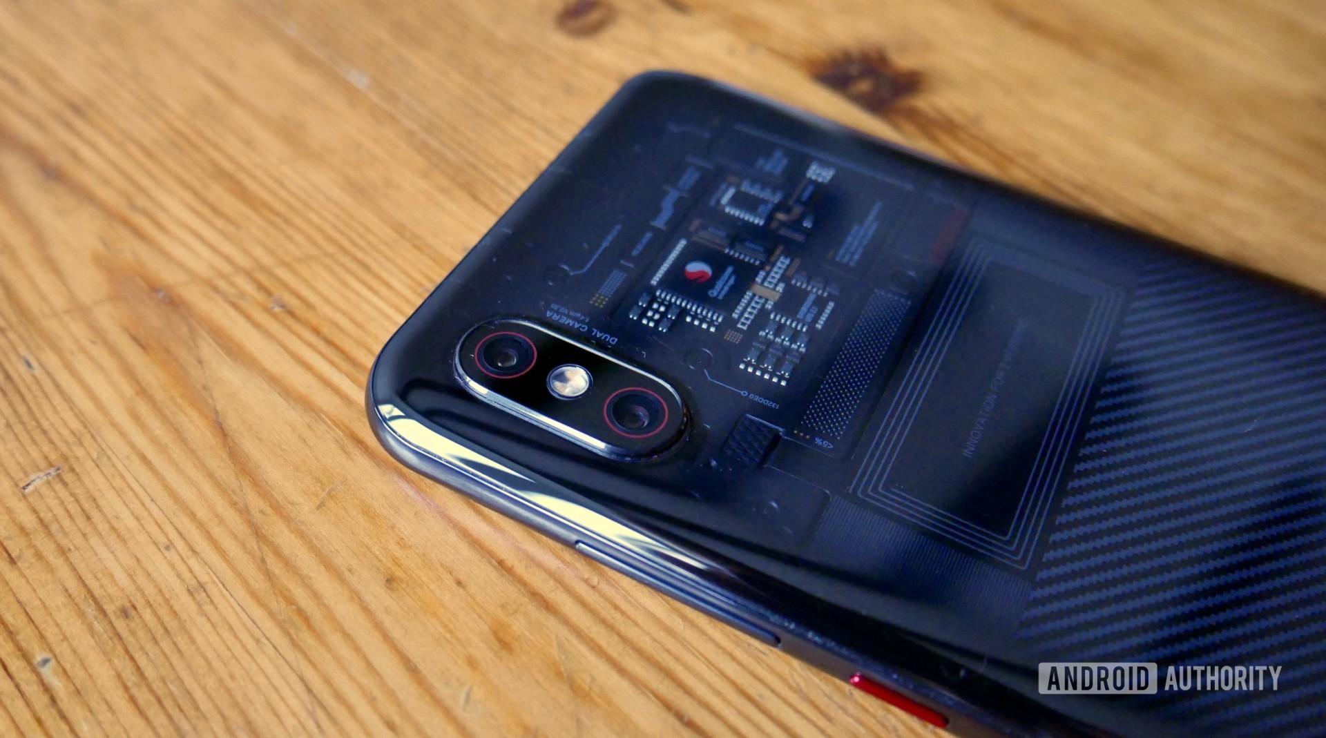
While blue and gold and pink colorways are available in China, the global Mi 8 Pro only comes in transparent titanium. This see-through glass style isn’t exactly new — the HTC U12 Plus opted for a similar look — but it’s eye catching without bordering on the ostentatious.
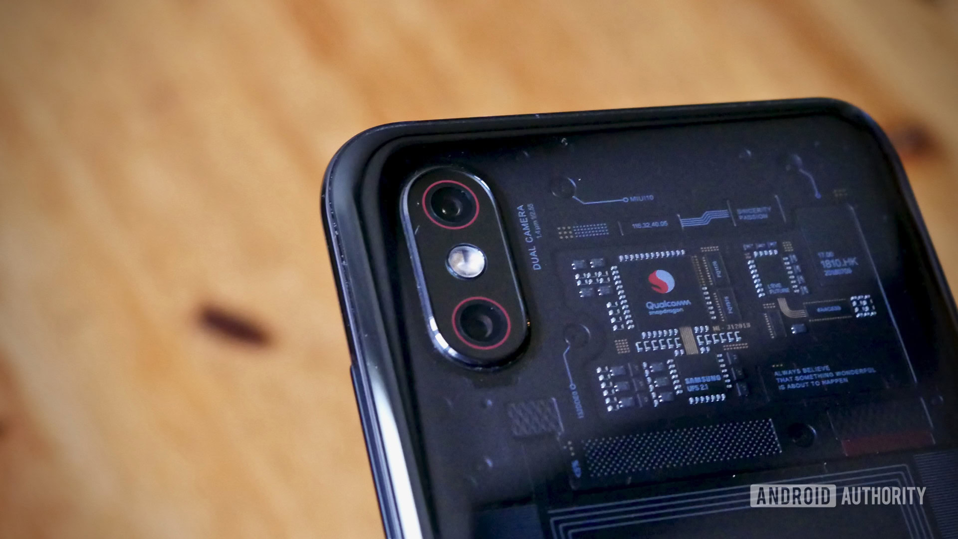
The same can’t be said, however, of what lies beneath the rear glass. Unlike HTC’s as-you-see-it approach, the Mi 8 Pro’s carefully constructed visible components are just that — constructed.
What you’re seeing isn’t all fake, but most of it is. If you’ve ever taken a phone apart or watched an amateur fix video, you’ll know phone component boards don’t look this tidy.
One thing that is real (Xiaomi assures me) is the rectangular NFC chip. Emblazoned with the phrase “Innovation for Everyone,” it’s far from the only bit of bizarre branding.
Scattered between the meticulously arranged faux-ponents are references to the onboard Samsung flash storage and the Qualcomm Snapdragon SoC, as well as several Xiaomi in-jokes and inspirational slogans.
If you’re anything like me, your mileage with these hidden messages will vary. I can abide the subtly nerdy hexadecimal representation of the Mi 1 launch, but the sledgehammer-to-the-face cringe of the “be the coolest company in the hearts of our users” line plastered near the bottom is stomach-churning.
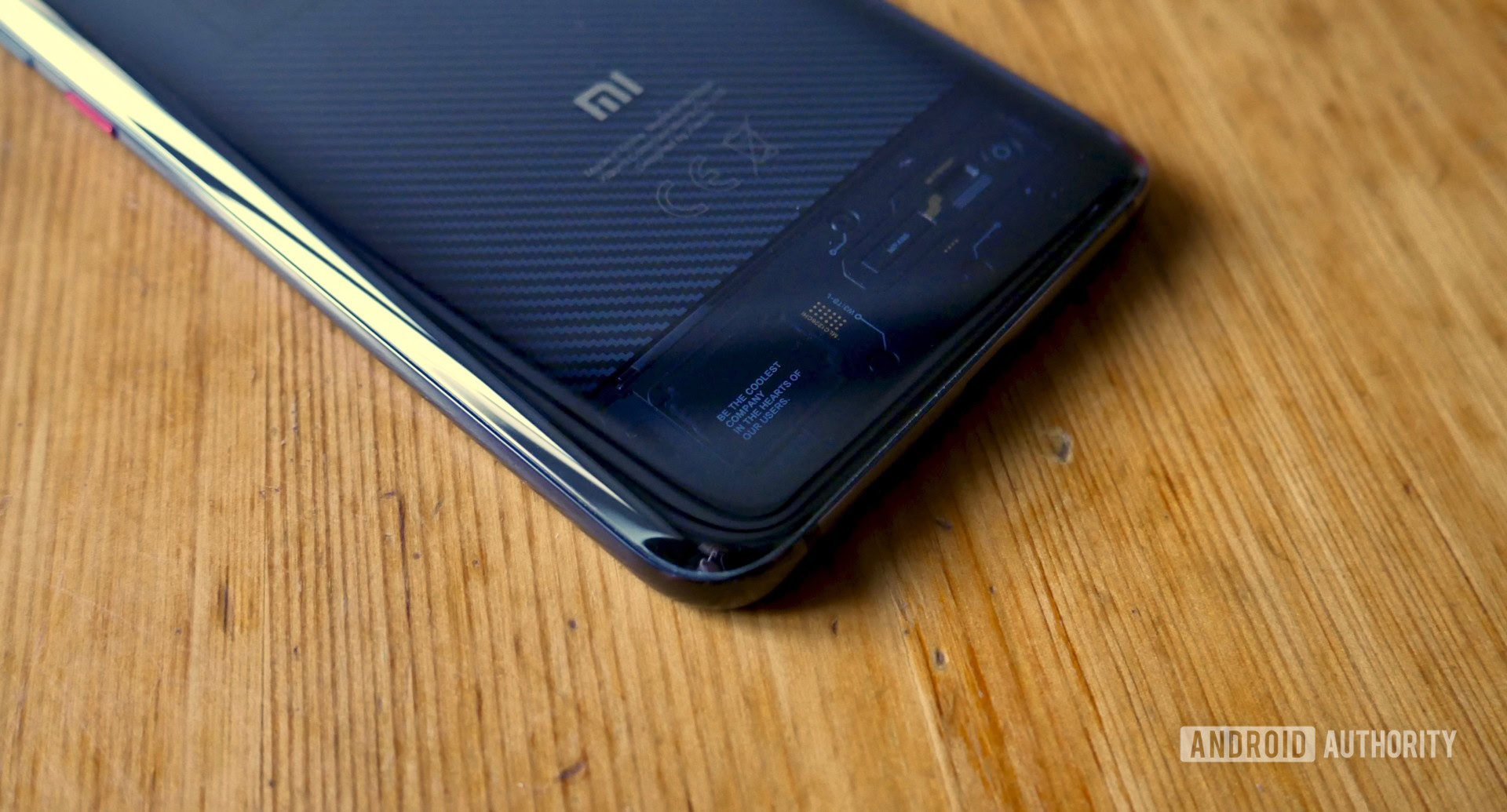
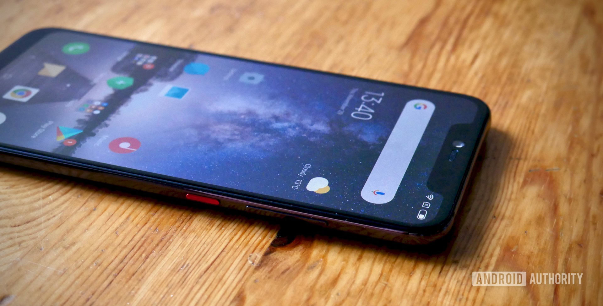
The Mi 8 Pro also features subtle red accents around the camera lenses and inside the USB Type-C port, and it has a chrome red power button on the right side just above the black volume rocker. I’m a sucker for tech that contrasts red and black so I love these minor touches.
As for the glass itself, Xiaomi stuck Corning Gorilla Glass 5 on both the front and back with a brushed, gently curved aluminium chassis separating the two. It’s far from the slipperiest phone I’ve used, but all that glass lead to some gasps as it slid off my sofa on a few occasions.
The rear glass also has a plastic feel in your palm and a number of hairline scratches have appeared on both sides from general use. In short, buy a case (or use the one provided in the box).
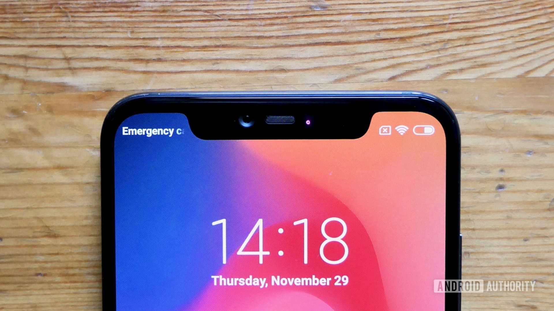
I can’t talk design without mentioning that notch, which is shorter than the worst offenders (hello, Pixel 3 XL), but quite a bit wider than the average notch. There’s plenty of tech crammed in there, like a 20MP selfie shooter and an infrared camera, but it could still be a deal breaker for many, especially with the dawn of waterdrop notches and other alternatives on the horizon.
While the bottom bezel is a reasonable size, it’s disappointing to see such relatively thick bezels surrounding the display, particularly around the top where the screen’s forced bunny ears are squeezed in by the encroaching bezel void.
Considering the wider problems I had with notifications on the phone (more on that later), I have to wonder why the makers of the innovative Mi Mix 3 couldn’t juggle space more effectively to allow additional room in the left “ear” for more than just a tiny digital clock.
Otherwise this is Mi 8 business as usual. The bottom mounted speaker grill has a nasty habit of being exactly where you want to put your index finger, especially if you like playing mobile games. The only other major diversion from the Mi 8 series’ design is the missing fingerprint sensor, which is now under the display.
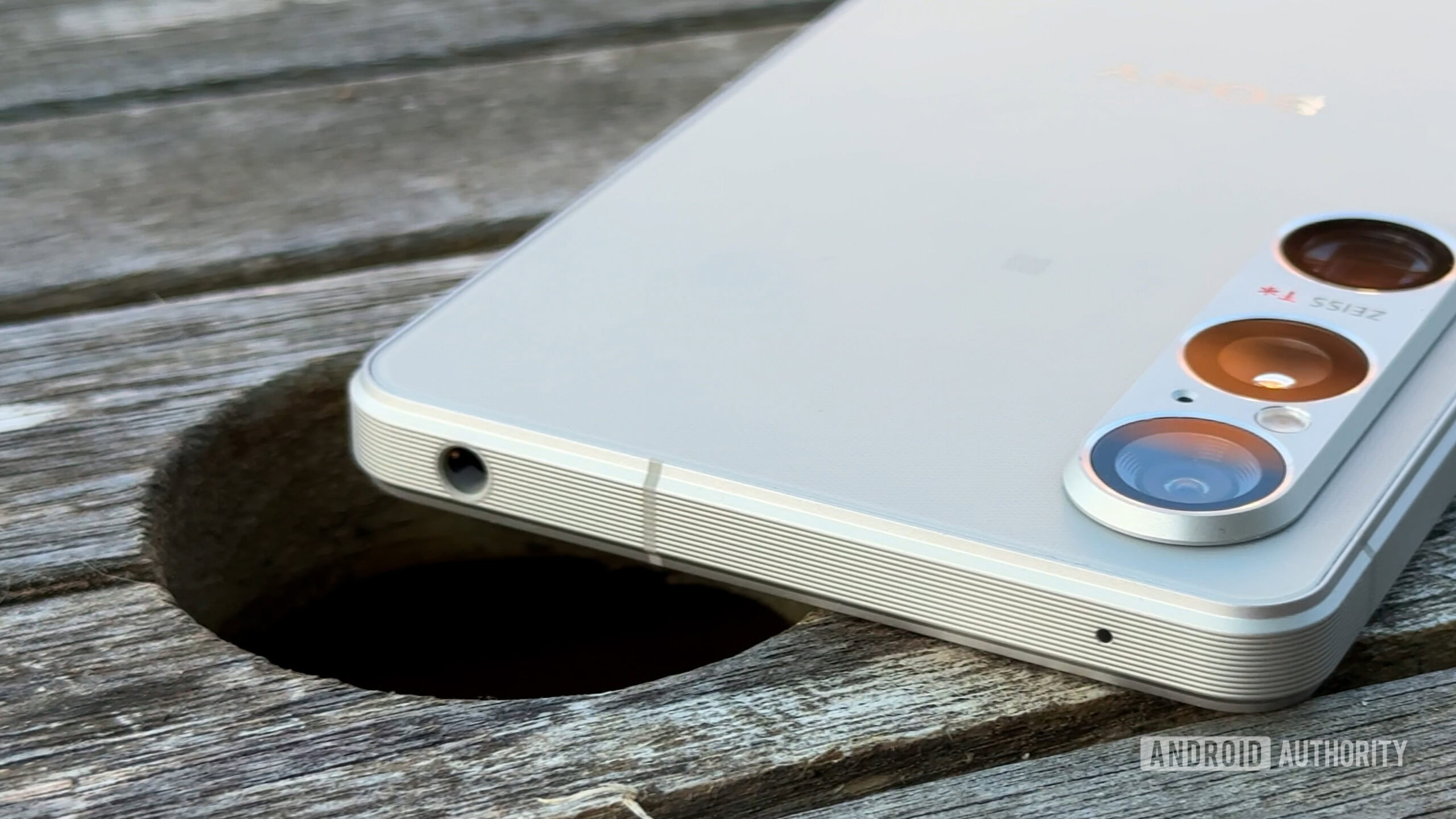
Xiaomi’s decision to stick to the existing Mi 8 template so closely also extends to the lack of an IP rating for water and dust resistance. There’s also no headphone jack, and despite the glass build, the Mi 8 Pro does not support wireless charging.
All of the aesthetic changes don’t do enough to hide the iPhone similarities, but I’m not going to dwell on comparisons beyond this point. If you want an Android phone that at least looks like an iPhone, the Mi 8 series is arguably the best attempt so far. The Mi 8 Pro tweaks it just enough to deliver an additional wow factor, which could turn the heads of a few iOS users.
Just don’t let them read those nauseating perfume ad-like slogans.
Display
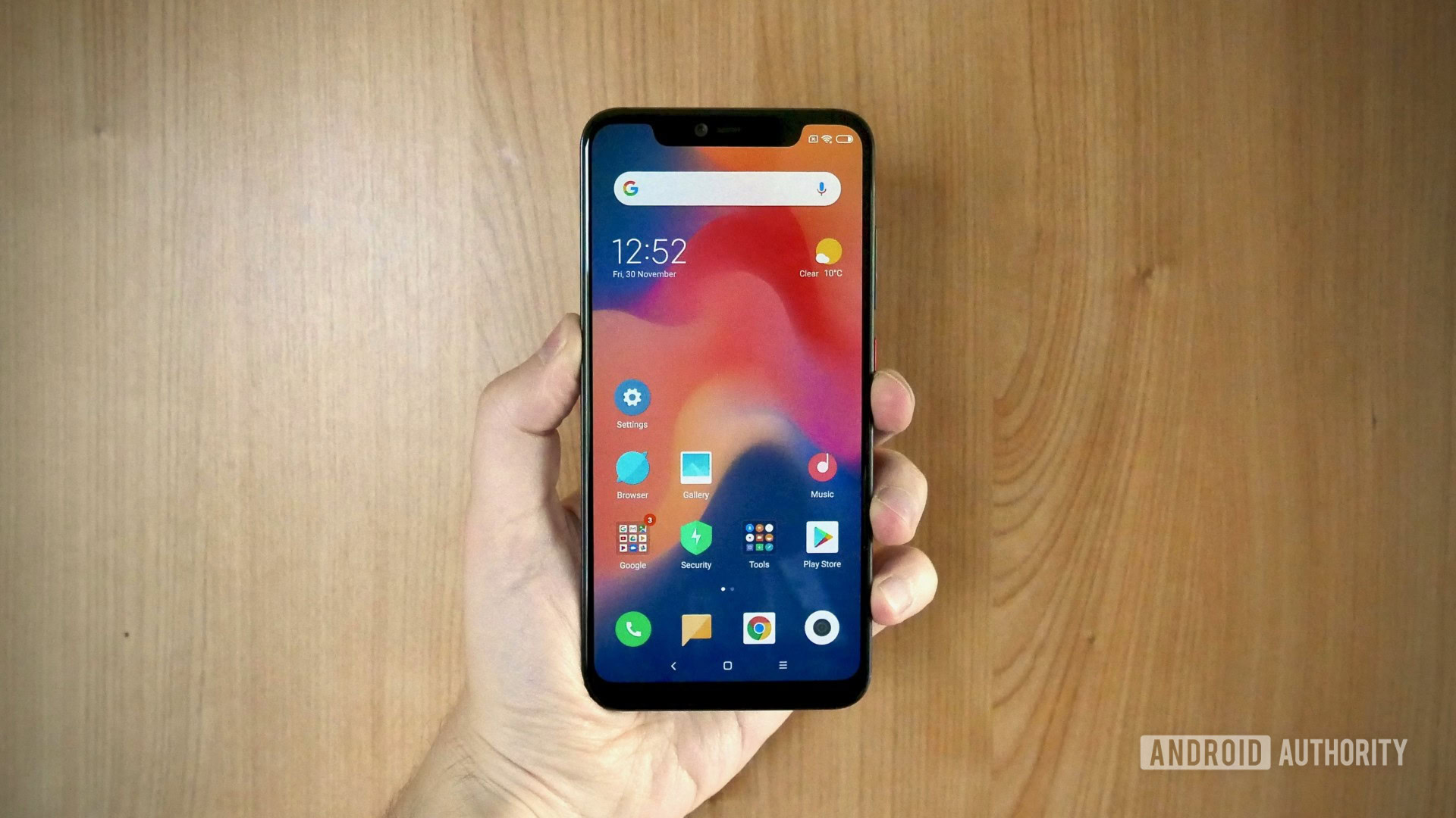
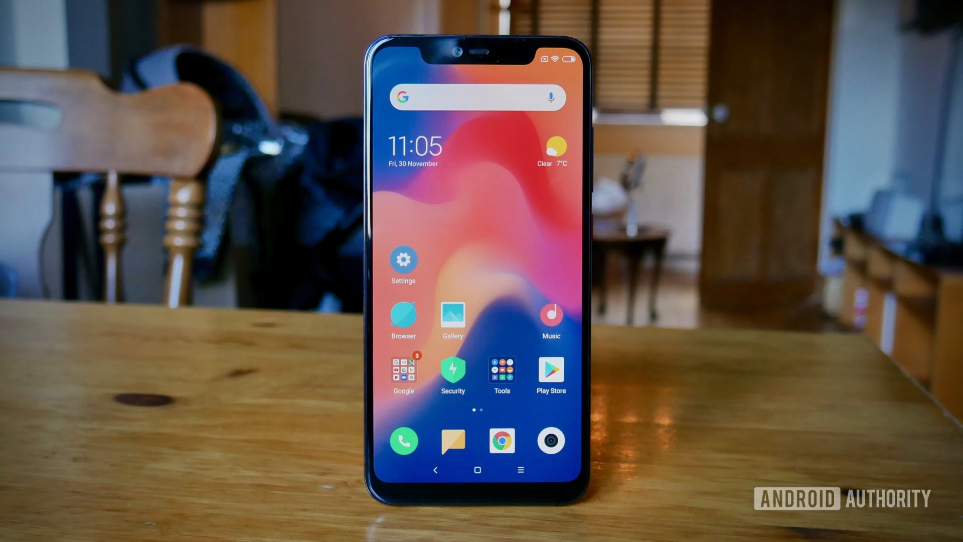
The Mi 8 Pro sports a 6.21-inch, Samsung-made Super AMOLED display with a resolution of 1,080 x 2,248 (402ppi) and HDR support. Very few phones at the Mi 8 Pro’s price range stand out in the display stakes and Xiaomi’s phone is no different. That’s not to say it’s bad, it just meets the already high bar of quality established in 2018.
Brightness is rated up to 600 nits and viewing angles are great in general. As with any Xiaomi phone, the colors veer towards colder temperatures, which complements the muted hues of the MIUI launcher. There are plenty of options to alter the contrast if you prefer a punchier look, but don’t expect the deep blacks you’ll find on Samsung’s own top-tier phones.
Performance
As with the regular Mi 8, the Mi 8 Pro is powered by Qualcomm’s Snapdragon 845 SoC, only this time you get 8GB of RAM standard.
I had no complaints with the phone’s overall performance in the real world. It handled everything I threw at it with ease. Considering the phone costs half as much as some of the top flagships, Xiaomi clearly didn’t cut any corners tuning its core hardware.
In terms of benchmarks, the Mi 8 Pro performed marginally better on the whole than its non-Pro sibling. Here are the results:
The Mi 8 Pro came out at 2,395 in the Geekbench 4 Single-Core test and 8,969 in the Multi-Core test. For comparison, the OnePlus 6T (6GB) scored 2,368 and 8.843, while Xiaomi’s POCOphone F1 scored 2,492 and 9,072, respectively.
Antutu gave the Mi 8 Pro a score of 288,330, landing just below Xiaomi’s Black Shark gaming phone (291,099), the OnePlus 6, (293,745), and OnePlus 6T (295,181), but above the regular Mi 8 (287,142). Meanwhile, the POCOphone F1 scored 266,264.
3DMark’s Sling Shot Extreme (OpenGL ES 3.1) test delivered an overall score of 4,612, which is an improvement over the Mi 8 (4,233) and POCOphone F1 (4,216), but below the OnePlus 6T (4,697).
Hardware
As well as the RAM bump over the Mi 8, the Mi 8 Pro also has twice the ROM, with 128GB non-expandable storage to play with.
The battery, however, drops from 3,400mAh to 3,000mAh. I imagine the culprit behind the size reduction is the additional space taken up by the in-display fingerprint sensor.
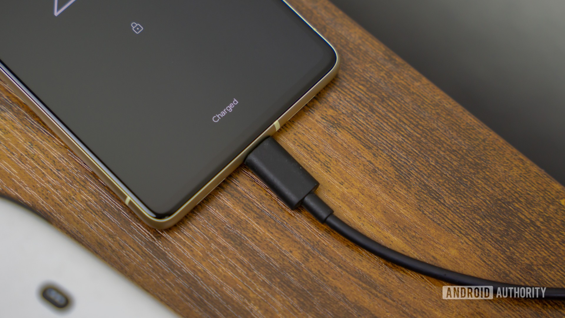
The Mi 8’s battery performance was already underwhelming and unfortunately the Mi 8 Pro comes off even worse.
It’ll get you through a day of average use, but if you’re on a long commute and want to stream anything or play a few games you can expect to be rushing around for a charger when you arrive at your destination.
I averaged just under five hours screen-on time based on a number of samples and 15-17 hours between charges. It’s not the worst endurance I’ve seen from a phone, but it’s a weak spot Xiaomi could’ve easily avoided by adding a little more bulk to the Mi 8 Pro’s overall build to better fit the in-display sensor and a decent size cell.
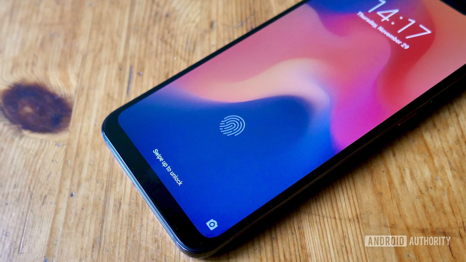
Let’s talk about the in-display fingerprint sensor.
I hate it.
The scanner is apparently built from the same Goodix tech found inside the HUAWEI Mate 20 Pro and the OnePlus 6T. I’ve used both of those phones (albeit just for two weeks a piece) and neither had me swearing as my finger failed to register for the umpteenth time.
The Mi 8 Pro fingerprint sensor worked maybe 40 percent of the time, well below the hit rate I’d want for feature that gets so much use during any given day. I remapped it multiple times, altered my finger position, used different fingers, tried varying amounts of pressure, and the result was almost always me having to type in a PIN instead.
I actually quite like the sci-fi-esque halo effect around the fingerprint icon when you apply pressure on the sensor and when the thing actually works it does unlock the phone in seconds. Yet as you might expect, these minor consolations were not enough to stop me from turning it off and forgetting about it completely. That’s not a great situation for one of the phone’s headline features.
The Mi 8 Pro fingerprint sensor worked maybe 40 percent of the time.
Mercifully, the Mi 8 Pro’s implementation of face unlock — added in recently via an OTA update — is infinitely better.
The system relies on the myriad sensors in the phone’s elongated notch, including the infrared camera, which means you can rely on the biometrics even in dimly lit conditions. I tested this at night with all the lights off and it still unlocked the phone with ease.
It’s incredibly fast and very reliable, which means there’s no reason to even touch the wonky fingerprint sensor.
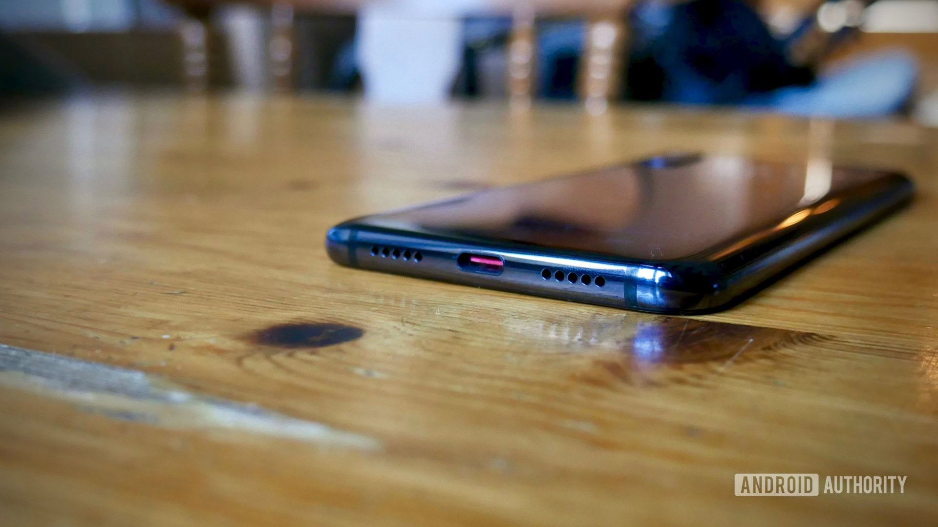
On the audio side, the Mi 8 Pro has two speaker grills on the bottom of the phone, but only one actually houses a speaker. It also lacks an earpiece speaker. While the clarity is generally acceptable, the loudspeaker volume is annoyingly quiet even at max. There’s also no 3.5mm jack, so users with a trusty old pair of wired headphones will also need to invest in a new set of cans or use the adapter included in the box.
Software
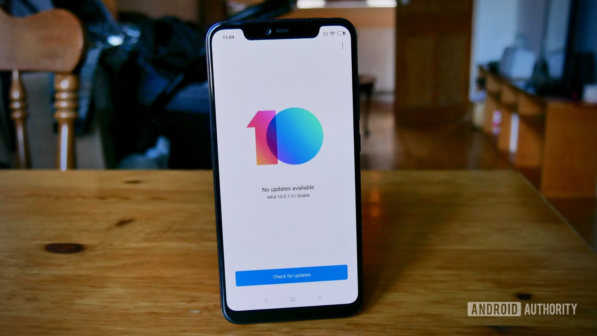
The Mi 8 Pro runs MIUI 9 out of the box, but it recently updated to MIUI 10. While the latest version of Xiaomi’s custom skin sure looks like it’s based on Android 9 Pie, it’s actually still running Oreo. Xiaomi did a decent job replicating Pie’s UI changes, you really just miss out on the AI smarts Pie adds behind the scenes.
Before the update, this section would’ve gone very, very differently. MIUI 10 solves the most heinous issues of MIUI 9 — most notably the lack of threaded notifications, which was driving me up the wall.
Read more: Android 9 Pie update tracker: When will your phone get Pie?
MIUI is generally quite barebones, which at this point appears to be a conscious decision by Xiaomi. Visually It’s somewhere between LG’s UX and Huawei’s EMUI. The square-shaped default apps and muted color palette won’t be to everyone’s taste, but it’s at least functional and largely inoffensive.
While there’s some app redundancy — duplicate browsers and the like — Xiaomi’s stock tools apps are largely useful and they all feature the same simple font and soft color schemes to create a nice sense of consistency. As a Mi Band 3 wearer and Mi Fit app user, I felt quite at home.
I also quite like the Xiaomi Guide, which sits on the left home screen panel, where the Google Discover feed would be on a Pixel phone. It isn’t as cluttered as some other third-party feed-style alternatives on the market and it’s relatively customizable.
Other neat inclusions are Dual Apps, which duplicates supported apps so you can run two accounts while with separate app icons and data, and Second Space, which essentially lets you replicate your entire phone so you can store sensitive data in a password protected clone. MIUI 10 also adds full-screen gesture support, although certain unique gestures — accessing recent apps by swiping up and holding in particular — don’t feel all that natural.
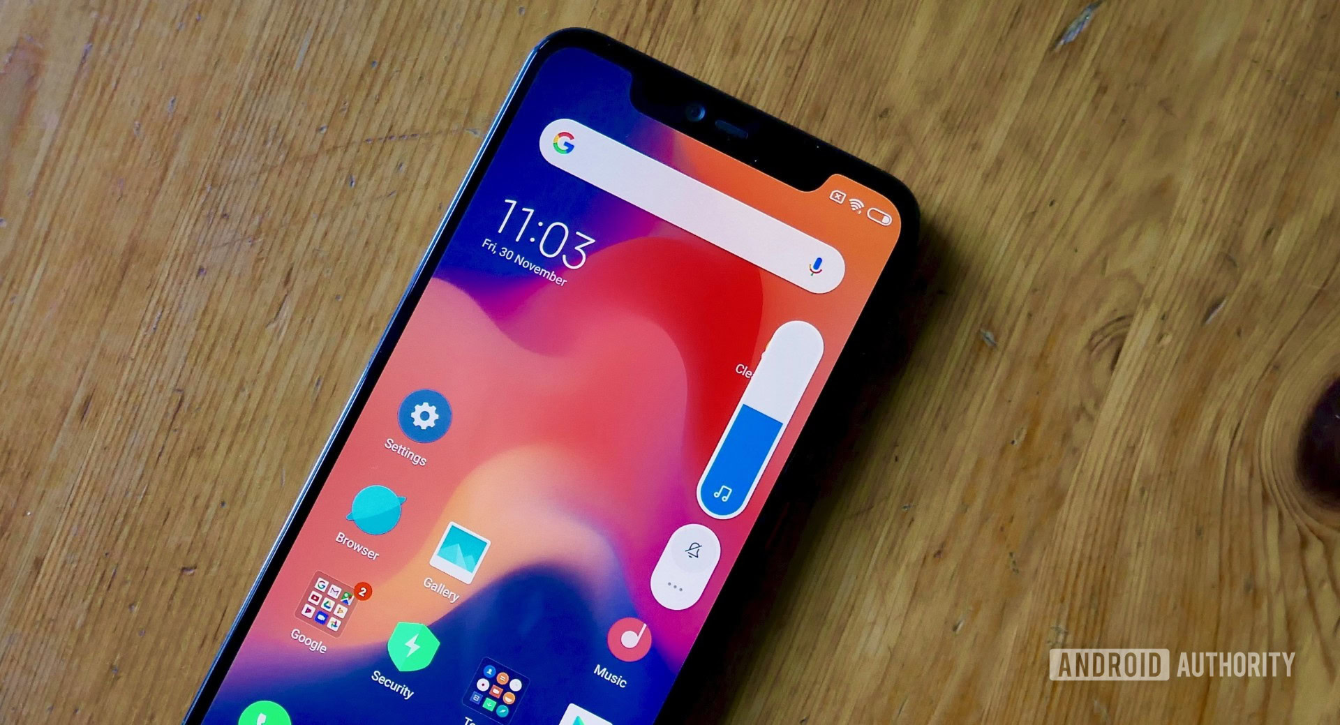
Unfortunately, actually finding all of MIUI 10’s better features is an absolute pain. The Settings app is a labyrinthine maze of arbitrary sub menus. If there wasn’t a search bar at the top, I’m not sure I would’ve ever worked out how to un-mirror the back and recent apps buttons.
This unnecessary complexity is directly at odds with the simplicity of the rest of the UI, which permanently removes a number of Android staples. The most notable casualty is the app drawer, which is odd considering the Xiaomi POCOphone F1’s POCO launcher at least gives lets you turn it back on.
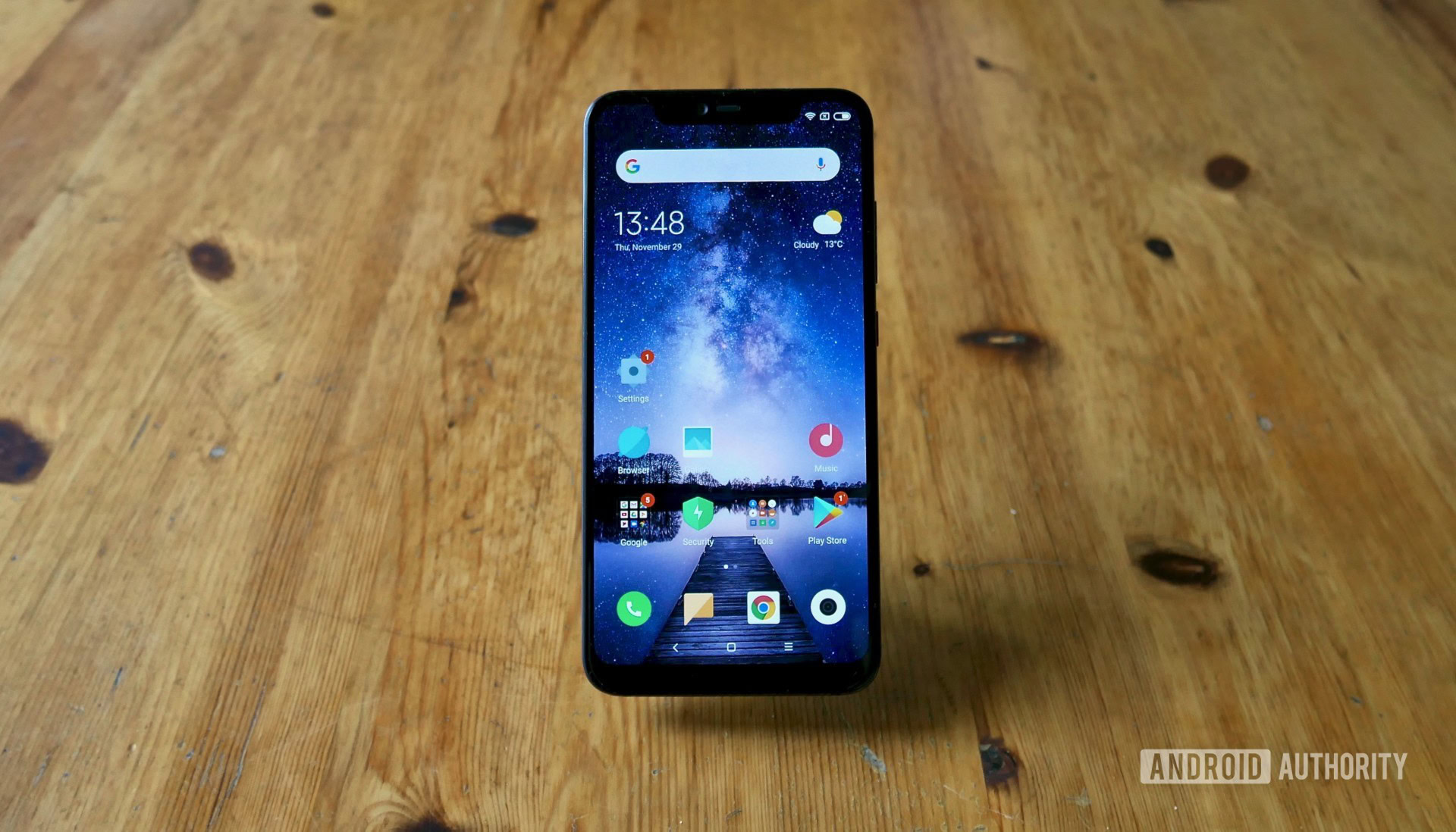
The most inexplicable decision is the lack of any notification icons on the left side of the notch. I’ve already mentioned how the thicker bezel and stretched cutout area leaves very little room, but there’s at least enough space for three icons at a time. Even the right side shows the battery, Wi-Fi, and mobile reception.
It leaves the user in the ridiculous situation where you’ll only see notifications on the lock screen or in the few seconds after they arrive. Otherwise, you could be giddily browsing your phone, completely unaware you have a dozen messages and emails waiting for a reply until you swipe the notification bar down or lock your phone and see the LED light pulsing (although many of Xiaomi’s own apps don’t trigger the light).
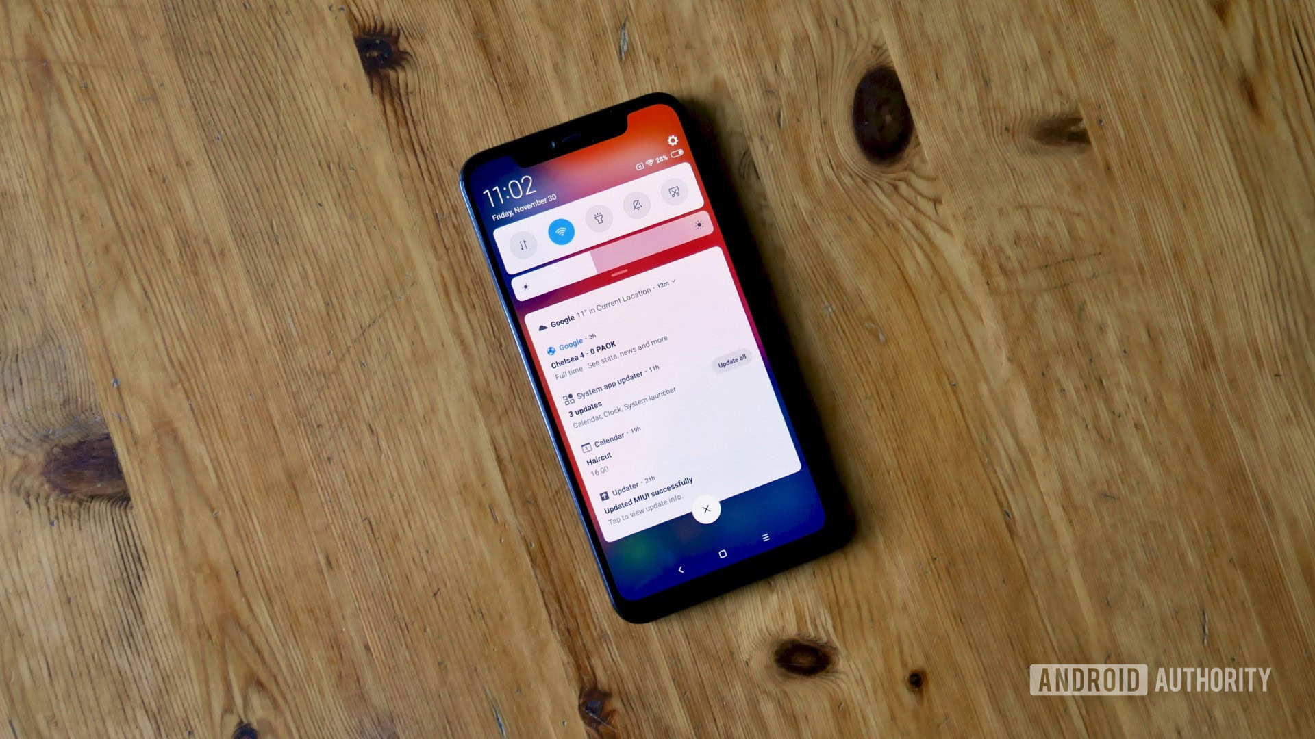
This was exacerbated by the phone’s always-on display, which refused to work throughout my entire time with it. I’m apparently not alone here, though so far Xiaomi hasn’t got back to me regarding the issue. However, even if it starts working, it won’t fix the lack of icons, which is frankly inexcusable when there’s already a solution baked into Android to ensure notification icons work in tandem with notches.
I should note that I haven’t seen any of the controversial ads Xiaomi has slipped into MIUI, Trojan Horse-style, but you might if you pick up the phone for yourself.
As my colleague David Imel noted in his review of the Mi 8, MIUI 10 feels like a solid base for Xiaomi to build on, and hopefully the feedback from its dedicated community will help with that.
Don’t be fooled, though. As much as this is called MIUI 10, it feels like 1.0.
Camera
In a running theme for the Mi 8 Pro, the dual-lens rear camera is identical to the module found on the standard Mi 8. You get a 12MP main lens with an f/1.8 aperture and a secondary 12MP telephoto lens with an f/2.4 aperture that enables 2x optical zoom.
The camera app itself looks remarkably similar to the Google Pixel camera, with the same carousel layout and circular-style icons.
Aside from auto and manual modes, the Mi 8 Pro camera app also supports panorama and portrait shots, as well as slow motion and time lapse videos.
It also has an AI shooting mode, all but a given for Chinese smartphones in 2018. This option can be toggled on or off and Xiaomi says the phone will recognize scenes to take the best photo and automatically tweak bokeh for better portrait shots.
the Mi 8 Pro camera is capable of producing great shots in all but the worst light conditions.
I took a few duplicate photos to compare the results with the AI camera on and off and only saw minor color, sharpness, and contrast adjustments. It’s certainly far from the overtuned mess we’ve seen some AI camera modes produce, but it’s not on par with the NPU-powered results of Huawei’s flagships.
The Mi 8 Pro also lets you toggle HDR either on, off, or on auto. The latter produced impressive results during my photography sessions and the camera has a nice knack of knowing when to kick HDR into gear.

In fact, the Mi 8 Pro camera in general is capable of producing great shots in all but the worst light conditions. Sharpness, color reproduction, dynamic range, and contrast are all solid and Xiaomi has included plenty of options to tinker with the image in the Gallery app if you’re not happy with the immediate results.
My only real complaint is the dual camera watermark, which is turned on by default. Just remember to turn it off before taking that first, perfect shot.
Below are a few compressed sample photos taken in a variety of different conditions. You can see the same samples in full resolution here.
I should also mention video recording (up to 4K at 30fps) produces equally reliable results thanks to the onboard 4-axis OIS. The 20MP selfie cam is far better than you’d expect for a phone at this price range — just don’t spend too long in the comprehensive beauty and remodeling suites or you might not recognize your own face by the time you’re done.
Specs
| Xiaomi Mi 8 Pro | |
|---|---|
Display | 6.21-inch AMOLED 2,248 x 1,080 resolution 18.7:9 screen ratio |
SoC | Qualcomm Snapdragon 845 Octa-core, up to 2.8Ghz |
GPU | Adreno 630 |
RAM | 8GB LPDDR4X |
Storage | 128GB UFS |
Cameras | Rear cameras Main: 12MP with 1.4 micron pixels, 4-axis OIS, f/1.8 aperture Secondary: 12MP telephoto with 1.0 micron pixels, f/2.4 aperture Video: 4K at 30fps, 1080p at 240/120/30fps, 720p at 240/30fps Front camera: 20MP with 1.8 micron pixels, f/2.0 aperture |
Audio | Bottom-firing speaker USB Type-C No 3.5mm jack |
Battery | 3,000mAh Non-removable Quick Charge 4+ |
Facial recognition | 3D facial recognition (via OTA) |
Sensors | Goodix In-display fingerprint sensor Accelerometer Gyroscope Proximity Ambient Light Electronic Compass Barometer |
Network | GSM: B2/B3/B5/B8 CDMA: 1X/EVDO BC0 WCDMA: B1/B2/B4/B5/B8 TD-SCDMA: B34/B39 TD-LTE: B34/B38/B39/B40/B41 (120MHz) FDD-LTE: B1/B2/B3/B4/B5/B7/B8/B12/B17/B20 LTE B41 4 antenna technology supporting 4x4 MIMO |
Connectivity | Wi-Fi: 2x2 MIMO, 802.11 a/b/g/n/ac, 2.4G/5G Bluetooth 5.0 AptX/AptX-HD support NFC Dual frequency GPS (GPS L1+L5, Galileo E1+E5a, QZSS L1+L5, GLONASS L1, Beidu B1) |
SIM | Dual nano-SIM |
Software | Android 8.1 Oreo MIUI 10 |
Dimensions and weight | 154.9 x 74.8 x 7.6mm 177g |
Colors | Transparent Titanium |
Gallery
Pricing and availability
The Xiaomi Mi 8 Pro is available in the U.K. priced at 499 pounds (~$634) and selected European countries where it retails for 599 euros.
Final thoughts and the competition
When looking at the Mi 8 Pro’s place in the wider market, the most obvious comparison is with the OnePlus 6T. The two “flagship killers” represent incredible value for money, both starting at just 499 pounds in the U.K.
If you’re already deep into Xiaomi’s Mi ecosystem of apps and services, which will only grow as the company expands further into the smart home market, the Mi 8 Pro is potentially the better bet. That’s also the case if you really need that additional 2GB of RAM (I’d argue you don’t) and can’t stomach spending anything over the base asking price.
For everyone else, however, the intuitive software, far better battery performance, and sleek hardware design of OnePlus’ latest is hard to deny.
However, the Mi 8 Pro’s real rival isn’t another Chinese brand. It’s Xiaomi itself.
The POCOphone F1 and Xiaomi Mi 8 are both enticing alternatives.
While it doesn’t look or feel anywhere near as premium, the POCOphone F1 is fundamentally the same device in many key areas. It has a headphone jack, a better native launcher, a much larger battery, and crucially costs 170 pounds (~$215) less.
You could also always consider the regular Mi 8 with its near identical build and feature list and enjoy (marginally) better battery life while also saving 40 pounds versus the Pro.
You’ll lose the transparent rear glass, the extra 2GB of RAM, and the atrociously bad in-display fingerprint sensor, but I’d argue that’s fair when you could save yourself a bit of cash and almost afford both a Mi Band 3 and some USB Type-C earphones (not included in the box) with the savings.
In the case of the Mi 8 Pro, I’d stick with an “amateur” alternative.
What do you make of the Mi 8 series’ top dog? Let us know in the comments.