Affiliate links on Android Authority may earn us a commission. Learn more.
It's high time Xiaomi stopped copying Apple iOS
Published onMay 20, 2023
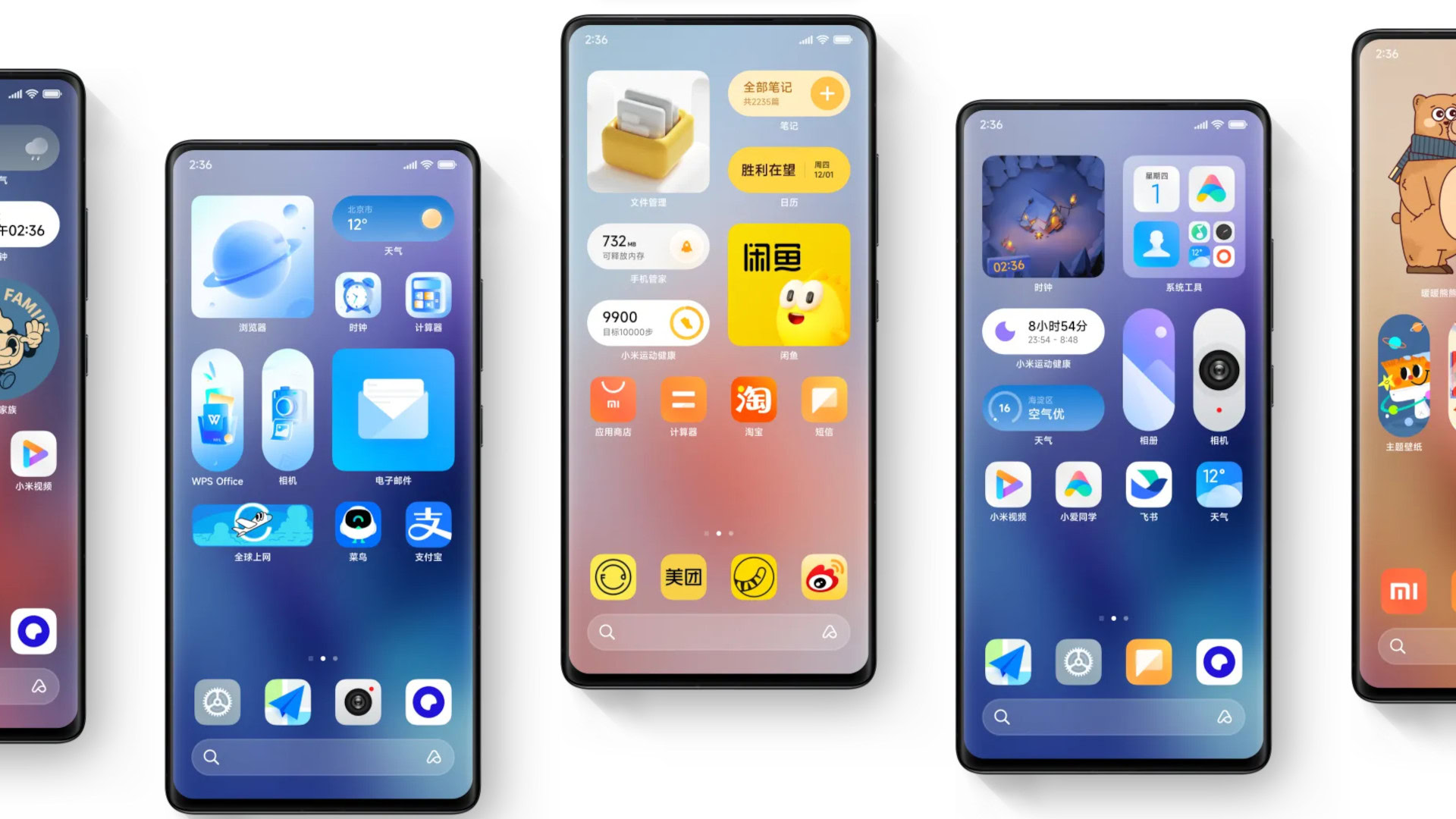
Xiaomi was one of many Chinese brands copying Apple iOS in the early 2010s, and this was an understandable trend at the time. It created a familiar experience for former iPhone users while also giving people a similar experience without paying a premium. Even today, iPhone 14 Pro users would feel right at home switching over to Xiaomi.
In fact, I distinctly remember this iOS-like aesthetic upon first using the Xiaomi Mi 4 and Mi Pad in the mid-2010s. I definitely excused it at the time due to the fact that these were cheap devices. “Who cares? I’m getting a great Android tablet with a Tegra chipset for under $250,” I thought upon buying the Mi Pad in China in 2015.
Now that we’re in an era of ultra-premium Xiaomi phones though, I really can’t excuse an Android skin that copies Apple’s iOS aesthetics.
How does MIUI copy iOS? Let me count the ways
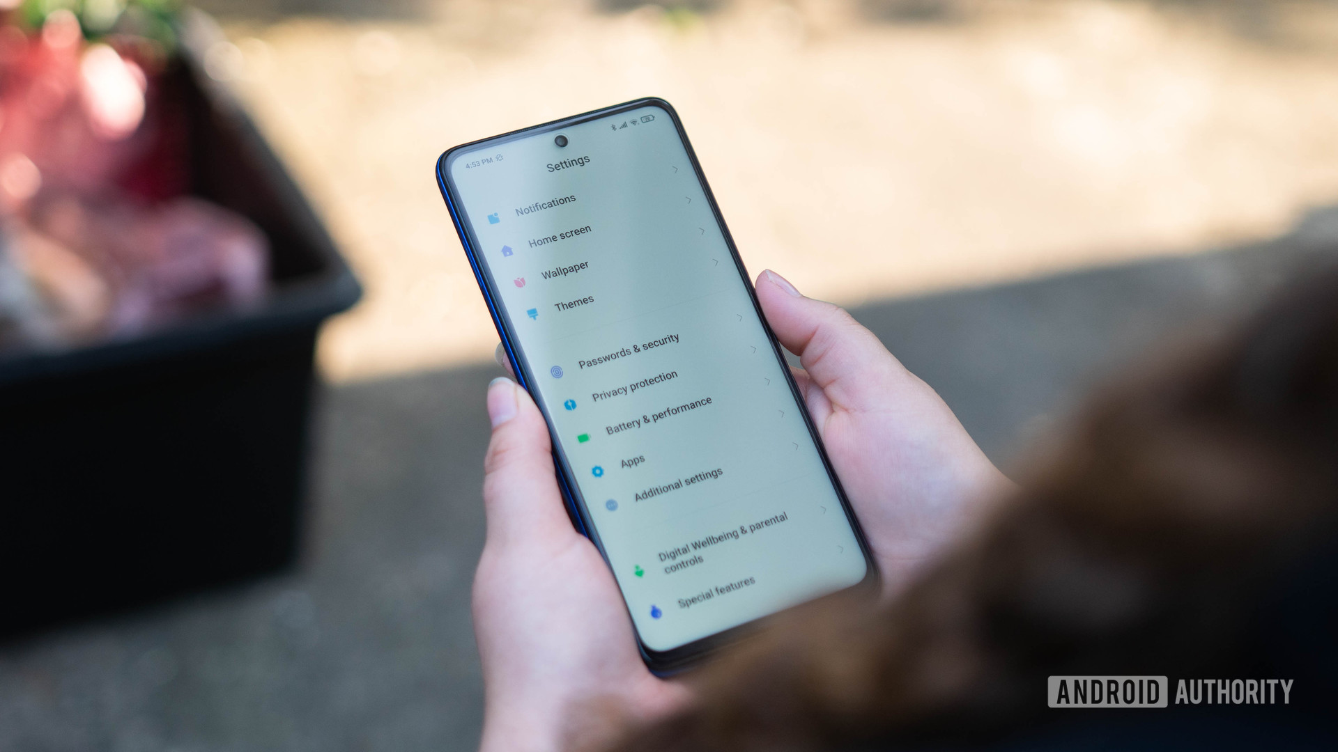
There’s no shortage of Chinese brands with visually distinct, feature-rich Android skins in the global market in 2023, such as OPPO, HONOR, Motorola, and vivo. After all, an original or stock-like visual style is the way to stand out in global markets. So I find it frustrating to see Xiaomi’s MIUI continue to crib from iOS instead.
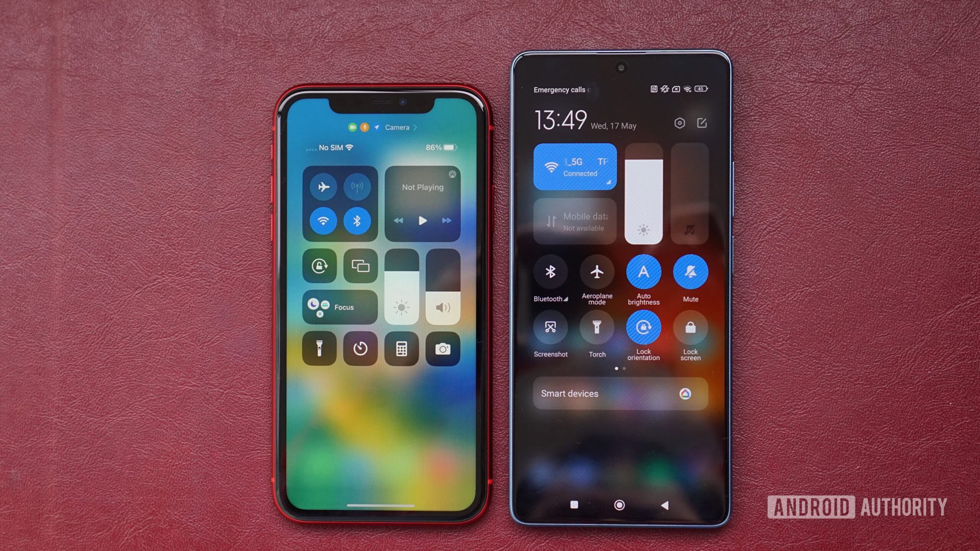
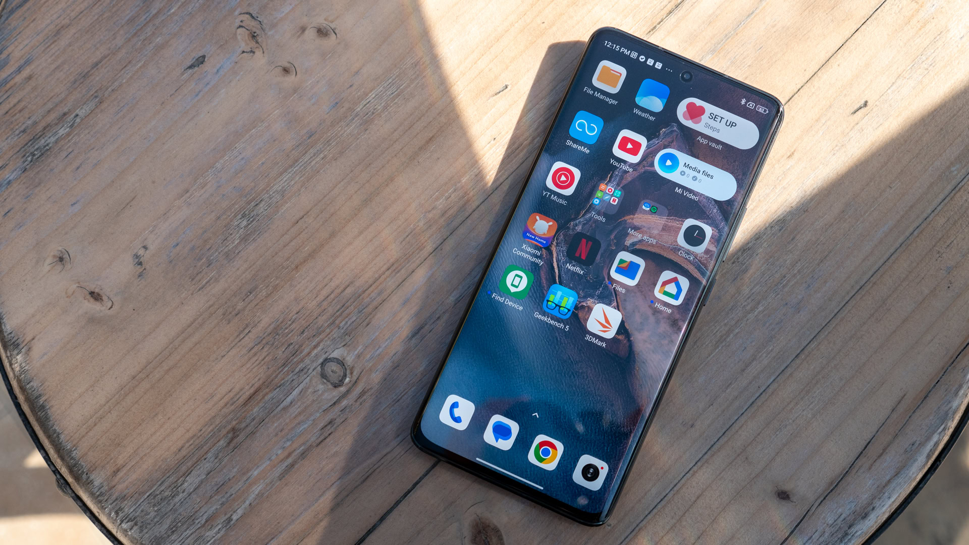
In addition to the overall visual style, use of skeuomorphism, and similar toggle designs, perhaps the most notable way Xiaomi copies iOS is with the Control Center. The Chinese brand’s take is eerily similar to Apple’s screen, down to the same color scheme and similar sliders for brightness and volume. Check the gallery out below.
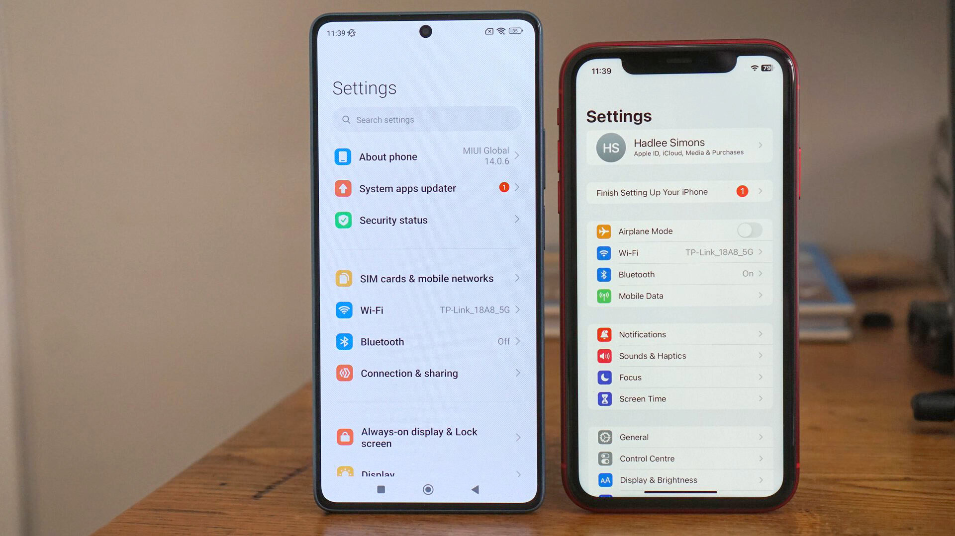
Xiaomi also adopts a very similar settings menu compared to iOS, featuring black text on a white background and similar icons. We also see a “finish setting up your device” prompt in the settings menu on Xiaomi phones. The actual settings items differ between the two devices, but the overall similarities are still plain to see.
Even the MIUI camera app looks very similar to the iPhone camera app. Now, many smartphone brands offer a rotating carousel of modes in their camera app, so some skeptics might argue that Xiaomi is in the clear here. But it’s evident that Xiaomi has aped Apple’s layout, featuring the carousel directly below the viewfinder. By contrast, Google offers a different camera UI layout, featuring the carousel at the bottom of the app and zoom controls below the viewfinder rather than inside the viewfinder.
The iOS trappings used to be even more overt until a few years ago. I hated the lack of an app drawer in earlier MIUI versions. There wasn’t even an option to enable one back then, but more recent MIUI versions have this feature now, thankfully. Furthermore, the global MIUI skin are more original than the Chinese skin, which goes all-in on the iOS-style home widgets.
Nevertheless, it’s a real shame to see MIUI sticking with the iOS aesthetic at large, as I feel it’s still one of the more feature-packed Android skins outside of Samsung One UI. Some of my favorite current features include per-app volume controls, super wallpapers, and notification pulse lights. The Xiaomi skin also helped popularize other features like themes, dual apps, and scrolling screenshots.
You only need to activate the quick settings menu to realize that MIUI is still similar to Apple iOS.
It pains me to admit that MIUI is still inspired by Apple’s software, as I’d argue that no brand has done more to democratize the modern smartphone than Xiaomi. Devices like the Redmi Note series, in particular, redefined the mid-range market in the mid to late 2010s, delivering a ton of bang for your buck.
In any event, this heavily inspired visual design is particularly disappointing given that Xiaomi charges €1,300 for the Xiaomi 13 Pro. Furthermore, the Xiaomi 13 Ultra was recently announced, and it’ll likely exceed the €1,300 mark when it launches in global markets. You’d really expect more originality for that sort of money.
Why is this a big deal?
Copying features is usually a two-way street in the mobile space, as various brands frequently crib from each other. In fact, Apple pinched two Xiaomi hardware features for the iPhone 14 launch. But copying overall aesthetics shows a disappointing lack of originality. First impressions count, and less tech-savvy consumers might look at the €1,300+ Xiaomi flagship price tag, then look at the software and ask why they’d pay that much cash for a cloned or derivative experience.
Me? I know what I’m getting into at this point when buying a Xiaomi phone, but I would still prefer the combo of Xiaomi hardware and OPPO, Google, or Samsung software.
This dramatic change to Android also has practical implications. Xiaomi makes loads of modifications to Android, which has resulted in more bugs. This was particularly notable in our Poco F3 and Poco X4 Pro reviews. Colleague C Scott Brown reviewed the former and encountered everything from random reboots and notification glitches to random brightness drops. Meanwhile, I reviewed the Poco X4 Pro and found several weird issues, such as the camera app sometimes capturing thumbnail-sized 108MP photos and music/podcast apps cutting out for no reason.
Xiaomi's extensive Android reskin is likely the reason behind MIUI's lackadaisical update schedule and inconsistent level of polish.
That said, some recent devices didn’t suffer from major bugs at all, and Xiaomi launched an MIUI working group that appears to have helped deliver a more polished experience. Still, I can’t help but feel we wouldn’t see nearly as many glitches if the company took a more restrained approach to MIUI.
This raft of changes also means a longer timeline for releasing system updates. Then again, Samsung makes similarly sweeping changes to Android and still manages to deliver loads of updates at a faster pace.
Either way, I’ve spent enough time with OPPO and Samsung handsets to know that Android phones can have an original look and feel without alienating users. I particularly liked my time with the OPPO Reno 8 Pro owing to the sheer level of customization on tap.
What can Xiaomi do instead?
There are effectively two routes ahead of Xiaomi if it wants to make MIUI a more original Android skin. It could offer two visually distinct MIUI skins (one for global users and one for China) or deliver one major visual overhaul to rule them all.
The first option means that each market gets what they want, so an original or stock-like skin for global markets and an iOS-like approach in China. This route does have the potential for more bugs and slower update speeds though, owing to resources being spread more thinly.
Do you think MIUI copied Apple iOS?
Xiaomi wouldn’t be the first to offer two Android skins, as vivo offers Origin OS for China and the stock-like Fun Touch OS for global users, for instance. I’m not the biggest fan of Fun Touch OS when it comes to bloatware and other system additions, but the stock-like aesthetic is very much appreciated.
A single overhauled MIUI skin for both markets could enable faster updates and fewer bugs, as Xiaomi would theoretically not have to spread its resources as thinly as a two-pronged approach. However, the downside is that each market might not get exactly what they want.
No matter which route Xiaomi takes, the end result would be that global users would no longer have to put up with an Apple iOS-like Android skin.
It’s time for a fresh coat of paint
Xiaomi can no longer afford to offer an Android skin that looks like a heavily inspired version of Apple iOS if it wants to entice customers in today’s crowded flagship market. Especially when it’s expected to charge upwards of €1,300 for the Xiaomi 13 Ultra. I sincerely hope the company takes cues from rival brands and delivers that overdue visual overhaul.
I’ve always recommended Xiaomi phones to friends and family, even buying Redmi Note 8 phones for my immediate family a few years ago. But these recommendations and purchases came despite the iOS-like MIUI software rather than because of it. So it’s high time for Xiaomi to turn one of its greatest weaknesses into a major strength.
