Affiliate links on Android Authority may earn us a commission. Learn more.
YouTube Music finally gets its 'Speed dial' for recent favorites
October 28, 2024

- YouTube Music is getting a quick-access “Speed dial” grid with songs you’ve recently played.
- Google formally announced the feature on October 24, 2023.
- YouTube Music also gets some subtle changes to the way it displays menus.
Google giveth, and Google taketh away. Sometimes Google drops a new feature on us out of the blue, and it just instantly catches on and becomes a part of our lives pretty much overnight. But the company also has a habit of dragging things out, and sometimes we’ll see a feature pop in and out of existence over and over as the company tries to get things just right. Today we’re looking at the return of one change that YouTube Music has been flirting with for well over a year now, as the app’s “Speed dial” suggestions make a return.
Back in September of 2023, YouTube Music was testing a UI tweak that replaced the “Listen again” track listing with this new “Speed dial.” And then this week last year, Google formally announced “Speed dial,” even if it wasn’t going to immediately be available for everyone:
In the coming months, we’ll be launching a new feature on the Home tab that will help you quickly explore and listen to the songs and artists you’ve got on repeat. Simply open the YouTube Music app and right at the top of the Home tab, you’ll be greeted by your most listened to music content, making it easy for you to jump back into your current favorites.
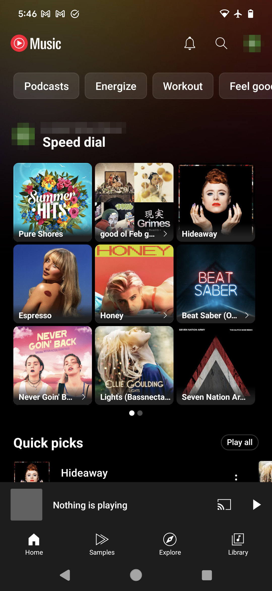
Well, it may have taken its sweet time in getting here, but as 9to5Google spotted, and we’re able to confirm on our own devices, Google finally seems to be flipping the switch and bringing “Speed dial” to YouTube Music users everywhere:

Functionally, it’s just a quick one-tap way to jump right back into listening to one of your recent favorites. For something so impossibly straightforward, it’s a little crazy that it took Google a solid year to roll it out, but at least it’s here now. Compared to the old interface, this feels a lot tighter, squeezing nine tracks or playlists into an area not much larger than where we got six before — and you can always swipe over for even more.
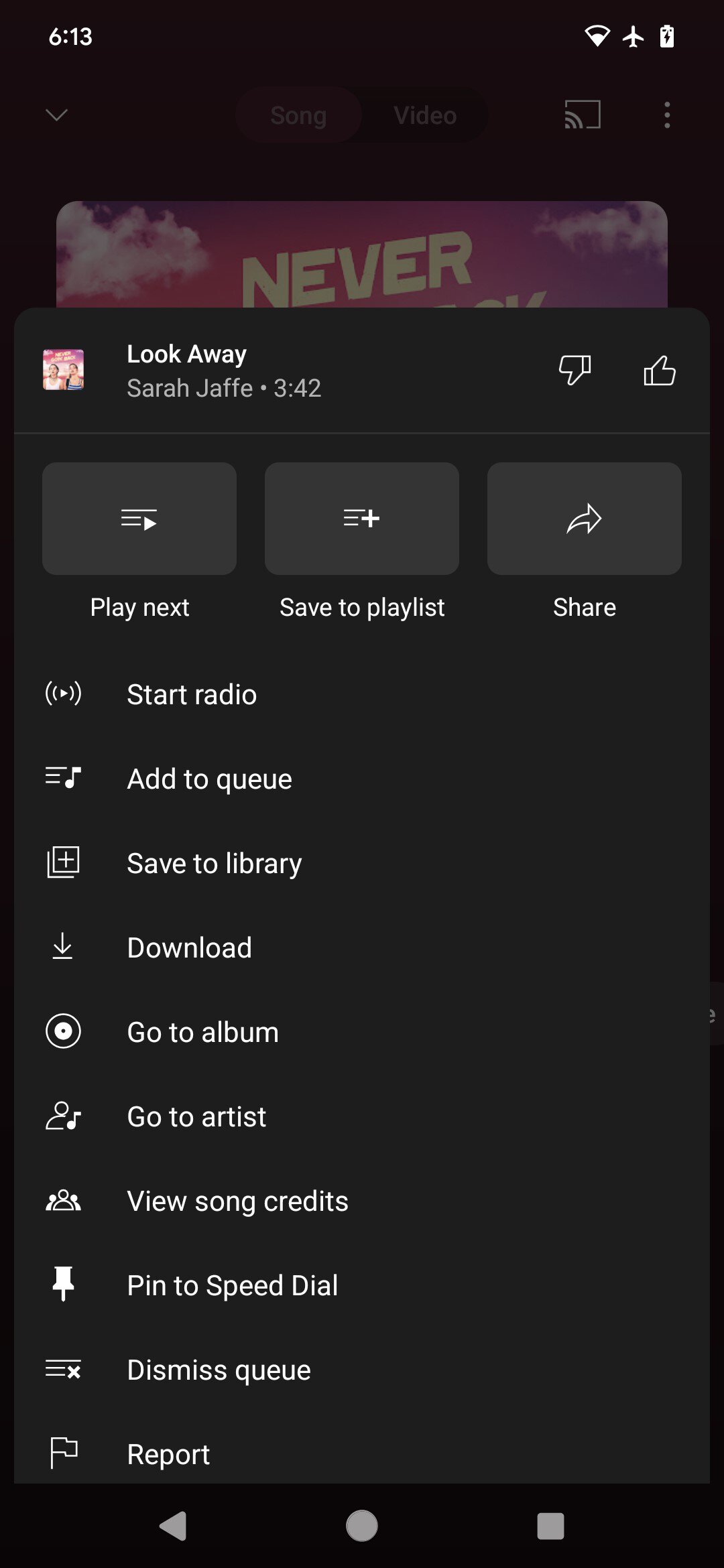
Separately from this long-overdue addition, 9to5Google spotted another change that seems to be currently hitting YouTube Music: Overflow menus now open in a rounded-corner floating window.

It’s just a subtle change from the old overflow menus that filled the width of the screen, and arrives along side other minor tweaks like dropping the rainbow highlighting around cast targets. Check the YouTube Music app on your phone or tablet to see if you’ve gotten all these changes, too.
Thank you for being part of our community. Read our Comment Policy before posting.